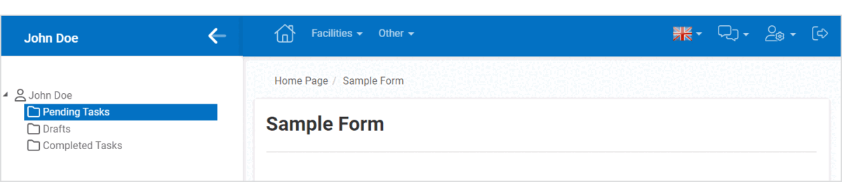
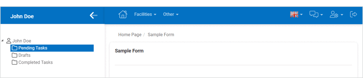
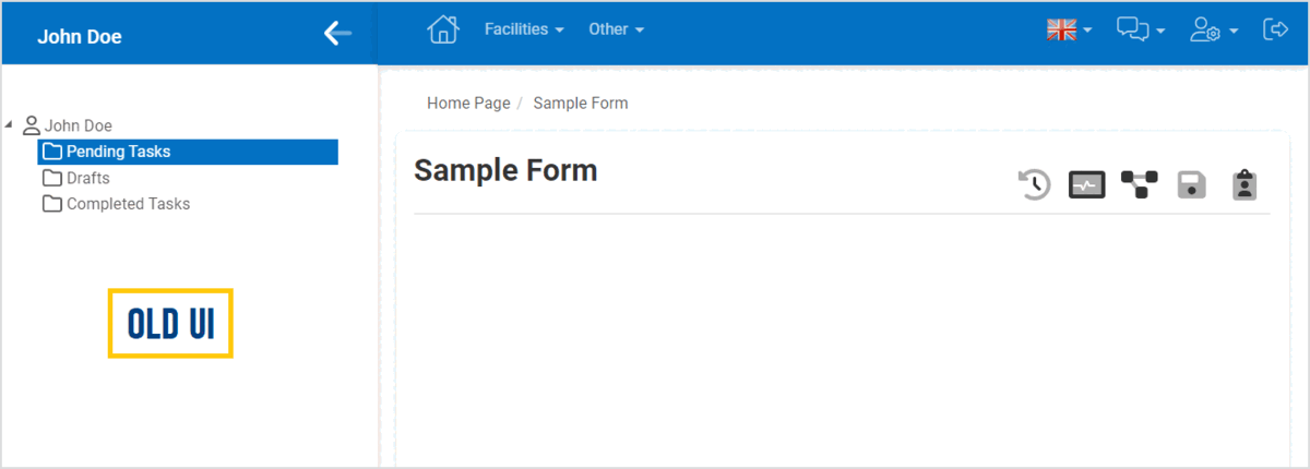
We have implemented an array of enhancements to the user interface of the DBP web application.
Changes in this latest release include:
- Revised Default Color Scheme for Platform Background and Mandatory Fields
We have made adjustments to the default color scheme for the platform’s background and mandatory fields.
- The platform’s previous dark blue background (#002D56) has been replaced with a brighter and more vibrant blue (#0371C3), creating an atmosphere that is fresh and engaging.
- UI Evolution: Before vs. After
-
![]()
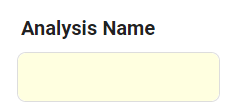
- The color for required fields has been changed from light-yellow (#FFFFE0) to light-blue (#DBF0FF), complementing the new default background color and enhancing visibility by addressing the challenge of the previous color’s low contrast.
- UI Evolution: Before vs. After
![]()
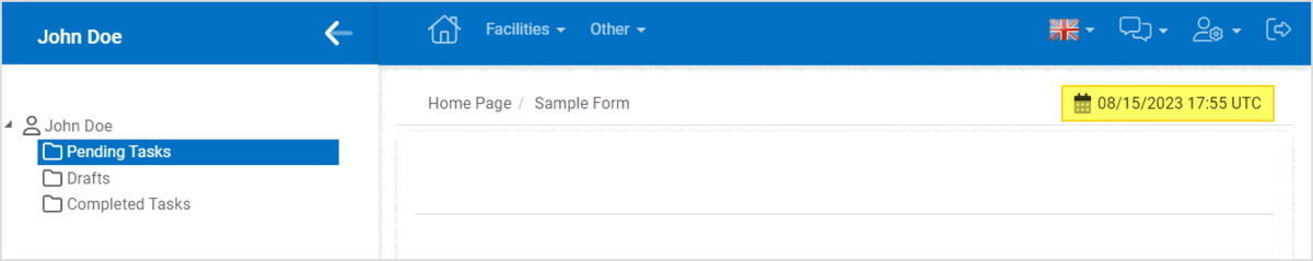
- Timestamp Removal
We have removed the timestamp, which was previously located in the upper right corner above forms, to declutter the interface and optimize space.
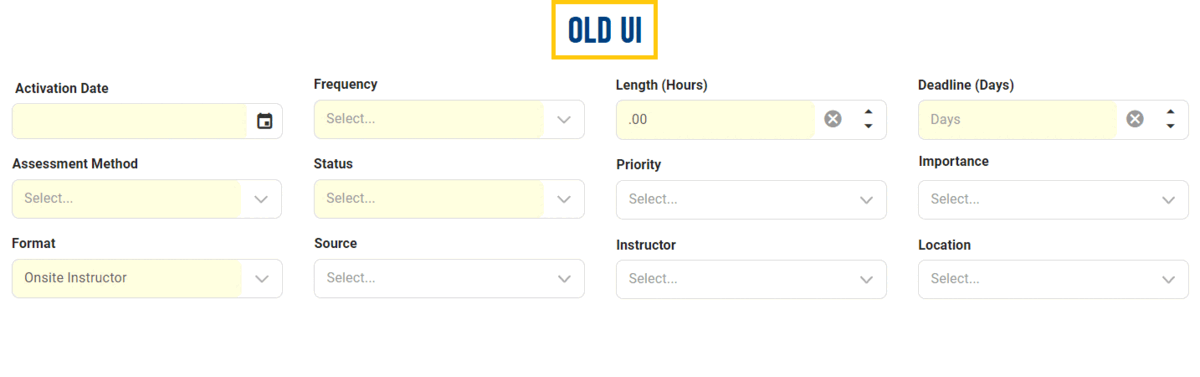
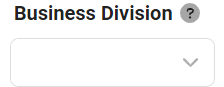
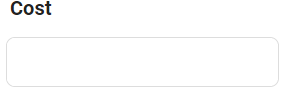
- Form Elements – Modernized Border Styles
We have redesigned form elements to provide a more contemporary look and feel.
- Forms: Forms now showcase rounded edges, contributing to a softer, more pleasing aesthetic.
- UI Evolution: Before vs. After
-
![]()
- Fields: Text fields, dropdowns, and other relevant input fields now feature rounded edges and borders on all sides.
- UI Evolution: Before vs. After
-
![]()
- Buttons: Buttons now also sport rounded edges for a cohesive design.
- UI Evolution: Before vs. After
-
![]()

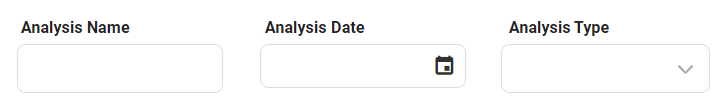
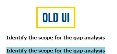
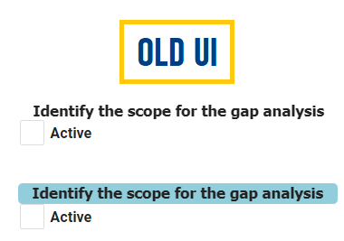
- Form Elements – Font Size Adjustments
To enhance readability and elevate the overall visual appeal, we have implemented a series of font size adjustments across various elements of our forms:
- Form Titles: We have increased the font size of form titles from 17px to 25px.
- UI Evolution: Before vs. After
-
![]()
- Control Caption: We have increased the default font size of control captions from 13px to 16px.
- UI Evolution: Before vs. After
-
![]()
- Control Values: We have increased the font size of values within controls from 13px to 15px.
- UI Evolution: Before vs. After
-
![]()
- Style Change for Form-Specific Menu
We have made an adjustment to the form-specific menu layout. Instead of the previous horizontal arrangement, we have opted for a more compact kebab menu. This change ensures efficient access to contextually relevant actions while maximizing available space within the interface.
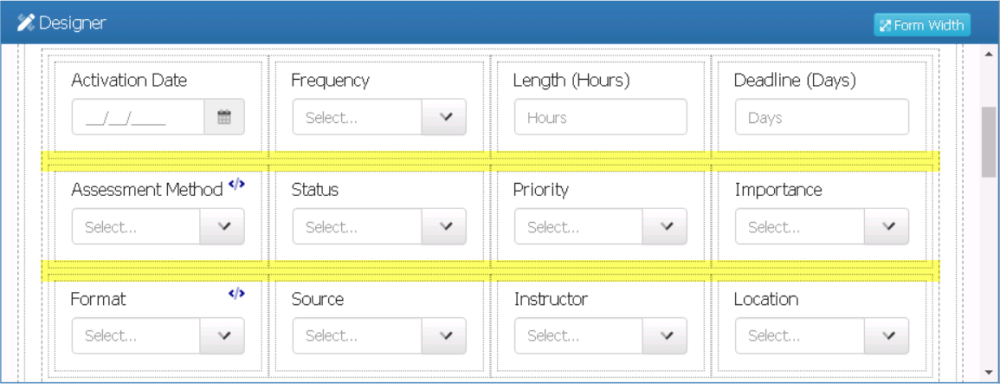
- Rows – Increased Vertical Padding
We have increased the vertical padding between rows, allowing for a cleaner, more organized layout.
- Increased Vertical Padding: Designer View
-
![]()
- Control Tooltip – Size & Color Scheme Adjustment
To ensure better visibility, we have enlarged control tooltips and adopted a vibrant blue color scheme, replacing the previous monochromatic grayscale.
- Label Control – Improvements
We have enhanced the visual appeal of the label control by implementing two key changes.
- Firstly, we have added padding to the left and right sides of the control, creating a more balanced and aesthetically pleasing layout.
- UI Evolution: Before vs. After
-
![]()
- Secondly, we have included vertical padding between the label control and other controls, but only when the Has Height checkbox has been selected. This change improves the overall layout and makes it easier for users to distinguish between different elements in the form.
- UI Evolution: Before vs. After
-
![]()
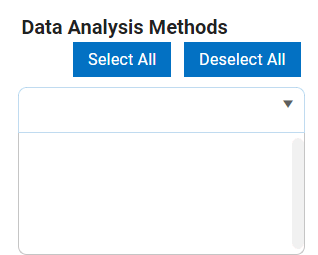
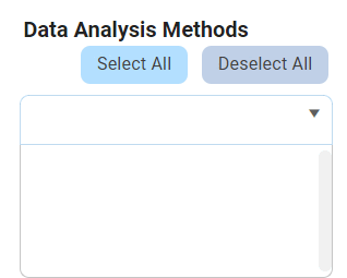
- Multi-Select Dropdown Control – Improvements
We have changed the color scheme of the Select All and Deselect All buttons in the multi-select dropdown control.
- Select All now features a brighter shade of blue that sets it apart from Deselect All.
- UI Evolution: Before vs. After
-
![]()
- As users hover over these buttons, the color now dynamically adjusts to match the platform’s background.
- UI Evolution: Before vs. After
-
![]()
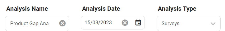
- Numeric Textbox Control – Improvements
We have upgraded the numeric textbox control by adding up/down arrows, simplifying the input of numerical values and providing users with a more intuitive interaction.
- Tab Control – Improvements
We have enhanced the visual appeal of the tab control by implementing two key changes.
- Firstly, we now only apply the bold effect to the active or currently selected tab within the set, creating a clear visual distinction.
- UI Evolution: Before vs. After
-
![]()
- Secondly, we have redesigned the tab set with a white background, departing from the previous transparent design. This alteration ensures that, when the floating tab is enabled, it no longer interferes with the text in the form.
- Tab Control: White Background Preview
-
![]()

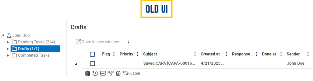
- Drafts Folder – Task Context Menu Removal
After reviewing the Drafts folder, we have found that the task context menu for saved forms is unnecessary. As a result, we have removed it to simplify the interface.