
In the Control Behavior category, users can configure the behavior of the control and define how it interacts with the form or application.
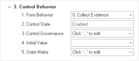
- Form Behavior: This is a single-select dropdown field that retrieves the list of form behaviors (from the Form Behavior section of the Forms module). It allows users to select the form behavior associated to the control.
- Any state or validation properties set for the control will apply only to the selected form behavior.
- Any state or validation properties set for the control will apply only to the selected form behavior.
- Control State: This field displays the current state of the control.
- Control States
- Enabled: This option allows for the control to be visible and editable in the web application.
- Disabled: This option allows for the control to be visible but not editable in the web application.
- Invisible: This option allows for the control to be hidden in the web application.
- Control Governance: This field allows users to configure various properties that govern the functionality of controls, including validation rules and other control-specific settings.
- To access the control governance properties, click on the ellipses (
![]() ) inside the field. It will display the Form / Behavior / Control window.
) inside the field. It will display the Form / Behavior / Control window.
- To access the control governance properties, click on the ellipses (
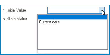
- Initial Value: This field allows users to set an initial value for the control, which can either be input manually or selected from a dropdown menu.
- For example, when configuring the initial value for the date picker control, users can either set a specific date or select the Current Date option from the dropdown menu.
![]()
- Control Initial Value Preview: Web View
- A control’s initial value is the default value that is assigned to it when the form is first opened or loaded.
![]()
- For example, when configuring the initial value for the date picker control, users can either set a specific date or select the Current Date option from the dropdown menu.
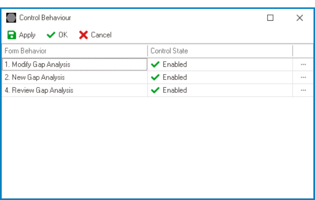
- State Matrix: This field allows users to configure the control state properties.
- To access the control state properties, click on the ellipses (
![]() ) inside the field.
) inside the field.
![]()
- Form Behavior: This field displays the form behavior.
- All form behaviors linked to associated form will be listed in this window.
- Control State: This is a single-select dropdown field that displays the list of control states. It allows users to modify the current control state of the form behavior.
- Apply: This button allows users to save their changes.
- OK: This button allows users to save their changes and close the window.
- Cancel: This button allows users to cancel their changes and close the window.
- Form Behavior: This field displays the form behavior.
- To access the control state properties, click on the ellipses (
 ) inside the field. It will display the Form / Behavior / Control window.