
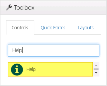
The help control is a useful tool for providing contextual guidance to users as they navigate the interface. When users hover their mouse over the control, a message will appear to give them additional information or assistance.
When a help control is selected in the design environment, its associated properties are displayed in the Control Properties panel.
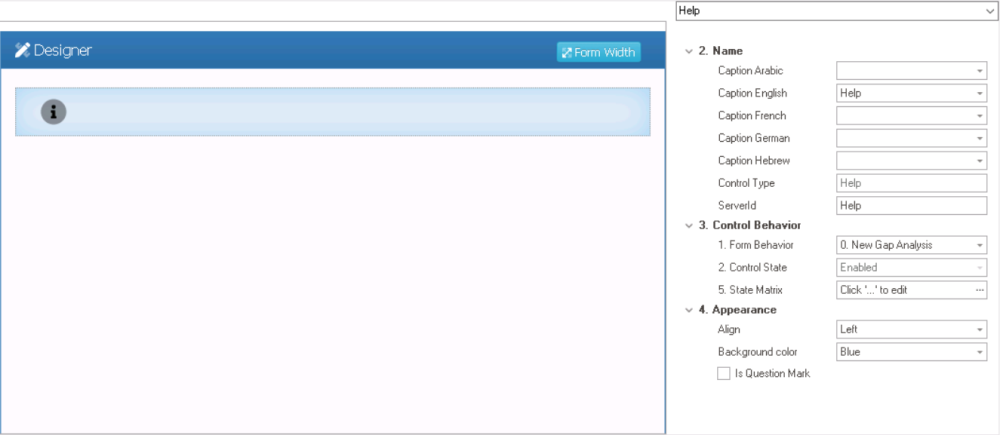
- Name: In this category, users can set the caption that will be displayed when hovering over the control in the web application. They can also access basic properties required for the control’s identification and proper referencing in the code.
- Caption: This field allows users to input the text that will be displayed when hovering over the control in the web application.
- As English is set as the default language in the system, any caption inputted in the English caption field will be used as the display caption for the control, regardless of other language options that may be available.
- As English is set as the default language in the system, any caption inputted in the English caption field will be used as the display caption for the control, regardless of other language options that may be available.
- Control Type: This field displays the control type. It cannot be modified.
- Server ID: This is a text field that allows users to input the Server ID for the control.
- Server ID refers to the name used to call the control in the code.
- Caption: This field allows users to input the text that will be displayed when hovering over the control in the web application.
- Control Behavior: In this category, users can configure the behavior of the control and define how it interacts with the form or application.
- Form Behavior: This is a single-select dropdown field that retrieves the list of form behaviors (from the Form Behavior section of the Forms module). It allows users to select the form behavior associated to the control.
- Any state or validation properties set for the control will apply only to the selected form behavior.
- Any state or validation properties set for the control will apply only to the selected form behavior.
- Control State: This field displays the current state of the control.
- Control States
- Enabled: This option allows for the control to be visible and editable in the web application.
- Disabled: This option allows for the control to be visible but not editable in the web application.
- Invisible: This option allows for the control to be hidden in the web application.
- State Matrix: This field allows users to configure the control state properties.
- To access the control state properties, click on the ellipses (
![]() ) inside the field.
) inside the field.
![]()
- Form Behavior: This field displays the form behavior.
- All form behaviors linked to associated form will be listed in this window.
- Control State: This is a single-select dropdown field that displays the list of control states. It allows users to modify the current control state of the form behavior.
- Apply: This button allows users to save their changes.
- OK: This button allows users to save their changes and close the window.
- Cancel: This button allows users to cancel their changes and close the window.
- Form Behavior: This field displays the form behavior.
- To access the control state properties, click on the ellipses (
- Form Behavior: This is a single-select dropdown field that retrieves the list of form behaviors (from the Form Behavior section of the Forms module). It allows users to select the form behavior associated to the control.
- Appearance: In this category, users can customize the visual appearance of the control.
- Align: This is a single-select dropdown field that allows users to choose the alignment of the control.
- Alignment Options: Right, Center, or Left.
- Right: This option aligns the control to the right side of the screen.
- Center: This option aligns the control to the center of the screen.
- Left: This option aligns the control to the left side of the screen.
- Alignment Options: Right, Center, or Left.
- Background Color: This is a single-select dropdown field that allows users to choose the background color of the control.
- Background Colors: Blue, Light Green, Dark Pink, Violet, Yellow, Grass Green, Amethystine, or Grey.
- Is Question Mark: This is a checkbox which, if selected, allows the help control’s icon to be changed from the default information (
![]() ) symbol to the question mark (
) symbol to the question mark ( ![]() ) symbol.
) symbol.
- Align: This is a single-select dropdown field that allows users to choose the alignment of the control.
 ) inside the field.
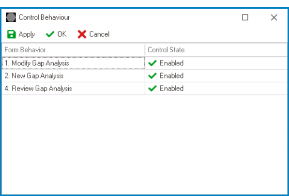
 ) symbol to the question mark (
  ) symbol.
- Help Control Preview: Web View
-
![]()