
When a layout is selected in the design environment, its associated properties are displayed in the Control Properties panel.

- Name: In this category, users can access basic properties required for the layout’s identification and proper referencing in the code.
- Control Type: This field displays the control type. It cannot be modified.
- The control type for all layout styles is set to ‘row’.
- Server ID: This is a text field that allows users to input the Server ID for the control.
- Server ID refers to the name used to call the layout in the code.
- Server ID refers to the name used to call the layout in the code.
- Control Type: This field displays the control type. It cannot be modified.
- Control Behavior: In this category, users can define the behavior of the layout.
- Form Behavior: This is a single-select dropdown field that retrieves the list of form behaviors (from the Form Behavior section of the Forms module). It allows users to select the form behavior associated with the layout.
- Only form behaviors linked to the associated form will be displayed in this dropdown.
- Control State: This field displays the current state of the layout.
- Control States
- Enabled: This option allows for the content of the layout to be visible and editable in the web application.
- Disabled: This option allows for the content of the layout to be visible but not editable in the web application.
- Invisible: This option allows for the content of the layout to be hidden in the web application.
- State Matrix: This field allows users to configure the control state properties.
- To access the control state properties, click on the ellipses (
![]() ) inside the field.
) inside the field.
![]()
- Form Behavior: This field displays the form behavior.
- All form behaviors linked to associated form will be listed in this window.
- Control State: This is a single-select dropdown field that displays the list of control states. It allows users to modify the current control state of the form behavior.
- Apply: This button allows users to save their changes.
- OK: This button allows users to save their changes and close the window.
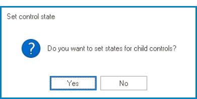
- If a control state has been modified, a prompt will appear asking users whether they want to apply the same state to the child controls inside the layout.
![]()
- If Yes is selected, the chosen control state will be applied to all the controls inside the layout.
- This means that the behavior of all the child controls will be updated to match the control state of the parent layout.
- If No is selected, the chosen control state will not be applied to the controls inside the layout.
- This means that the child controls will retain their previous behavior, regardless of any changes made to the parent layout’s control state.
- If Yes is selected, the chosen control state will be applied to all the controls inside the layout.
- If a control state has been modified, a prompt will appear asking users whether they want to apply the same state to the child controls inside the layout.
- Cancel: This button allows users to cancel their changes and close the window.
- Form Behavior: This field displays the form behavior.
- To access the control state properties, click on the ellipses (
- Form Behavior: This is a single-select dropdown field that retrieves the list of form behaviors (from the Form Behavior section of the Forms module). It allows users to select the form behavior associated with the layout.
 ) inside the field.
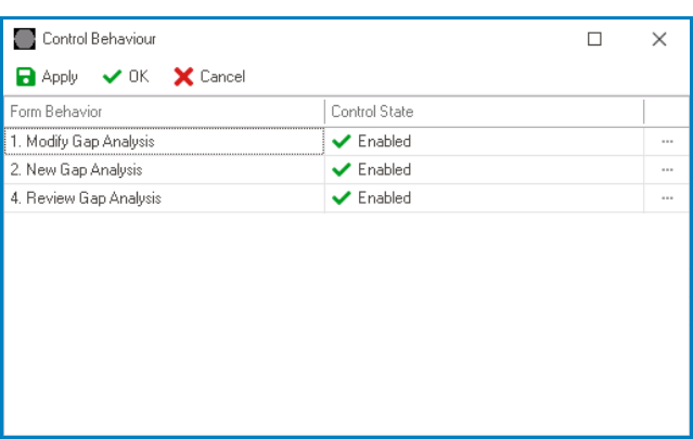
- Misc: In this category, users can define additional properties for the layout.
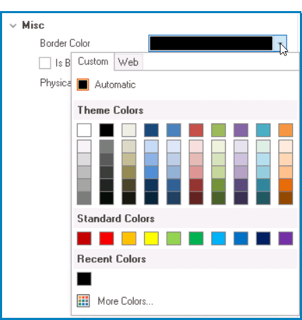
- Border Color: This is a single-select dropdown field that allows users to choose a border color for the layout.
- It contains two tabs: Custom and Web.
![]()
- In the Custom tab, users can choose a border color by selecting a color from a color picker. The color picker offers a selection of theme colors, standard colors, and the ability to create custom colors.
- In the Web tab, users can select a border color from a scrollable list. The list displays a range of specific colors, each with its own name, allowing users to easily choose from pre-defined options.
- After choosing a border color, the layout will update to reflect the new color scheme.
- It contains two tabs: Custom and Web.
- Is Border: This is a checkbox which, if selected, allows users to display a border around the layout.
- In order to apply a border color to the layout, users must first select the Is Border checkbox.
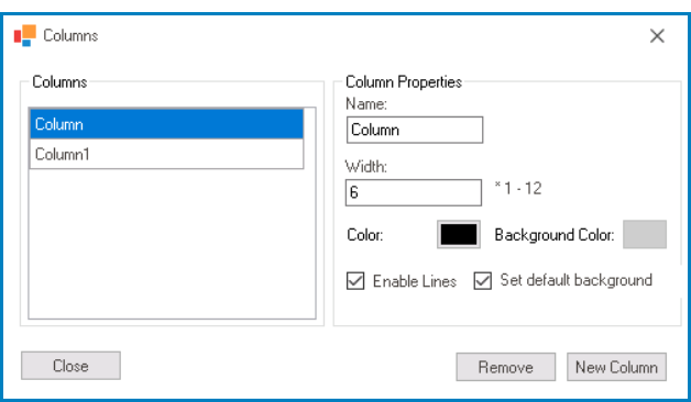
- Physical Columns: This field allows users to configure the column properties.
- To access the column properties, click on the ellipses (
![]() ) inside the field.
) inside the field.
![]()
- Name: This field displays the name of the selected column.
- Users can modify this field as needed.
- Width: This field displays the width of the selected column.
- Users can modify this field as needed. They must, however, ensure that the value entered falls within the range of 1-12.
- Color: This field allows users to set the border color of the selected column.
- If selected, it will display the Color window, in which users can access a color picker.
- This color picker offers a selection of basic colors and the ability to create custom colors.
- If selected, it will display the Color window, in which users can access a color picker.
- Background Color: This field allows users to set the background color of the selected column.
- If selected, it will display the Color window, in which users can access a color picker.
- This color picker offers a selection of basic colors and the ability to create custom colors.
- In order to apply a background color to the column, users must first select a border color.
- If selected, it will display the Color window, in which users can access a color picker.
- Enable Lines: This is a checkbox which, if selected, allows users to enable lines or borders around the columns.
- In order to apply a border color to the column, users must first select the Enable Lines checkbox.
- Set Default Background: This is a checkbox which, if selected, allows users to reset the column background color to its default state.
- By default, the background color for columns is transparent.
- New Column: This button allows users to add a new column.
- Before adding a new column, users must adjust the width of existing columns to ensure the total width of all columns does not exceed 12.
- Remove: This button allows users to remove a selected column.
- Close: This button allows users to close the Columns window.
- To access the column properties, click on the ellipses (
- Border Color: This is a single-select dropdown field that allows users to choose a border color for the layout.
- Layout Border Color Preview: Web View
-
![]()
- Column Border and Background Color Preview: Web View
-
![]()