
The nested form link control is a user interface element that allows users to link or associate one form with another form. It consists of a link or button that, when clicked, opens a nested form within the main form.

When a nested form link control is selected in the design environment, its associated properties are displayed in the Control Properties panel.
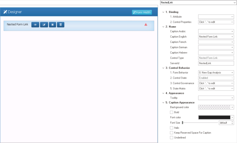
- Binding: In this category, users can link a control to its corresponding attribute and define its binding properties.
- For more information on the fields in this category, click here.
- Name: In this category, users can access basic properties required for the control’s identification and proper referencing in the code.
- For more information on these properties and how to configure them, click here.
- Control Behavior: In this category, users can configure the behavior of the control and define how it interacts with the form or application.
- Form Behavior: This is a single-select dropdown field that retrieves the list of form behaviors (from the Form Behavior section of the Forms module). It allows users to select the form behavior associated to the control.
- Any state properties set for the control will apply only to the selected form behavior.
- Any state properties set for the control will apply only to the selected form behavior.
- Control State: This field displays the current state of the control.
- Control States
- Enabled: This option allows for the control to be visible and editable in the web application.
- Disabled: This option allows for the control to be visible but not editable in the web application.
- Invisible: This option allows for the control to be hidden in the web application.
- Control Governance: This field allows users to configure various properties that govern the functionality of controls.
- To access the control governance properties, click on the ellipses (
![]() ) inside the field.
) inside the field.
![]()
- Enable View: This is a checkbox which, if selected, allows users to enable the View function for the control.
- If this checkbox is selected, it will enable the View Form Behavior field.
- View Form Behavior: This is a single-select dropdown field that retrieves the list of form behaviors (from the Form Behavior section of the Forms module). It allows users to select the form behavior linked to the control’s ‘view’ functionality.
- To define a new form behavior, select the
![]() button.
button.
- It will display the Form Behavior Properties window.
- To modify an existing form behavior, select the
![]() button.
button. - To remove a form behavior, select the
![]() button.
button.
- To define a new form behavior, select the
- View Form Behavior: This is a single-select dropdown field that retrieves the list of form behaviors (from the Form Behavior section of the Forms module). It allows users to select the form behavior linked to the control’s ‘view’ functionality.
- If this checkbox is selected, it will enable the View Form Behavior field.
- Enable Edit: This is a checkbox which, if selected, allows users to enable the Edit function for the control.
- If this checkbox is selected, it will enable the Edit Form Behavior field.
- Edit Form Behavior: This is a single-select dropdown field that retrieves the list of form behaviors (from the Form Behavior section of the Forms module). It allows users to select the form behavior linked to the control’s ‘edit’ functionality.
- To define a new form behavior, select the
![]() button.
button.
- It will display the Form Behavior Properties window.
- To modify an existing form behavior, select the
![]() button.
button. - To remove a form behavior, select the
![]() button.
button.
- To define a new form behavior, select the
- Edit Form Behavior: This is a single-select dropdown field that retrieves the list of form behaviors (from the Form Behavior section of the Forms module). It allows users to select the form behavior linked to the control’s ‘edit’ functionality.
- If this checkbox is selected, it will enable the Edit Form Behavior field.
- Enable New: This is a checkbox which, if selected, allows users to enable the Add function for the control.
- If this checkbox is selected, it will enable the New Form Behavior field.
- New Form Behavior: This is a single-select dropdown field that retrieves the list of starter form behaviors (from the Form Behavior section of the Forms module). It allows users to select the form behavior linked to the control’s ‘new’ functionality.
- To define a new form behavior, select the
![]() button.
button.
- It will display the Form Behavior Properties window.
- To modify an existing form behavior, select the
![]() button.
button. - To remove a form behavior, select the
![]() button.
button.
- To define a new form behavior, select the
- New Form Behavior: This is a single-select dropdown field that retrieves the list of starter form behaviors (from the Form Behavior section of the Forms module). It allows users to select the form behavior linked to the control’s ‘new’ functionality.
- If this checkbox is selected, it will enable the New Form Behavior field.
- Enable Delete: This is a checkbox which, if selected, allows users to delete the added instance of the nested form.
- Apply: This button allows users to save their changes.
- OK: This button allows users to save their changes and close the window.
- Cancel: This button allows users to cancel their changes and close the window.
- Enable View: This is a checkbox which, if selected, allows users to enable the View function for the control.
- To access the control governance properties, click on the ellipses (
- State Matrix: This field allows users to configure the control state properties.
- To access the control state properties, click on the ellipses (
![]() ) inside the field.
) inside the field.
![]()
- Form Behavior: This field displays the form behavior.
- All form behaviors linked to associated form will be listed in this window.
- Control State: This is a single-select dropdown field that displays the list of control states. It allows users to modify the current control state of the form behavior.
- Control Governance: This field allows users to configure the control governance properties.
- If selected, it will display the Form / Behavior / Control window (described above).
- Apply: This button allows users to save their changes.
- OK: This button allows users to save their changes and close the window.
- Cancel: This button allows users to cancel their changes and close the window.
- Form Behavior: This field displays the form behavior.
- To access the control state properties, click on the ellipses (
- Form Behavior: This is a single-select dropdown field that retrieves the list of form behaviors (from the Form Behavior section of the Forms module). It allows users to select the form behavior associated to the control.
- Appearance: In this category, users can customize the visual appearance of the control.
- Tooltip: This field allows users to input a tooltip for the control.
- In the web application, the tooltip is represented by the tooltip icon (
![]() ) next to the control.
) next to the control. - Nested Form Link Tooltip Preview: Web View
-
![]()
- In the web application, the tooltip is represented by the tooltip icon (
- Tooltip: This field allows users to input a tooltip for the control.
- Caption Appearance: In this category, users can customize the visual appearance of the control’s caption.
- For more information on the fields in this category, click here.
 ) inside the field.
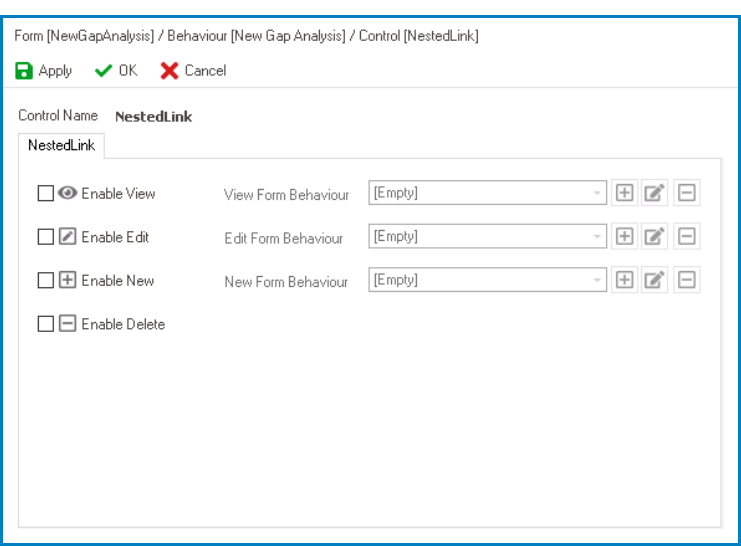
 button.
 button.
 button.
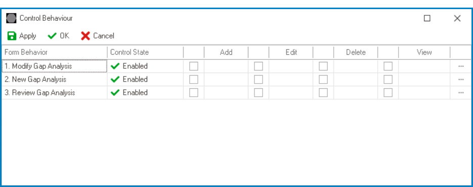
 ) next to the control.
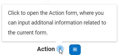
- Nested Form Link Control Preview: Web View
-
![]()