
In the Grid Column window, users can define the properties of the column.
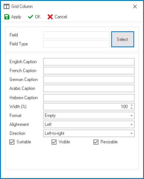
- Select: This button allows users to select the corresponding attribute for the column.
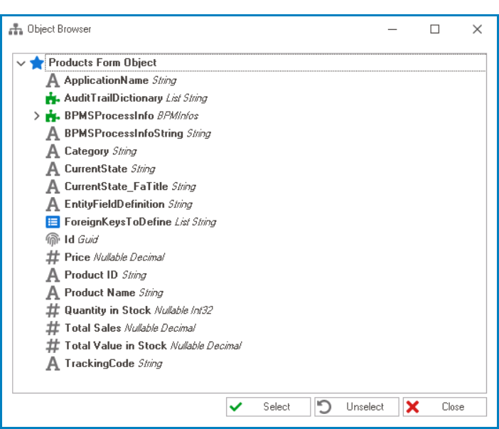
- If selected, it will display the Object Browser window, in which users can access a list of the associated entity’s attributes.
![]()
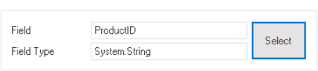
- Once an attribute has been selected, its name will populate the Field box and its data type will populate the Field Type box.
![]()
- If selected, it will display the Object Browser window, in which users can access a list of the associated entity’s attributes.
- Caption: This field allows users to input the name or caption of the column.
- As English is set as the default language in the system, any caption inputted in the English caption field will be used as the display caption for the column, regardless of other language options that may be available.
- Width (%): This is a numeric updown field that allows users to set the width of the column.
- By default, the width is set to 100. To adjust this size, users can enter numbers into the field either manually or by clicking the increment/decrement arrows.
- Format: This field allows users to choose the display format of the column from a dropdown menu.
- For more information on some of the options in this dropdown, click here.
- Alignment: This field allows users to choose the text alignment of the column from a dropdown menu.
- Alignment Options: Left, Right, Center, or Not Set.
- Left: This option aligns the text to the left side of the column.
- Right: This option aligns the text to the right side of the column.
- Center: This option centers the text within the column.
- Not Set: This option aligns the text based on the language or culture setting in the web application.
- It will typically align left for left-to-right languages and right for right-to-left languages.
- Alignment Options: Left, Right, Center, or Not Set.
- Direction: This field allows users to specify the text direction of the column from a dropdown menu.
- Direction Options: Left-to-Right, Right-to-Left, or Not Set.
- Left-to-Right: This option specifies that the text in the column should be read from left to right, in the standard direction for languages that use a Latin-based alphabet (such as English).
- Right-to-Left: This option specifies that the text in the column should be read from right to left, in the opposite direction to the standard direction for languages that use a Latin-based alphabet (such as Arabic or Hebrew).
- Not Set: This option specifies that the text direction should be based on the language or culture setting in the web application.
- Direction Options: Left-to-Right, Right-to-Left, or Not Set.
- Sortable: This is a checkbox which, if selected, allows users to sort the column by clicking on its header.
- Visible: This is a checkbox which, if selected, allows for the column to be visible in the grid.
- Resizable: This is a checkbox which, if selected, allows users to resize the width of the column in the grid.
- Apply: This button allows users to save their changes.
- OK: This button allows users to save their changes and close the window.
- Cancel: This button allows users to cancel their changes and close the window.