
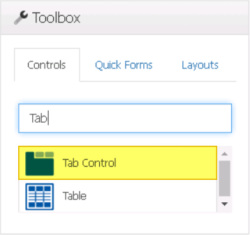
The tab control is a user interface element that displays multiple tabs, each representing a different section of content or functionality. It allows users to easily switch between different views or modes within a form, providing a convenient way to organize and access information.
When an tab control is selected in the design environment, its associated properties are displayed in the Control Properties panel.
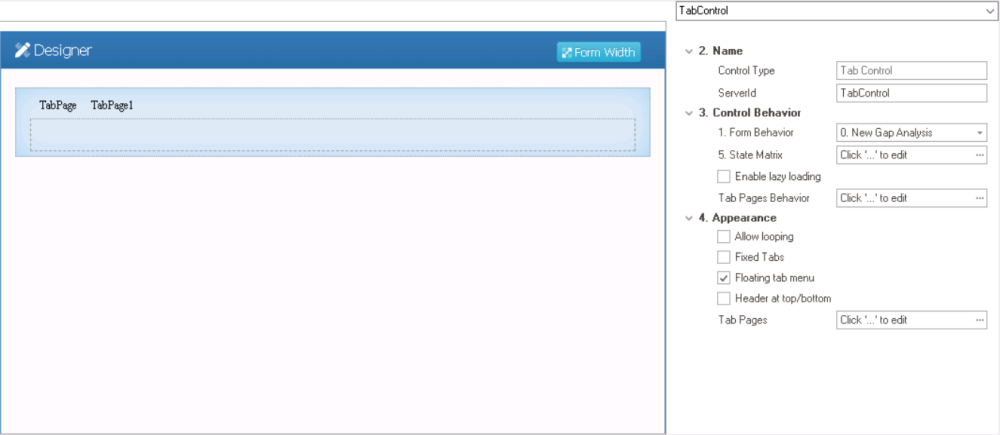
- Name: In this category, users can access basic properties required for the control’s identification and proper referencing in the code.
- Control Type: This field displays the control type. It cannot be modified.
- Server ID: This is a text field that allows users to input the Server ID for the control.
- Server ID refers to the name used to call the control in the code.
- Control Behavior: In this category, users can configure the behavior of the control and define how it interacts with the form or application.
- Form Behavior: This is a single-select dropdown field that retrieves the list of form behaviors (from the Form Behavior section of the Forms module). It allows users to select the form behavior associated to the control.
- Any state properties set for the control will apply only to the selected form behavior.
- Any state properties set for the control will apply only to the selected form behavior.
- State Matrix: This field allows users to configure the control state properties.
- To access the control state properties, click on the ellipses (
![]() ) inside the field.
) inside the field.
![]()
- Form Behavior: This field displays the form behavior.
- All form behaviors linked to associated form will be listed in this window.
- Control State: This is a single-select dropdown field that displays the list of control states. It allows users to modify the current control state of the form behavior.
- Control States
- Enabled: This option allows for the control to be visible and selectable in the web application.
- Disabled: This option allows for the control to be visible but not selectable in the web application.
- Invisible: This option allows for the control to be hidden in the web application.
- Apply: This button allows users to save their changes.
- OK: This button allows users to save their changes and close the window.
- Cancel: This button allows users to cancel their changes and close the window.
- Form Behavior: This field displays the form behavior.
- To access the control state properties, click on the ellipses (
- Enable Lazy Loading: This is a checkbox which, if selected, allows users to load tab content on-demand, rather than loading all the content upfront when the form is first loaded.
- Tab Pages Behavior: This field allows users to configure the behavior of individual tabs within the tab control.
- To access the tab behavior properties, click on the ellipses (
![]() ) inside the field.
) inside the field.
![]()
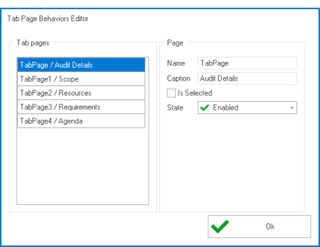
- Name: This field displays the name of the tab. It cannot be modified.
- Caption: This field displays the caption or title of the table. It cannot be modified.
- Is Selected: This checkbox determines whether the tab is pre-selected or not.
- To pre-select a tab, users must check the Is Selected checkbox for that tab.
- To pre-select a tab, users must check the Is Selected checkbox for that tab.
- State: This is a single-select dropdown field that displays the list of states. It allows users to modify the current state of the tab.
- States
- Enabled: This option allows for the tab to be visible and selectable in the web application.
- Disabled: This option allows for the tab to be visible but not selectable in the web application.
- Invisible: This option allows for the tab to be hidden in the web application.
- To access the tab behavior properties, click on the ellipses (
- Form Behavior: This is a single-select dropdown field that retrieves the list of form behaviors (from the Form Behavior section of the Forms module). It allows users to select the form behavior associated to the control.
- Appearance: In this category, users can customize the visual appearance of the control.
- Allow Looping: This is a checkbox which, if selected, allows for a tab set to be looped so that when users reach the last tab in a set, the first tab is automatically next to be shown.
- Tab Looping Preview: Web View
-
![]()
- Fixed Tabs: This is a checkbox which, if selected, allows for a tab set to be fixed so that all tabs are displayed on screen simultaneously. Each tab is placed at a fixed width, as determined by the total number of tabs in the set.
- By default, if tabs are not fixed, they are set up as scrollable. A tab set is only scrollable, however, if it can no longer fit uniformly on screen.
- Floating Tab Menu: This is a checkbox which, if selected, allows for a tab set to remain in a fixed position as users scroll the page, “floating” above the content.
- Floating Tab Preview: Web View
-
![]()
- Header at Top/Bottom: This is a checkbox which, if selected, allows for the tab headers to be displayed at both the top and bottom of the form.
- Tab Pages: This field allows users to customize the appearance of individual tabs within the tab control.
- To access these properties, click on the ellipses (
![]() ) inside the field.
) inside the field.
- It will display the Tab Pages Editor window.
- To access these properties, click on the ellipses (
- Allow Looping: This is a checkbox which, if selected, allows for a tab set to be looped so that when users reach the last tab in a set, the first tab is automatically next to be shown.
 ) inside the field.
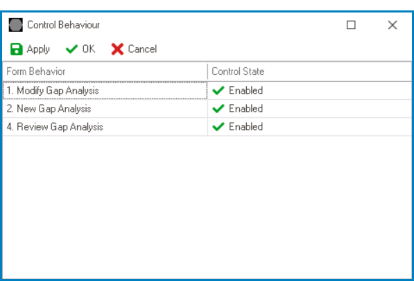

- Tab Control Preview: Web View
-
![]()
