
The file attachment control allows users to upload and download different types of files, providing a convenient way to share information.
When a file attachment control is selected in the design environment, its associated properties are displayed in the Control Properties panel.
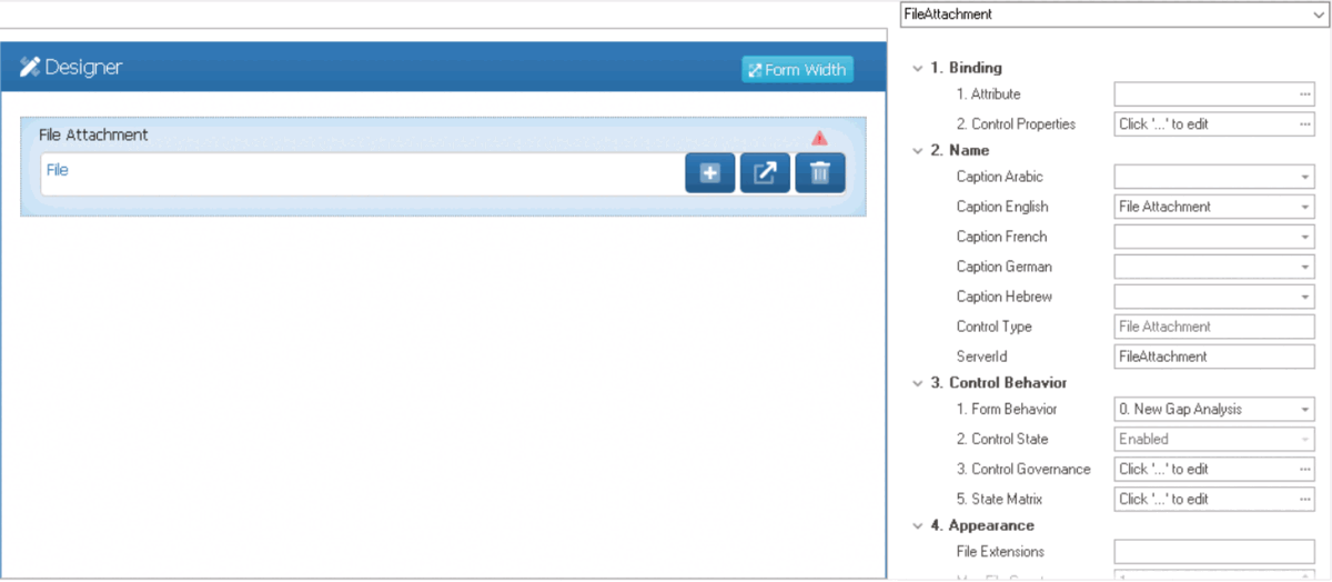
- Binding: In this category, users can link a control to its corresponding attribute and define its binding properties.
- For more information on the fields in this category, click here.
- Name: In this category, users can access basic properties required for the control’s identification and proper referencing in the code.
- For more information on these properties and how to configure them, click here.
- Control Behavior: In this category, users can configure the behavior of the control and define how it interacts with the form or application.
- Control Governance
-
- In the Control Governance field, users can configure various properties that govern the functionality of controls.
- To access the control governance properties, click on the ellipses (
![]() ) inside the field. It will display the Form / Behavior / Control window.
) inside the field. It will display the Form / Behavior / Control window.
- This window consists of two tabs:
- To access the control governance properties, click on the ellipses (
- In the Control Governance field, users can configure various properties that govern the functionality of controls.
- For more information on these properties and how to configure them, click here.
- Appearance: In this category, users can customize the visual appearance of the control.
- File Extensions: This field allows users to specify the types of files that can be uploaded to the control.
- Users can input specific file extensions in this field to restrict uploading access to only those files types.
- To include multiple file types, users need to separate each file type with a comma.
- To include multiple file types, users need to separate each file type with a comma.
- Users can input specific file extensions in this field to restrict uploading access to only those files types.
- Max File Count: This is a numeric updown field that allows users to set the maximum number of files that can be attached to the control.
- By default, the maximum file count is set to 1. To adjust this value, users can enter numbers into the field either manually or by clicking the increment/decrement arrows.
- Max File Size: This is a numeric updown field that allows users to set the maximum combined size limit, in megabytes, per file attached to the control.
- By default, the maximum file size is set to 2 MB. To adjust this value, users can enter numbers into the field either manually or by clicking the increment/decrement arrows.
- By default, the maximum file size is set to 2 MB. To adjust this value, users can enter numbers into the field either manually or by clicking the increment/decrement arrows.
- Tooltip: This field allows users to input a tooltip for the control.
- In the web application, the tooltip is represented by the tooltip icon (
![]() ) next to the control.
) next to the control. - File Attachment Tooltip Preview: Web View
-
![]()
- In the web application, the tooltip is represented by the tooltip icon (
- File Extensions: This field allows users to specify the types of files that can be uploaded to the control.
- Caption Appearance: In this category, users can customize the visual appearance of the control’s caption.
- For more information on the fields in this category, click here.
 ) inside the field. It will display the Form / Behavior / Control window.
 ) next to the control.
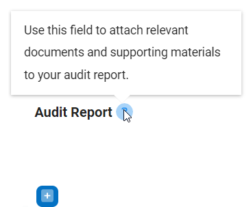
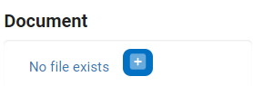
- File Attachment Control Preview: Web View
- If the max file count is set to 1, the file attachment field will take on the following appearance in the web application:
![]()
-
![]() : This button allows users to upload a single file.
: This button allows users to upload a single file. - If selected, a file dialog will appear, enabling users to browse and choose a file from their local system.
- If selected, a file dialog will appear, enabling users to browse and choose a file from their local system.
-
- If the max file count is greater than 1, the file attachment field will take on the following appearance in the web application:
![]()
- If the max file count is set to 1, the file attachment field will take on the following appearance in the web application:
 : This button allows users to upload a single file.
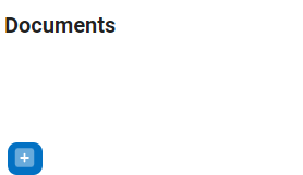
- Quick Forms Application
- To apply the Quick Forms feature to file attachment controls, take the following steps:
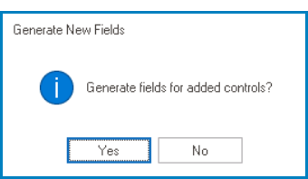
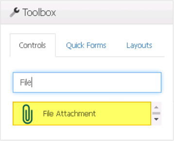
- Drag a file attachment control from the toolbox and drop it onto the design environment.
- Provide a caption for the control.
- Save the form and select Yes in response to the following prompt:
![]()