
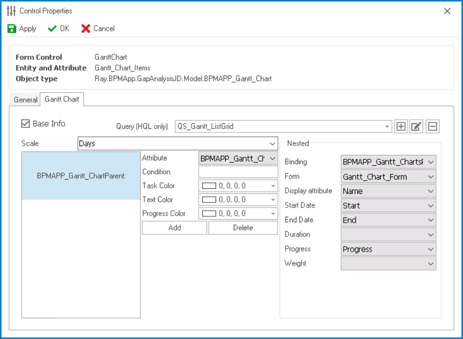
In the Gantt Chart tab of the Control Properties window, users can build and customize the Gantt chart.
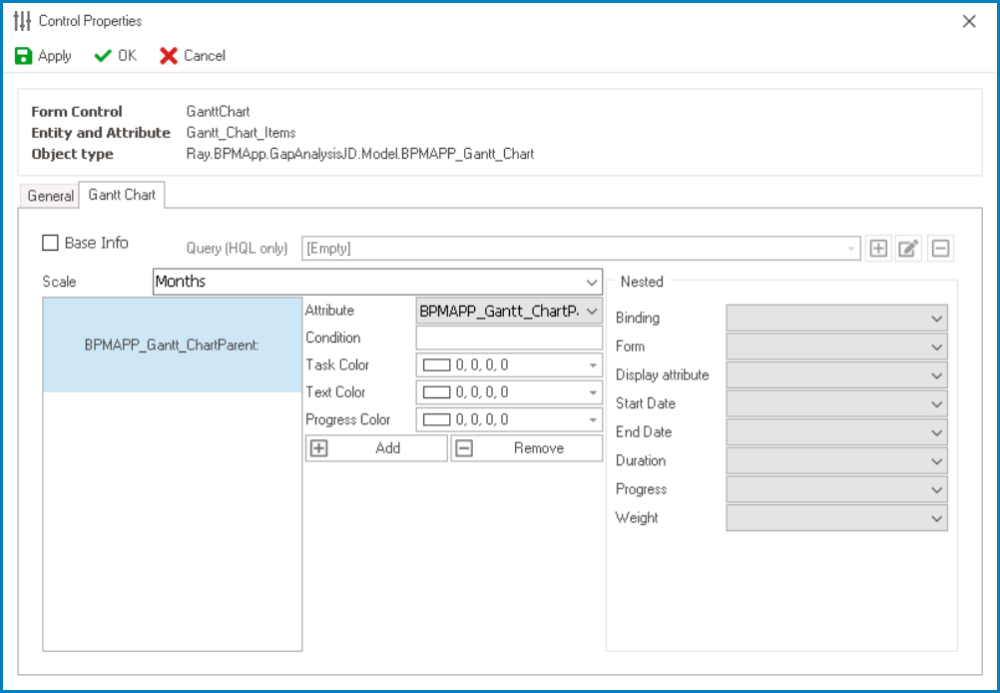
- Base Info: This option allows users to populate the control with data from a specific table.
- If this option is selected, it will enable the Query (HQL Only) field, allowing users to select or define a custom query for the Gantt chart data source.
- Scale: This is a single-select dropdown field that allows users to choose the time scale for the control.
- Time Scale Options: Hours, Days, Months, or Years.
- Time Scale Preview: Web View
-
![]()
- Time Scale Options: Hours, Days, Months, or Years.
- Attribute: This is a single-select dropdown field that retrieves the list of attributes available in the associated entity. It allows users to select the attribute to which the condition will be applied.
- Condition: This is a text field that allows users to specify a condition that needs to be met for chart elements to be colored.
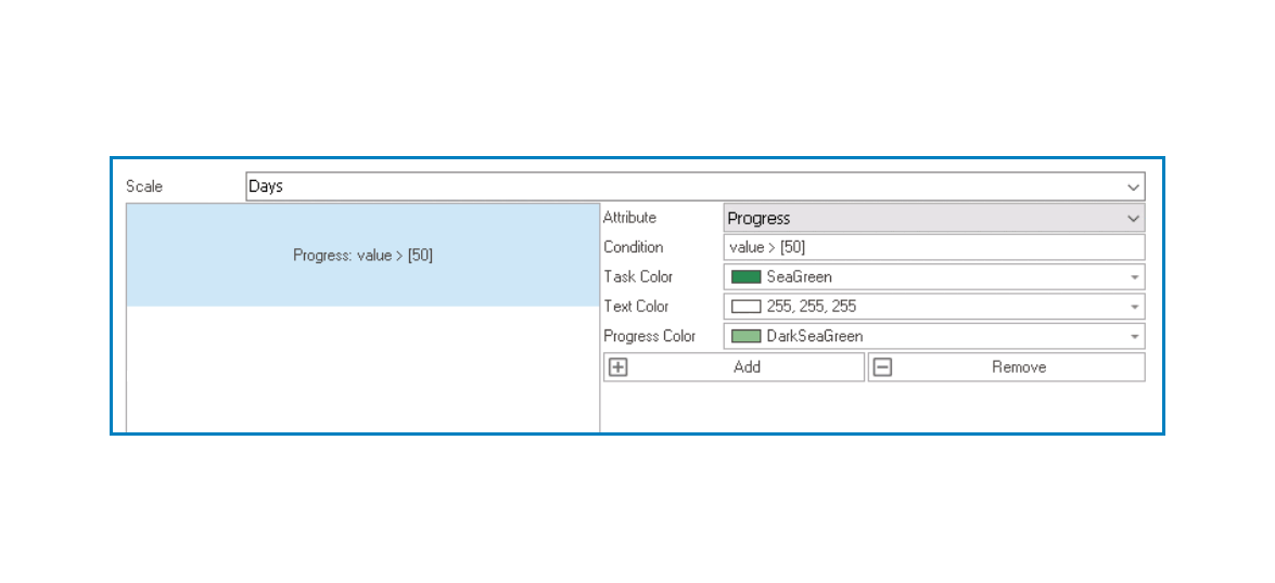
- Gantt Chart Conditions
- For example, users can apply the following conditions to the Progress attribute:
- If value > 50, display the text color in white and the task color and progress color in different shades of green.
![]()
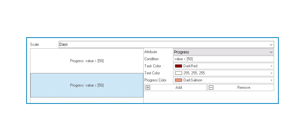
- If value < 50, display the text color in white and the task color and progress color in different shades of red.
![]()
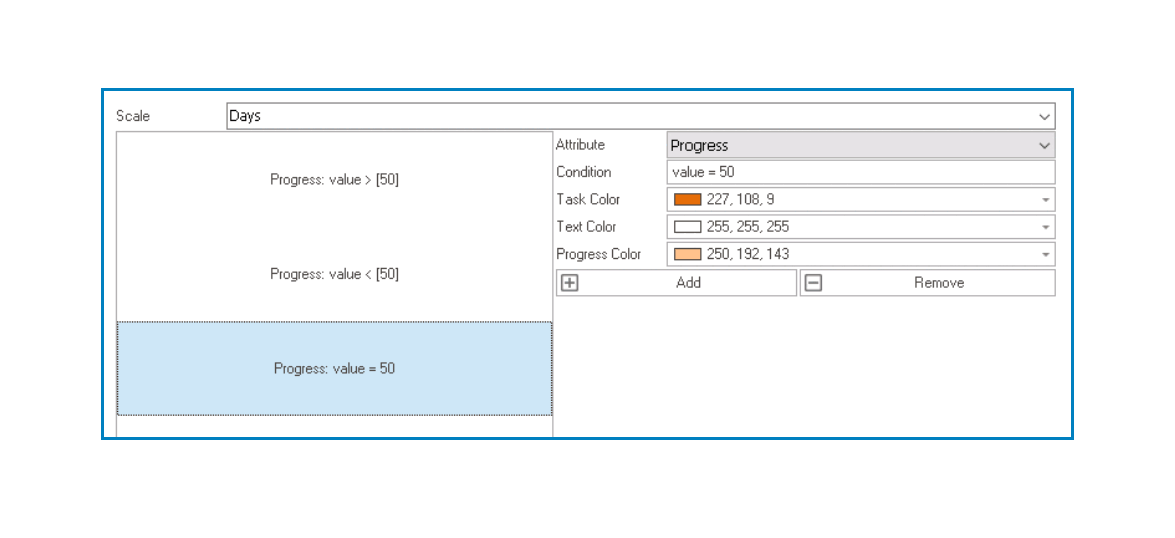
- If value = 50, display the text color in white and the task color and progress color in different shades of orange.
![]()
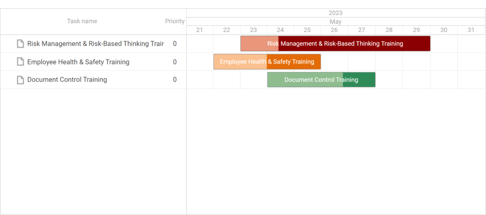
When all three conditions are applied, the tasks in the chart will appear like this:![]()
- If value > 50, display the text color in white and the task color and progress color in different shades of green.
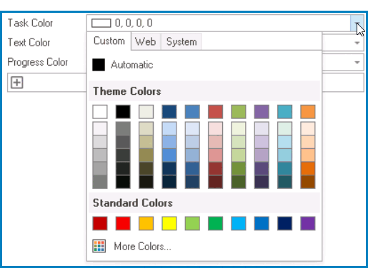
- Task Color: This is a color picker that allows users to choose the color that will be applied to the tasks displayed in the Gantt chart.
- It contains three tabs: Custom, Web, and System.
![]()
- In the Custom tab, users can choose a color by selecting a color from a color picker. The color picker offers a selection of theme colors, standard colors, and the ability to create custom colors.
- In the Web tab, users can select a color from a scrollable list. The list displays a range of specific colors, each with its own name, allowing users to easily choose from pre-defined options.
- In the System tab, users can select a color from a scrollable list. The list displays a range of specific colors, each with its own name, allowing users to easily choose from pre-defined options.
- It contains three tabs: Custom, Web, and System.
- Text Color: This is a color picker that allows users to choose the color that will be applied to the text displayed in the Gantt chart.
- It also has three tabs, similar to the Task Color field, where users can select a color from a color picker or a scrollable list of pre-defined options.
- Progress Color: This is a color picker that allows users to choose the color that will be used to indicate progress in the Gantt chart.
- It also has three tabs, similar to the Task Color field, where users can select a color from a color picker or a scrollable list of pre-defined options.
- Add: This button allows users to add a new condition for the control.
- If selected, it will add a new entry where users can define a new condition and specify the corresponding color styles to be applied.
![]()
- If selected, it will add a new entry where users can define a new condition and specify the corresponding color styles to be applied.
- Remove: This button allows users to remove selected conditions from the control.
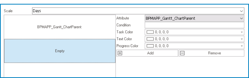
- Nested: In this section, users can select the nested attributes within the Gantt chart.
- Binding: This is a single-select dropdown field that retrieves the list of attributes available in the associated entity. It allows users to select the attribute that will be used for binding or establishing the hierarchy within the Gantt chart.
- Form: This is a single-select dropdown field that retrieves the list of forms linked to the associated entity. It allows users to select the form from which data will be pulled to build the Gantt chart.
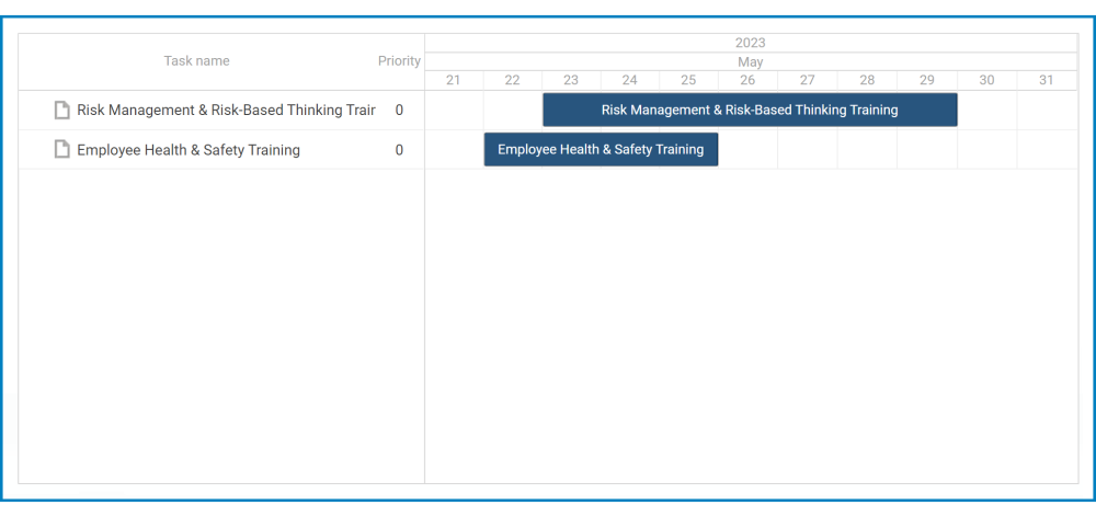
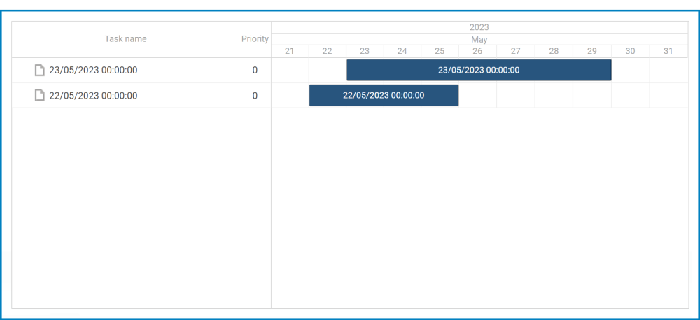
- Display Attribute: This is a single-select dropdown field that retrieves the list of attributes available in the associated entity. It allows users to select the attribute whose value will be displayed as text on individual items within the Gantt chart.
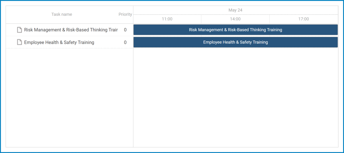
- Display Attribute Preview: Web View
- For example, if the selected attribute is Name, the control will update the display of each task item to showcase its corresponding name.
![]()
- Similarly, if the selected attribute is Start, the control will update the display of each task item to showcase its corresponding start date/time.
![]()
- For example, if the selected attribute is Name, the control will update the display of each task item to showcase its corresponding name.
- Start Date: This is a single-select dropdown field that retrieves the list of attributes available in the associated entity. It allows users to select the attribute representing the start date for the tasks in the Gantt chart.
- End Date: This is a single-select dropdown field that retrieves the list of attributes available in the associated entity. It allows users to select the attribute representing the end date for the tasks in the Gantt chart.
- Duration: This is a single-select dropdown field that retrieves the list of attributes available in the associated entity. It allows users to select the attribute representing the duration of the tasks in the Gantt chart.
- Progress: This is a single-select dropdown field that retrieves the list of attributes available in the associated entity. It allows users to select the attribute representing the progress status of the tasks in the Gantt chart.
- Weight: This is a single-select dropdown field that retrieves the list of attributes available in the associated entity. It allows users to select the attribute representing the weight or priority of the tasks in the Gantt chart.
- Example: Nested Attributes Selection
-
![]()
- Apply: This button allows users to save their changes.
- OK: This button allows users to save their changes and close the window.
- Cancel: This button allows users to cancel their changes and close the window.