
Users can configure validation properties for controls, such as required field and range validation.
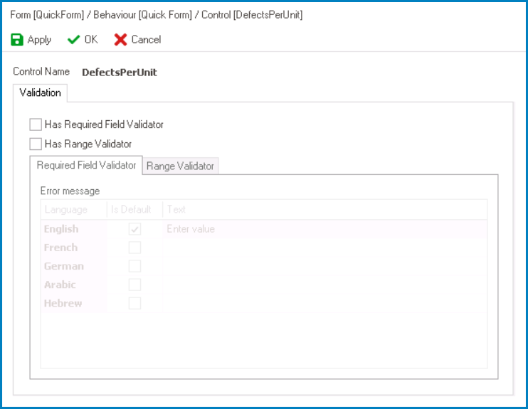
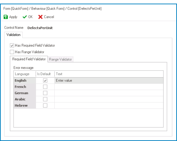
- Required Field Validator: This is a checkbox which, if selected, allows users to enforce a control as mandatory and trigger a message to appear if the mandatory field is left unfilled.
- If this checkbox is selected, it will enable the Required Field Validator tab.
![]()
- In this tab, users can customize the error message to be displayed when the mandatory field is not filled out. Users can specify this message in different languages as well as designate a default language.
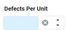
- Required Field Validation Preview: Web View
- By default, in the DBP web application, mandatory fields are visually distinguished with a light-blue background color.
![]()
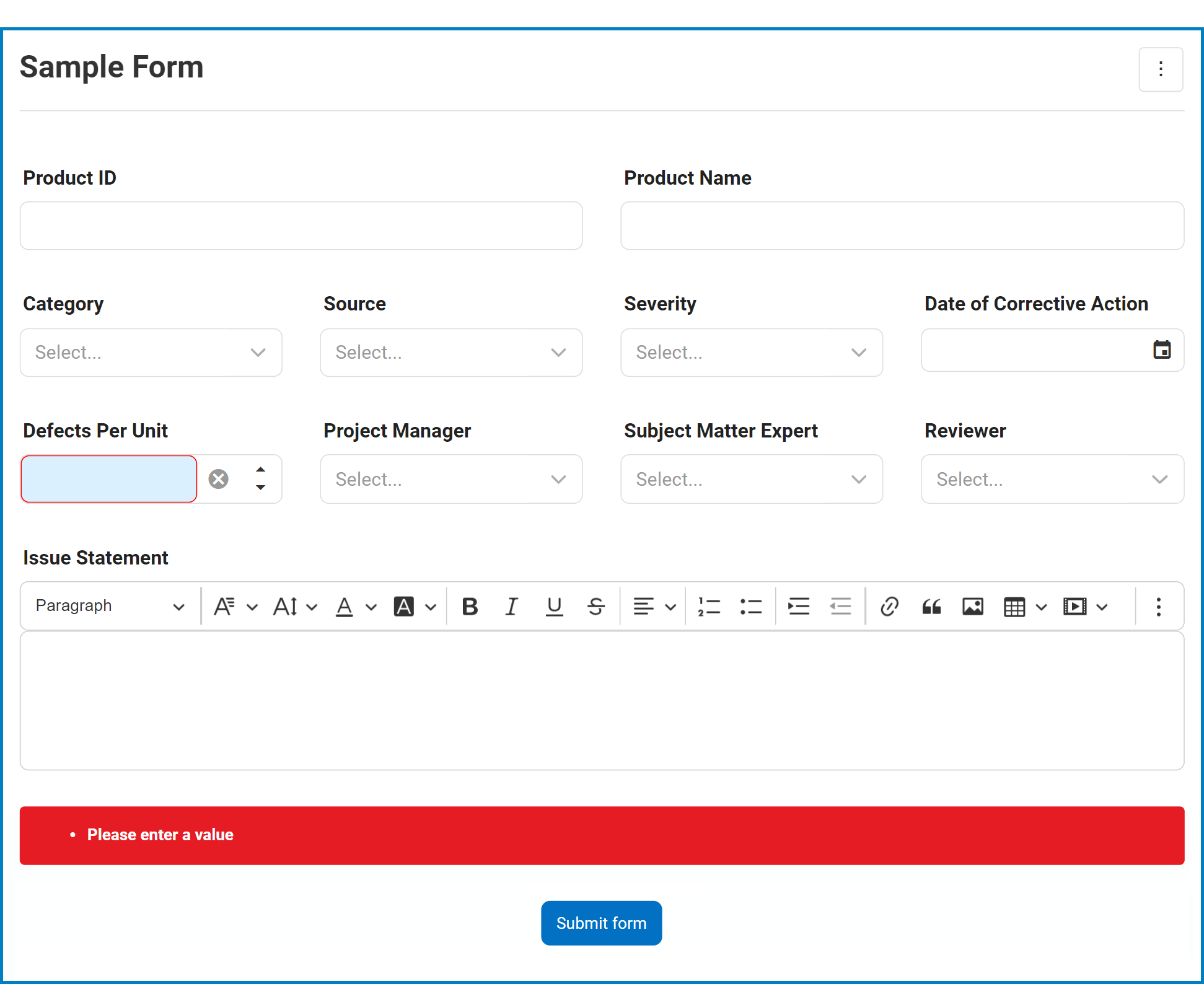
- In the event that a user attempts to submit the form without filling out a mandatory field, the specified error message will appear towards the bottom of the page.
![]()
- By default, in the DBP web application, mandatory fields are visually distinguished with a light-blue background color.
- If this checkbox is selected, it will enable the Required Field Validator tab.
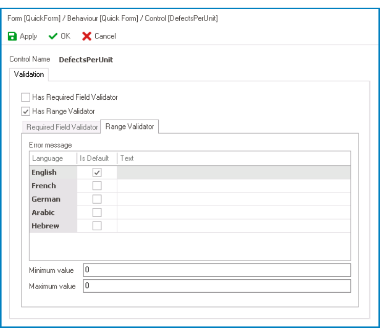
- Range Validator: This is a checkbox which, if selected, allows users to restrict a control to a specific range of values and trigger a message to appear if the range is not met.
- If this checkbox is selected, it will enable the Range Validator tab.
![]()
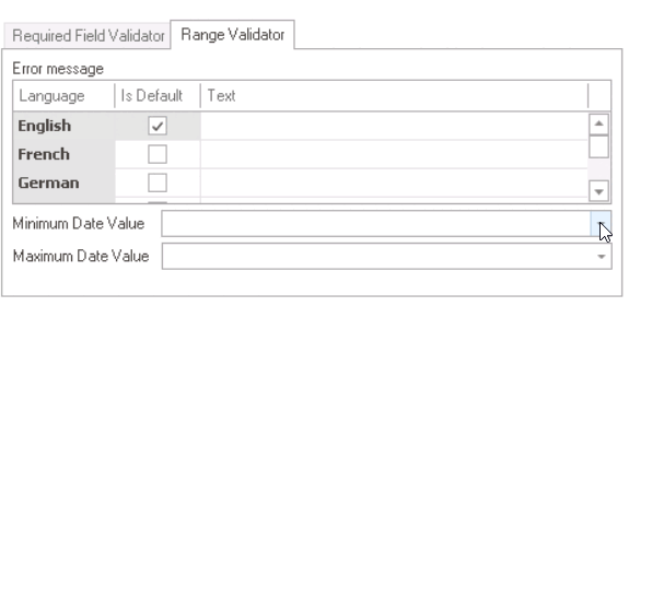
- In this tab, users can customize the behavior of range validation. They can specify the minimum and maximum values for the range, and define a custom error message to appear when the input value falls outside of the specified range. Users can specify this message in different languages as well as designate a default language.
- Note: For date picker controls, users will need to specify the maximum and minimum date values using a date picker. (In other words, users must specify the earliest and latest dates that can be selected in the control.)
![]()
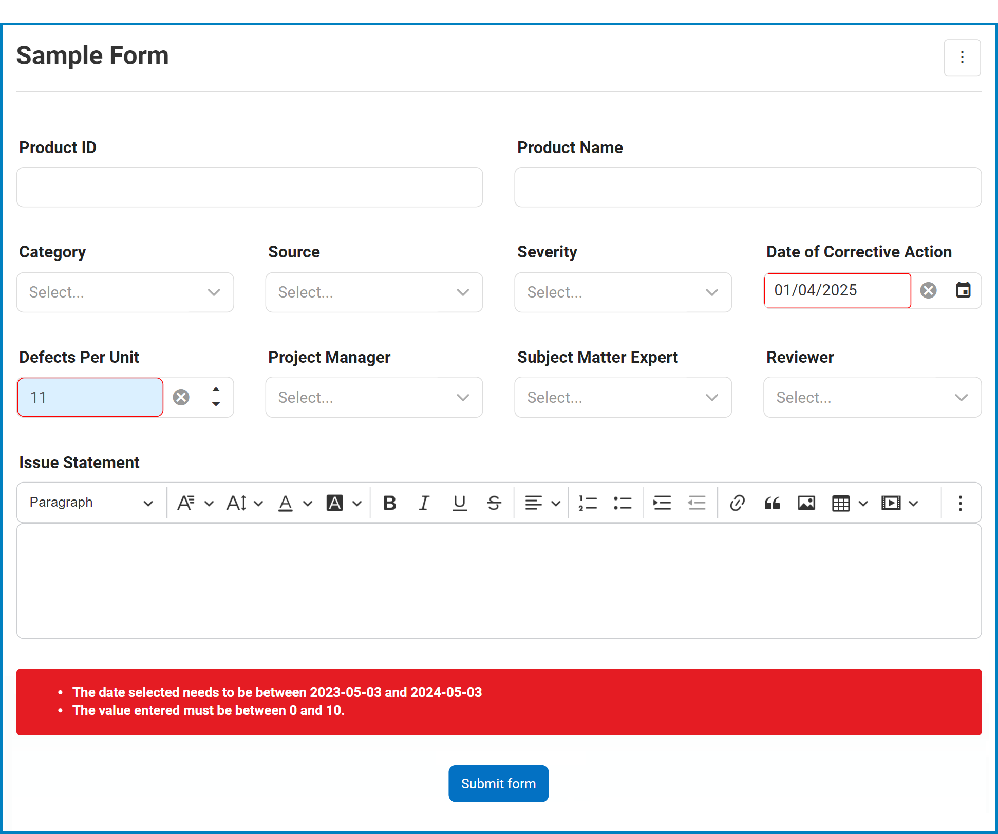
- Range Validation Preview: Web View
- In the event that a user attempts to submit the form without entering a value within the required range, the specified error message will appear towards the bottom of the page.
![]()
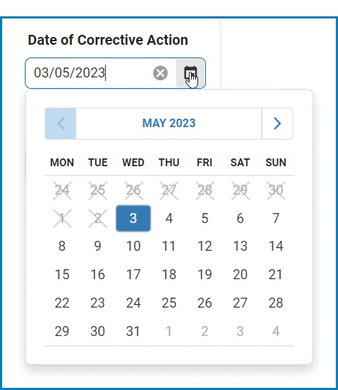
Note: For date picker controls, dates outside the specified range will be grayed out and inaccessible on the calendar.
![]()
- If this checkbox is selected, it will enable the Range Validator tab.
- Apply: This button allows users to save their changes.
- OK: This button allows users to save their changes and close the window.
- Cancel: This button allows users to cancel their changes and close the window.
- Fields with Configurable Validation
-
- To ensure the accuracy and completeness of the data entered into the form, certain controls have options for required field and range validation.
- Required field validation is available for the following controls:
- Comment
- Date/Time Picker
- File Attachment
- Free Draw
- Multi-Select Dropdown
- Multi-Line Textbox
- Numeric Textbox
- Password Box
- Radio-Button List
- Rich Textbox
- Single-Select Dropdown
- Textbox
- Time Duration
- Range validation is available for the following controls:
- Date/Time Picker
- Numeric Textbox
- Required field validation is available for the following controls:
- To ensure the accuracy and completeness of the data entered into the form, certain controls have options for required field and range validation.