
In the Static tab, users can manually enter the list of options that will be available in the dropdown.
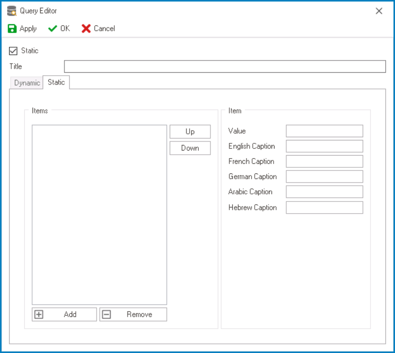
- Static: This is a checkbox which, if selected, will activate the Static tab and redirect users to it, while disabling the Dynamic tab.
- Title: This is a text field that allows users to input the title of the dropdown data source.
- A dropdown data source must have a unique name. It cannot have the same name as another dropdown data source in the application.
- Add: This button allows users to add a new dropdown item.
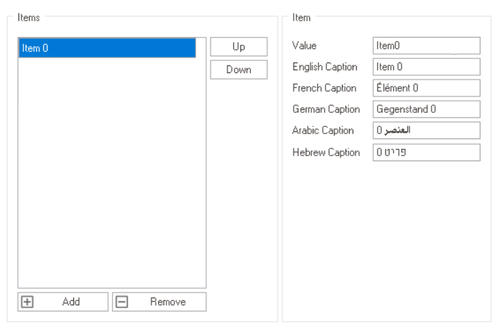
- Once added, the new item will be displayed in the Items box and its properties will be shown in the Item section.
![]()
- Value: This is a text field that allows users to input the data value for the dropdown item.
- This value corresponds to a specific item in the dropdown list. When users select the item, the corresponding value is sent to the server, allowing it to be processed in the backend.
- This value corresponds to a specific item in the dropdown list. When users select the item, the corresponding value is sent to the server, allowing it to be processed in the backend.
- Caption: This is a text field that allows users to input the displayed name or caption of the dropdown item.
- As English is set as the default language in the system, any caption inputted in the English caption field will be used as the display caption for the item, regardless of other language options that may be available.
- As English is set as the default language in the system, any caption inputted in the English caption field will be used as the display caption for the item, regardless of other language options that may be available.
- Value: This is a text field that allows users to input the data value for the dropdown item.
- Once added, the new item will be displayed in the Items box and its properties will be shown in the Item section.
- Remove: This button allows users to remove a selected dropdown item.
- Up / Down: These buttons allow users to reorder the items in the list.
- To move an item up or down, select it from the list and click on the Up or Down button. This will move the selected item one position up or down in the list, respectively.