
When a textbox control is selected in the design environment, its associated properties are displayed in the Control Properties panel.
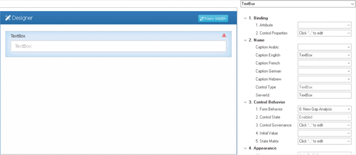
- Binding: In this category, users can link a control to its corresponding attribute and define its binding properties.
- For more information on the fields in this category, click here.
- Name: In this category, users can access basic properties required for the control’s identification and proper referencing in the code.
- For more information on these properties and how to configure them, click here.
- Control Behavior: In this category, users can configure the behavior of the control and define how it interacts with the form or application.
- For more information on these properties and how to configure them, click here.
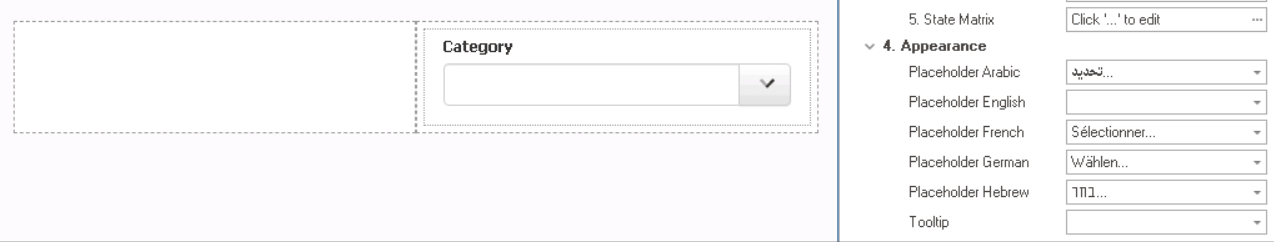
- Appearance: In this category, users can customize the visual appearance of the control.
- Align: This is a single-select dropdown field that allows users to choose the alignment of the text inside the control.
- Alignment Options: Right, Center, Left, or Auto By Culture.
- Auto By Culture: This option aligns the text based on the language or culture setting in the web application.
- Right: This option aligns the text to the right side of the control.
- Center: This option aligns the text to the center of the control.
- Left: This option aligns the text to the left side of the control.
- Alignment Options: Right, Center, Left, or Auto By Culture.
- Browser Autocomplete: This is a checkbox which, if selected, allows users to enable the autocomplete feature for the control, based on data entered previously.
- Browser Autocomplete Preview: Web View
-
![]()
- Chars and Digits Only: This is a checkbox which, if selected, allows users to restrict input in the textbox to only alphanumeric characters (letters and numbers).
- Any special characters, such as punctuation marks or symbols, will not be allowed in the input field.
- Latin Chars Only: This is a checkbox which, if selected, allows users to restrict input in the textbox to only Latin alphabet characters.
- Users will be allowed to input numbers and a limited set of special characters, such as punctuation marks and symbols for mathematical expressions. Any special characters outside this limited set, however, will not be allowed in the input field.
- Mask: This field allows users to specify a format for the input data in the textbox control. Users can either enter the format manually or select from a dropdown menu that includes two available formats:
- aaa-aaa: This format is used when the input data needs to follow a specific pattern of six characters, with the first three characters being letters (a-z) and the second three characters also being letters (a-z), separated by a hyphen (-)
- a9a/999: This format is used when the input data needs to follow a specific pattern of six characters, with the first and third characters being letters (a-z) and the second being a number (0-9), followed by a forward slash (/), and then three numbers (0-9).
- Textbox Mask Pattern Preview: Web View
-
![]()
- Max Length: This field allows users to specify the maximum number of characters that can be entered into the control.
- By default, this field is left blank. To specify a maximum length of input, however, users can enter numbers into the field either manually or by clicking the increment/decrement arrows.
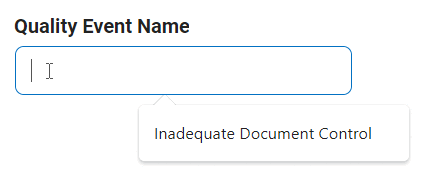
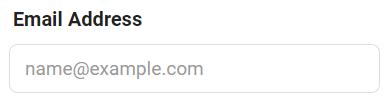
- Placeholder: This field allows users to input the placeholder text for the control.
- Users can also directly add a placeholder text to the control simply by clicking on the inside of the control in the design environment.
![]()
- As English is set as the default language in the system, any placeholder inputted in the English placeholder field will be used as the display placeholder for the control, regardless of other language options that may be available.
- Similarly, any placeholder text entered in the design environment will automatically populate the English placeholder field.
- Control Placeholder Text Preview: Web View
-
![]()
- Users can also directly add a placeholder text to the control simply by clicking on the inside of the control in the design environment.
- Rows: This field allows users to specify the number of visible rows for the multi-line textbox control, adjusting its height to display a certain amount of content at a time.
- By default, the number of rows is set to 4. To adjust this value, users can enter numbers into the field either manually or by clicking the increment/decrement arrows.
- By default, the number of rows is set to 4. To adjust this value, users can enter numbers into the field either manually or by clicking the increment/decrement arrows.
- Textbox Type: This is a single-select dropdown field that allows users to choose the type of textbox.
- Textbox Types: Single-Line, Multi-Line, or Password.
- Textbox Types: Single-Line, Multi-Line, or Password.
- Tooltip: This field allows users to input a tooltip for the control.
- In the web application, the tooltip is represented by the tooltip icon (
![]() ) next to the control.
) next to the control. - Textbox Tooltip Preview: Web View
-
![]()
- In the web application, the tooltip is represented by the tooltip icon (
- Align: This is a single-select dropdown field that allows users to choose the alignment of the text inside the control.
- Caption Appearance: In this category, users can customize the visual appearance of the control’s caption.
- For more information on the fields in this category, click here.

 ) next to the control.
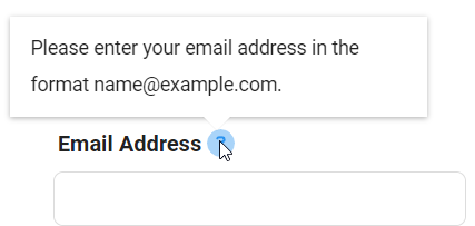
- Quick Forms Application
- To apply the Quick Forms feature to textbox controls, take the following steps:
- Drag a textbox control from the toolbox and drop it onto the design environment.
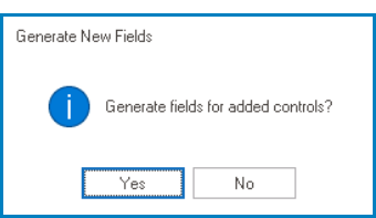
- Provide a caption for the control.
- Save the form and select Yes in response to the following prompt:
![]()