
In the Tab Pages Editor window, users can customize the appearance of individual tabs within the tab control.
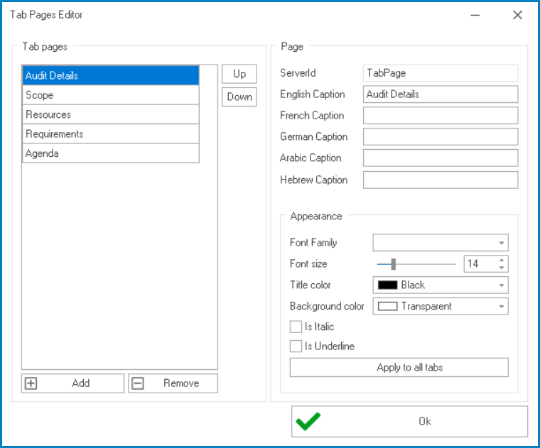
- Add: This button allows users to add a new tab.
- Once added, the new tab will be displayed in the Tab Pages box and its properties will be shown in the Page section.
- Remove: This button allows users to remove a selected tab.
- Up / Down: These buttons allow users to reorder the tabs in the list.
- To move a tab up or down, select it from the list and click on the Up or Down button. This will move the selected tab one position up or down in the list, respectively.
- Server ID: This field displays the Server ID for the tab. It cannot be modified.
- Server ID refers to the name used to call the tab in the code.
- Caption: This is a text field that allows users to input the displayed name or caption of the tab.
- As English is set as the default language in the system, any caption inputted in the English caption field will be used as the display caption for the tab, regardless of other language options that may be available.
- As English is set as the default language in the system, any caption inputted in the English caption field will be used as the display caption for the tab, regardless of other language options that may be available.
- Appearance: In this section, users can customize the visual appearance of the tab.
- Font Family: This field allows users to choose the font family from a dropdown menu.
- Font Size: This field allows users to set the font size of the caption text.
- By default, the font size is set to 14. To adjust this size, use either the slider or the numeric updown field.
- In the numeric updown field, users can enter numbers either manually or by clicking the increment/decrement arrows.
- By default, the font size is set to 14. To adjust this size, use either the slider or the numeric updown field.
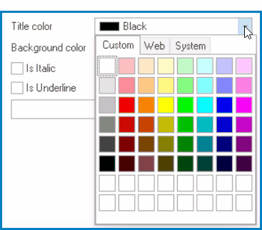
- Title Color: This field allows users to choose the font color of the caption text from a dropdown menu.
- It contains three tabs: Custom, Web, and System.
![]()
- In the Custom tab, users can choose a font color by selecting a color from a color picker. The color picker offers a selection of theme colors, standard colors, and the ability to create custom colors.
- In the Web tab, users can select a font color from a scrollable list. The list displays a range of specific colors, each with its own name, allowing users to easily choose from pre-defined options.
- In the System tab, users can select a font color from a scrollable list. The list displays a range of specific colors, each with its own name, allowing users to easily choose from pre-defined options.
- It contains three tabs: Custom, Web, and System.
- Background: This field allows users to choose the background color of the caption text from a dropdown menu.
- It also has three tabs, similar to the Title Color field, where users can select a color from a color picker or a scrollable list of pre-defined options.
- Is Italic: This is a checkbox which, if selected, allows users to apply an italic or slanted effect to the caption text.
- Is Underline: This is a checkbox which, if selected, allows users to apply an underline effect to the caption text.
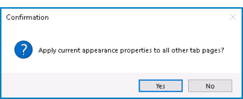
- Apply to All Tabs: This button allows users to apply the same caption appearance properties to all tabs within the tab control.
- If this button is selected, users will be alerted of the action with the following confirmation message:
![]()
- Yes or No: To confirm the application, click on the Yes button. To cancel, click on the No button.
- If this button is selected, users will be alerted of the action with the following confirmation message:
- OK: This button allows users to save their changes and exit the Tab Pages Editor window.
- Customizing Tab Control: Web View
-
![]()
