
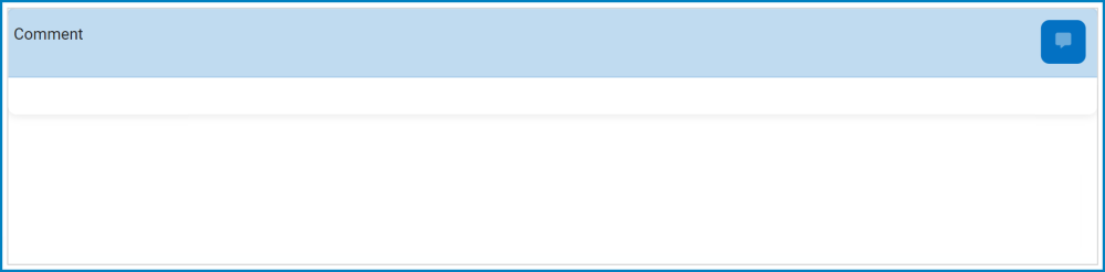
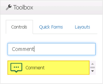
Comment controls enable users to add comments to a particular form.
When a comment control is selected in the design environment, its associated properties are displayed in the Control Properties panel.
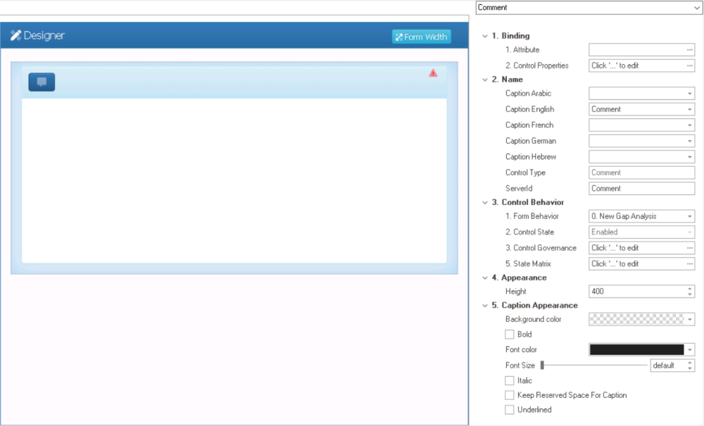
- Binding: In this category, users can link a control to its corresponding attribute and define its binding properties.
- For more information on the fields in this category, click here.
- Name: In this category, users can access basic properties required for the control’s identification and proper referencing in the code.
- For more information on these properties and how to configure them, click here.
- Control Behavior: In this category, users can configure the behavior of the control and define how it interacts with the form or application.
- Control Governance
-
- In the Control Governance field, users can configure various properties that govern the functionality of controls.
- To access the control governance properties, click on the ellipses (
![]() ) inside the field. It will display the Form / Behavior / Control window.
) inside the field. It will display the Form / Behavior / Control window.
- This window consists of two tabs:
- To access the control governance properties, click on the ellipses (
- In the Control Governance field, users can configure various properties that govern the functionality of controls.
- For more information on these properties and how to configure them, click here.
- Appearance: In this category, users can customize the visual appearance of the control.
- Height: This is a numeric updown field that allows users to set the height of the control.
- By default, the height is set to 400. To adjust this size, users can enter numbers into the field either manually or by clicking the increment/decrement arrows.
- Height: This is a numeric updown field that allows users to set the height of the control.
- Caption Appearance: In this category, users can customize the visual appearance of the control’s caption.
- For more information on the fields in this category, click here.
 ) inside the field. It will display the Form / Behavior / Control window.
- Comment Control Preview: Web View
-
![]()