
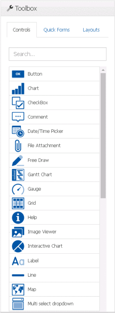
In the Controls tab of the toolbox, users are provided access to a variety of controls that can be used for designing a form.
To add controls to the design environment, take the following steps:
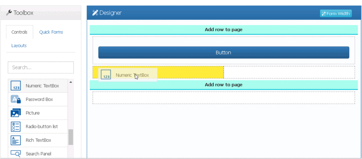
- From the toolbox, select a control and drag it towards a viable drop location in the design environment.
![]()
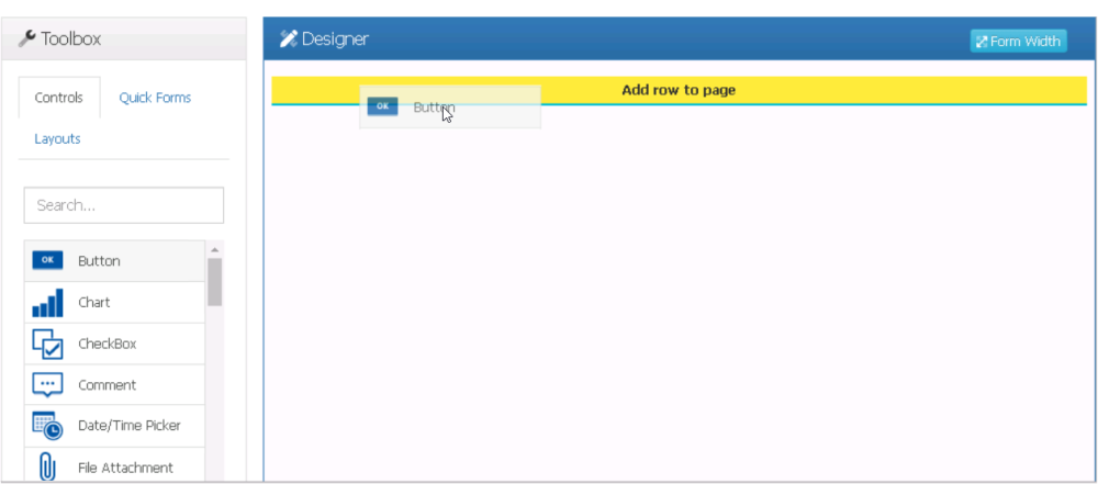
- Drop the control onto the viable area.
![]()
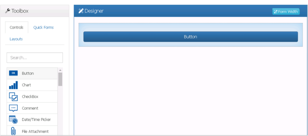
- In this manner, users can design the functionality of the form, adding as many controls as needed.
![]()
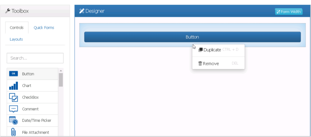
Once a control has been added to the design environment, users can perform the following actions:
- Duplicate or Remove Control
![]()
- For more information on the options in this context menu, click here.
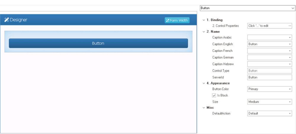
- Configure Properties
![]()
- To view the properties for a specific control, please refer to the corresponding section listed below.
- Controls
- Button
- Checkbox
- Comment
- Date/Time Picker
- File Attachment
- Free draw
- Gantt Chart
- Gauge
- Grid
- Help
- Image Viewer
- Interactive Chart
- Label
- Line
- Map
- Multi-Select Dropdown
- Multi-Line Textbox
- Nested Form Link
- Numeric Textbox
- Password Box
- Picture
- Radio Button List
- Rich Textbox
- Search Panel
- Single-Select Dropdown
- Static Image
- Tab Control
- Table
- Textbox
- Time Duration
- Tree
- User Picture
- User Signature
- For general control properties that apply to most controls, however, please refer to the dedicated section in the manual.
- To view the properties for a specific control, please refer to the corresponding section listed below.