
Numeric textbox controls are interactive elements that allow users to input, modify, and display numerical data in forms.
When a numeric textbox control is selected in the design environment, its associated properties are displayed in the Control Properties panel.
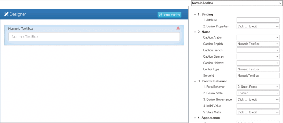
- Binding: In this category, users can link a control to its corresponding attribute and define its binding properties.
- For more information on the fields in this category, click here.
- Name: In this category, users can access basic properties required for the control’s identification and proper referencing in the code.
- For more information on these properties and how to configure them, click here.
- Control Behavior: In this category, users can configure the behavior of the control and define how it interacts with the form or application.
- For more information on these properties and how to configure them, click here.
- Appearance: In this category, users can customize the visual appearance of the control.
- Align: This is a single-select dropdown field that allows users to choose the alignment of the control.
- Alignment Options: Right, Center, Left, or Auto By Culture.
- Auto By Culture: This option aligns the control based on the language or culture setting in the web application.
- Right: This option aligns the control to the right side of the screen.
- Center: This option aligns the control to the center of the screen.
- Left: This option aligns the control to the left side of the screen.
- Alignment Options: Right, Center, Left, or Auto By Culture.
- Floating: This is a checkbox which, if selected, allows the control to accept and handle floating-point numbers, including decimal values.
- Format: This field allows users to specify a format for displaying the numeric data in the control. Users can either enter the format manually or select from a dropdown menu that includes four available formats:
- #,### This format displays the number with thousands separators and no decimal places.
- For example, the number 1234567 would be displayed as 1,234,567.
- #,###.0: This format displays the number with thousands separators and one decimal place.
- For example, the number 1234.567 would be displayed as 1,234.6.
- #,###.00: This format displays the number with thousands separators and two decimal places.
- For example, the number 1234.567 would be displayed as 1,234.57.
- #,###.000: This format displays the number with thousands separators and three decimal places.
- For example, the number 1234.567 would be displayed as 1,234.567.
- For example, the number 1234.567 would be displayed as 1,234.567.
- #,### This format displays the number with thousands separators and no decimal places.
- Mask: This field allows users to specify a format for the input data in the numeric textbox control. Users can either enter the format manually or select from a dropdown menu that includes two available formats:
- 9999: This format is used for integers and specifies that the input should have a maximum of four digits, with leading zeros added if necessary.
- 9999.99: This format is used for decimals and specifies that the input should have a maximum of four digits before the decimal point, and a maximum of two digits after the decimal point. The decimal point itself is added automatically.
- Numeric Textbox Mask Pattern Preview: Web View
-
![]()
- Max Length: This field allows users to specify the maximum number of characters that can be entered into the control.
- By default, this field is left blank. To specify a maximum length of input, however, users can enter numbers into the field either manually or by clicking the increment/decrement arrows.
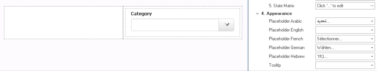
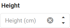
- Placeholder: This field allows users to input the placeholder text for the control.
- Users can also directly add a placeholder text to the control simply by clicking on the inside of the control in the design environment.
![]()
- As English is set as the default language in the system, any placeholder inputted in the English placeholder field will be used as the display placeholder for the control, regardless of other language options that may be available.
- Similarly, any placeholder text entered in the design environment will automatically populate the English placeholder field.
- Control Placeholder Text Preview: Web View
-
![]()
- Users can also directly add a placeholder text to the control simply by clicking on the inside of the control in the design environment.
- Tooltip: This field allows users to input a tooltip for the control.
- In the web application, the tooltip is represented by the tooltip icon (
![]() ) next to the control.
) next to the control. - Numeric Textbox Tooltip Preview: Web View
-
![]()
- In the web application, the tooltip is represented by the tooltip icon (
- Align: This is a single-select dropdown field that allows users to choose the alignment of the control.
- Caption Appearance: In this category, users can customize the visual appearance of the control’s caption.
- For more information on the fields in this category, click here.

 ) next to the control.
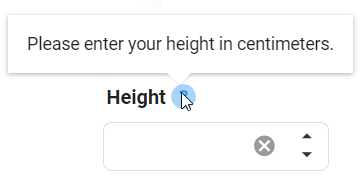
- Quick Forms Application
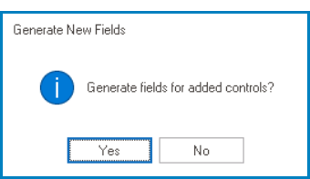
- To apply the Quick Forms feature to numeric textbox controls, take the following steps:
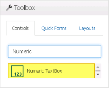
- Drag a numeric textbox control from the toolbox and drop it onto the design environment.
- Provide a caption for the control.
- Save the form and select Yes in response to the following prompt:
![]()