
The static image control enables users to display a fixed or pre-determined image within the form, providing a simple and efficient means of presenting visual content without the need for dynamic rendering or user-uploaded content.
When a static image control is selected in the design environment, its associated properties are displayed in the Control Properties panel.
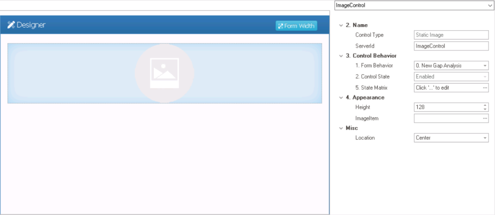
- Name: In this category, users can access basic properties required for the control’s identification and proper referencing in the code.
- Control Type: This field displays the control type. It cannot be modified.
- Server ID: This is a text field that allows users to input the Server ID for the control.
- Server ID refers to the name used to call the control in the code.
- Control Behavior: In this category, users can configure the behavior of the control and define how it interacts with the form or application.
- Form Behavior: This is a single-select dropdown field that retrieves the list of form behaviors (from the Form Behavior section of the Forms module). It allows users to select the form behavior associated to the control.
- Any state or validation properties set for the control will apply only to the selected form behavior.
- Any state or validation properties set for the control will apply only to the selected form behavior.
- Control State: This field displays the current state of the control.
- Control States
- Enabled: This option allows for the control to be visible and editable in the web application.
- Disabled: This option allows for the control to be visible but not editable in the web application.
- Invisible: This option allows for the control to be hidden in the web application.
- State Matrix: This field allows users to configure the control state properties.
- To access the control state properties, click on the ellipses (
![]() ) inside the field.
) inside the field.
![]()
- Form Behavior: This field displays the form behavior.
- All form behaviors linked to associated form will be listed in this window.
- Control State: This is a single-select dropdown field that displays the list of control states. It allows users to modify the current control state of the form behavior.
- Apply: This button allows users to save their changes.
- OK: This button allows users to save their changes and close the window.
- Cancel: This button allows users to cancel their changes and close the window.
- Form Behavior: This field displays the form behavior.
- To access the control state properties, click on the ellipses (
- Form Behavior: This is a single-select dropdown field that retrieves the list of form behaviors (from the Form Behavior section of the Forms module). It allows users to select the form behavior associated to the control.
- Appearance: In this category, users can customize the visual appearance of the control.
- Height: This is a numeric updown field that allows users to set the height of the control.
- By default, the height is set to 128. To adjust this size, users can enter numbers into the field either manually or by clicking the increment/decrement arrows.
- Image Item: This field allows users to upload an image file to the system.
- It will display the Application Files window, in which users can add and select the image file.
- Height: This is a numeric updown field that allows users to set the height of the control.
- Misc: In this category, users can define additional properties for the control.
- Location: This is a single-select dropdown field that allows users to choose the location of the control.
- Location Options: Right, Center, or Left.
- Right: This option places the control on the right-hand side of the screen.
- Center: This option centers the control in the middle of the screen.
- Left: This option places the control on the left-hand side of the screen.
- Location Options: Right, Center, or Left.
- Location: This is a single-select dropdown field that allows users to choose the location of the control.
 ) inside the field.
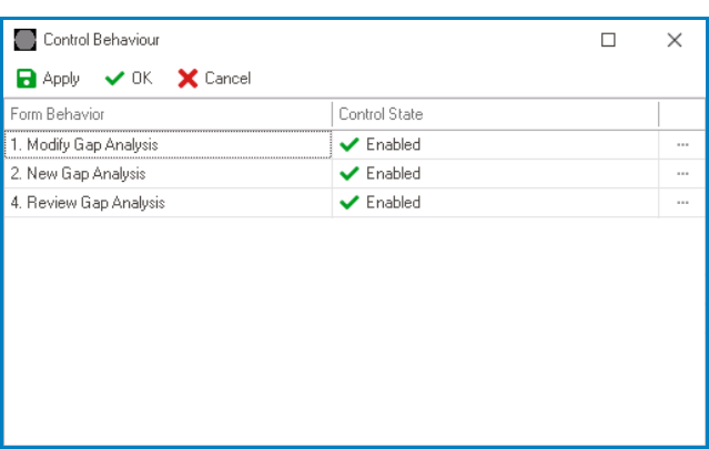
- Static Image Control Preview: Design View vs. Web View
-
![]()