
In the Appearance tab, users can customize the visual appearance of the gauge control.

- Gauge Area Background Properties: In this section, users can configure the visual properties related to the gauge area background.
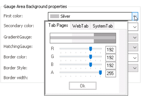
- First Color: This is a color picker that allows users to choose the first color in the gradient that defines the background of the gauge area.
- It contains three tabs: Tab Pages, Web, and System.
![]()
- In the Tab Pages tab, users can select a gradient color by manipulating sliders or input fields for each color channel in the RGBA color picker.
- In the Web tab, users can select a gradient color from a scrollable list. The list displays a range of specific colors, each with its own name, allowing users to easily choose from pre-defined options.
- In the System tab, users can select a gradient color from a scrollable list. The list displays a range of specific colors, each with its own name, allowing users to easily choose from pre-defined options.
- In the Tab Pages tab, users can select a gradient color by manipulating sliders or input fields for each color channel in the RGBA color picker.
- It contains three tabs: Tab Pages, Web, and System.
- Second Color: This is a color picker that allows users to choose the second color in the gradient that defines the background of the gauge area.
- Gauge Gradient Colors Preview: Web View
-
![]()
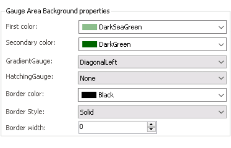
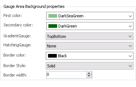
- Gradient Gauge: This field allows users to choose the gradient style of the gauge area background from a dropdown menu.
- Gauge Gradient Style Preview: Web View
-
![]()
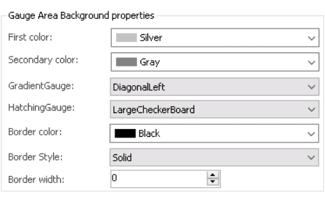
- Hatching Gauge: This field allows users to choose a specific hatching pattern for the gauge area background from a dropdown menu.
- Gauge Hatching Pattern Preview: Web View
-
![]()
- Border Color: This is a color picker that allows users to choose the border color of the gauge control.
- Gauge Border Color Preview: Web View
-
![]()
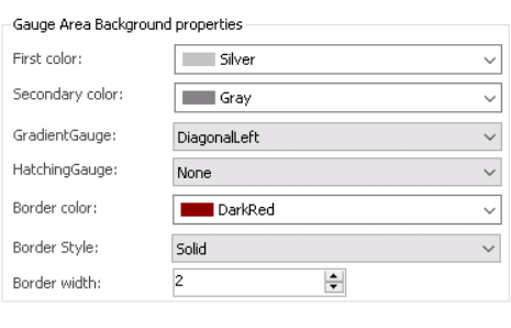
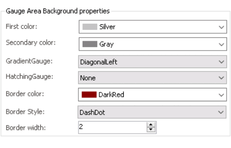
- Border Style: This field allows users to choose a border style for the control from a dropdown menu.
- Gauge Border Style Preview: Web View
-
![]()
- Border Width: This is a numeric updown field that allows users to set the width of the control’s border.
- Users can enter numbers into this field either manually or by clicking the increment/decrement arrows.
- Gauge Border Width Preview: Web View
-
![]()
- First Color: This is a color picker that allows users to choose the first color in the gradient that defines the background of the gauge area.
- Gauge Background: In this section, users can customize the visual properties related to the gauge background.
- First Color: This is a color picker that allows users to choose the color of the gauge background.
- Gauge Background Color Preview: Web View
-
![]()
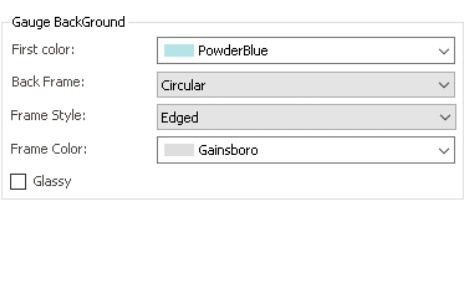
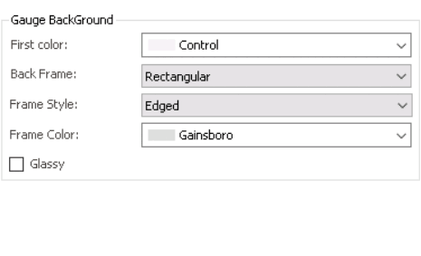
- Back Frame: This field allows users to choose the shape of the control’s background frame from a dropdown menu.
- Gauge Background Frame Preview: Web View
-
![]()
- Frame Style: This field allows users to choose the style of the control’s background frame from a dropdown menu.
- Gauge Background Frame Style Preview: Web View
- Edged vs. Simple vs. None
![]()
- Edged vs. Simple vs. None
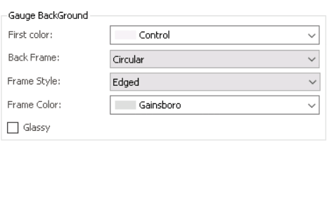
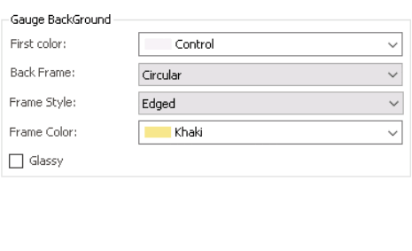
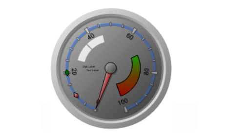
- Frame Color: This is a color picker that allows users to choose the color of the control’s background frame.
- Gauge Background Frame Color Preview: Web View
-
![]()
- Glassy: This is a checkbox which, if selected, allows users to apply a glassy effect to the gauge background, adding a glossy or reflective texture to the overall appearance.
- Gauge Glassy Effect Preview: Web View
-
![]()
- First Color: This is a color picker that allows users to choose the color of the gauge background.