
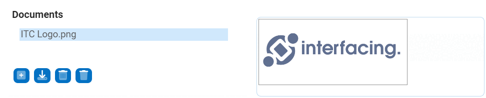
The image viewer control works in conjunction with the file attachment control to enable users to easily view uploaded images. Once an image is uploaded in the file attachment field, it will appear in the image viewer for display.
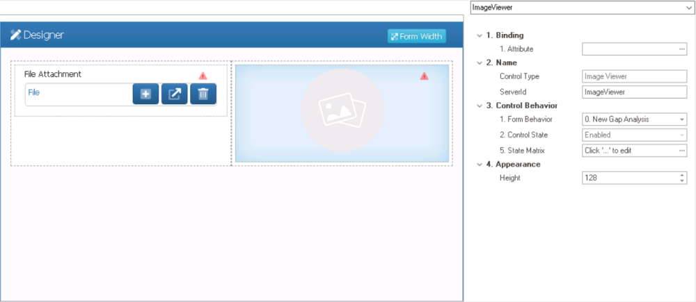
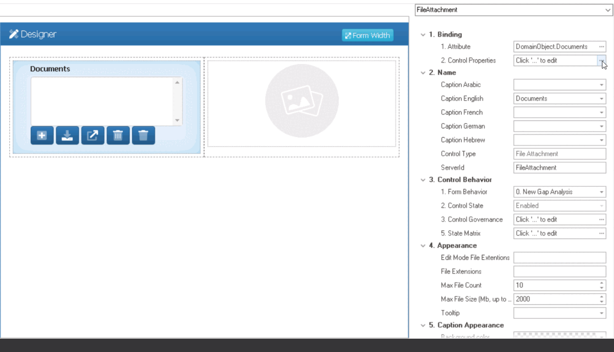
When an image viewer control is selected in the design environment, its associated properties are displayed in the Control Properties panel.
- Binding: In this category, users can link a control to its corresponding attribute.
- Attribute: This field allows users to select the attribute associated to the control.
- To access the list of relevant attributes, click on the ellipses (
![]() ) inside the field.
) inside the field.
![]()
- Once an attribute has been selected, it will populate the Attribute field.
![]()
- To access the list of relevant attributes, click on the ellipses (
- Attribute: This field allows users to select the attribute associated to the control.
 ) inside the field.
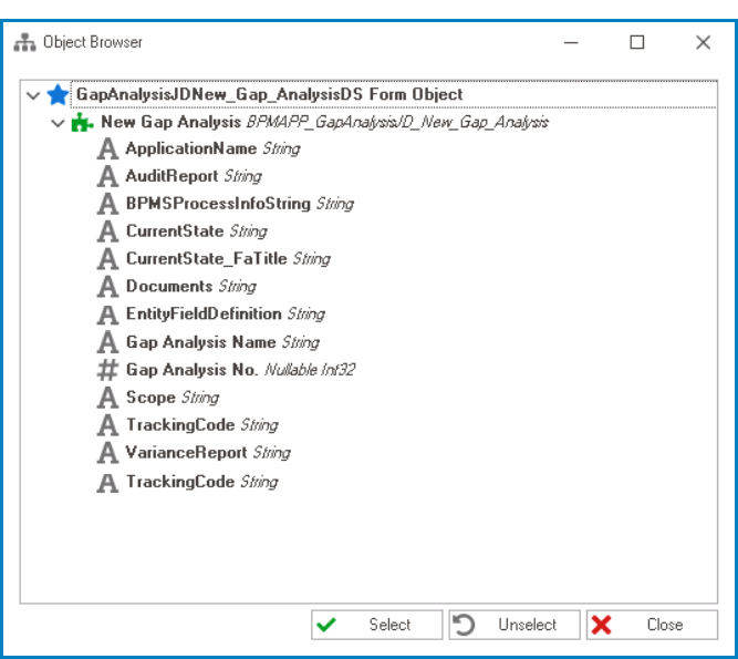
- Name: In this category, users can access basic properties required for the control’s identification and proper referencing in the code.
- Control Type: This field displays the control type. It cannot be modified.
- Server ID: This is a text field that allows users to input the Server ID for the control.
- Server ID refers to the name used to call the control in the code.
- Control Behavior: In this category, users can configure the behavior of the control and define how it interacts with the form or application.
- Form Behavior: This is a single-select dropdown field that retrieves the list of form behaviors (from the Form Behavior section of the Forms module). It allows users to select the form behavior associated to the control.
- Any state or validation properties set for the control will apply only to the selected form behavior.
- Any state or validation properties set for the control will apply only to the selected form behavior.
- Control State: This field displays the current state of the control.
- Control States
- Enabled: This option allows for the control to be visible and editable in the web application.
- Disabled: This option allows for the control to be visible but not editable in the web application.
- Invisible: This option allows for the control to be hidden in the web application.
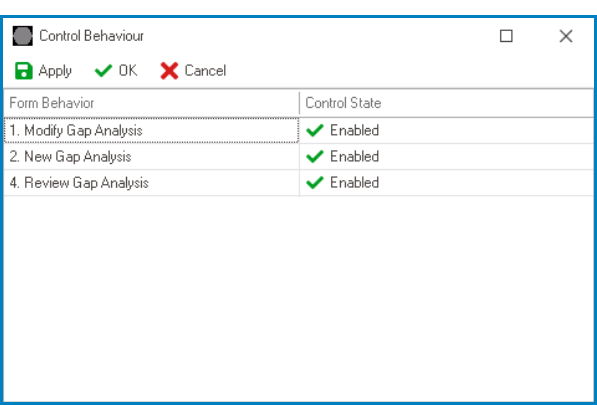
- State Matrix: This field allows users to configure the control state properties.
- To access the control state properties, click on the ellipses (
![]() ) inside the field.
) inside the field.
![]()
- Form Behavior: This field displays the form behavior.
- All form behaviors linked to associated form will be listed in this window.
- Control State: This is a single-select dropdown field that displays the list of control states. It allows users to modify the current control state of the form behavior.
- Apply: This button allows users to save their changes.
- OK: This button allows users to save their changes and close the window.
- Cancel: This button allows users to cancel their changes and close the window.
- Form Behavior: This field displays the form behavior.
- To access the control state properties, click on the ellipses (
- Form Behavior: This is a single-select dropdown field that retrieves the list of form behaviors (from the Form Behavior section of the Forms module). It allows users to select the form behavior associated to the control.
- Appearance: In this category, users can customize the visual appearance of the control.
- Height: This is a numeric updown field that allows users to set the height of the control.
- By default, the height is set to 128. To adjust this size, users can enter numbers into the field either manually or by clicking the increment/decrement arrows.
- Height: This is a numeric updown field that allows users to set the height of the control.
- File Attachment Control Configuration
-
![]()
- Image Viewer Control Preview: Web View
-
![]()