
In the Table tab of the Control Properties window, users can build and customize the table.
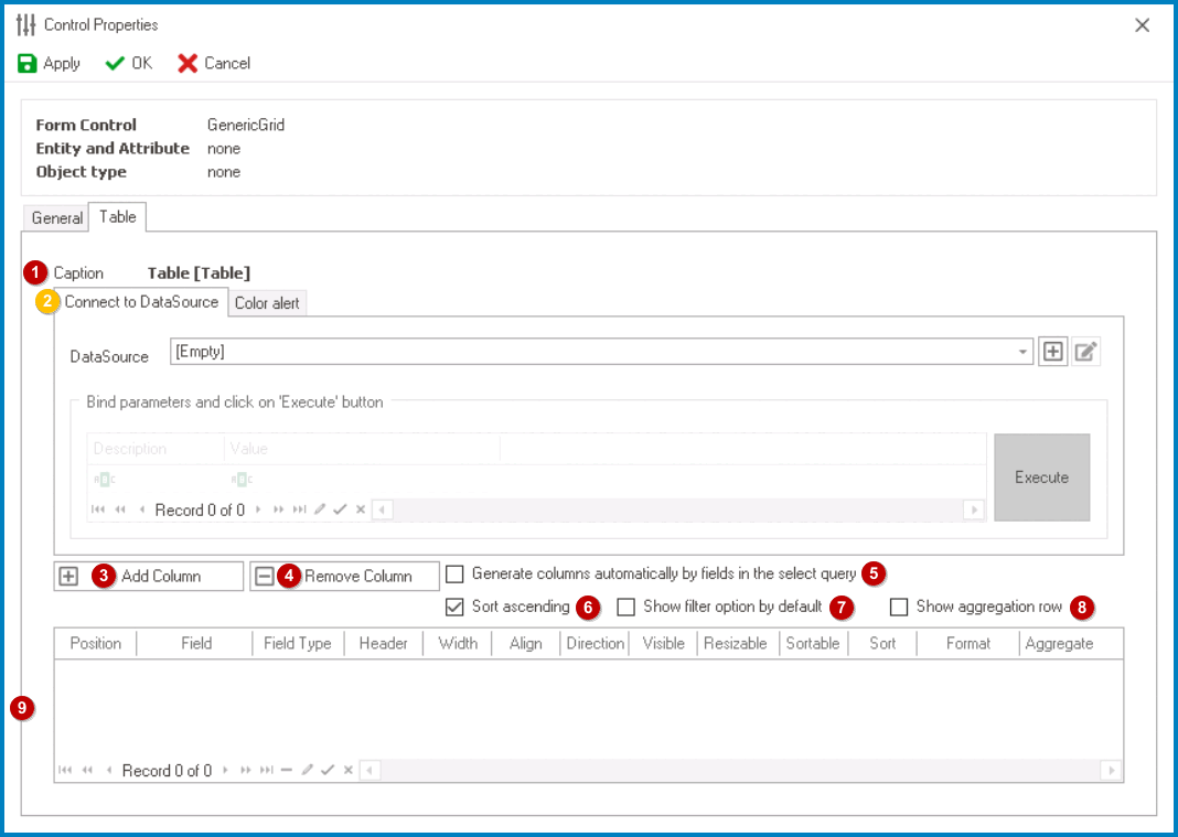
- Caption: This field displays the (English) caption of the table.
- To modify the caption displayed in this field, refer to the Name category in the Control Properties panel.
- Connect to Data Source: In this tab, users can link the appropriate data source to the table.
- Data Source: This field retrieves the list of data sources (from both the Dropdown Data Sources section of the Forms module and the KPIs section of the Entities module). It allows users to select the data source for the table.
- To define a new data source, select the
![]() button.
button.
- It will display the KPI Properties window.
- To modify an existing data source, select the
![]() button.
button. - To remove a data source, select the
![]() button.
button.
- This button will only be visible once users have added/selected a data source.
- This button will only be visible once users have added/selected a data source.
- To define a new data source, select the
- Parameters: This is a table field that allows users to define parameters for the query.
- Parameters are values that are used to filter or modify the data returned by the query.
- Users can define the parameters in the table by specifying a parameter name and data type. Once the parameters are defined, users can provide values for the parameters by entering them in the Value column of the table.
- When the query is executed, it uses the provided parameter values to filter or modify the data.
- Parameters are values that are used to filter or modify the data returned by the query.
- Execute: This button allows users to execute the query with the selected data source and parameters.
- Once the query is executed, the resulting data will be displayed in the table.
- Data Source: This field retrieves the list of data sources (from both the Dropdown Data Sources section of the Forms module and the KPIs section of the Entities module). It allows users to select the data source for the table.
- Color Alert: In this tab, users can apply color alerts to the table, which can highlight specific rows or columns based on certain criteria.
- Add Alert: This button allows users to add a new color alert to the table.
- Remove Alert: This button allows users to remove a selected color alert.
- Alert Name: This is a text field that allows users to input a name for the color alert.
- Filter: This field allows users to define a criteria statement that evaluates to true or false for each row in the column.
- The criteria can include typical operators and entity fields from the data source.
- The criteria can include typical operators and entity fields from the data source.
- Field: This field retrieves the list of fields related to the data source, which users can use to specify the column that the color alert should be applied to.
- All: This is a checkbox which, if selected, allows users to apply the color alert to all fields in the table.
- If this checkbox is selected, the Field dropdown will be disabled.
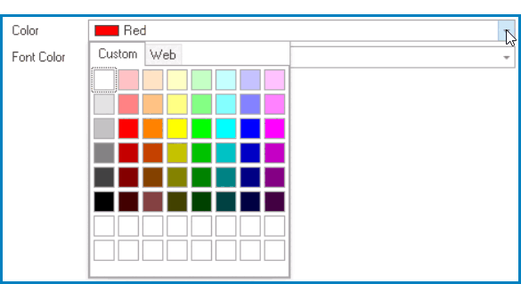
- Color: This field allows users to select a background color for the rows or columns that meet the alert criteria.
- It contains two tabs: Custom and Web.
![]()
- In the Custom tab, users can choose a background color by selecting a color from a color picker. The color picker offers a selection of theme colors, standard colors, and the ability to create custom colors.
- In the Web tab, users can select a background color from a scrollable list. The list displays a range of specific colors, each with its own name, allowing users to easily choose from pre-defined options.
- It contains two tabs: Custom and Web.
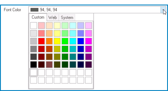
- Font Color: This field allows users to select a font color for the rows or columns that meet the alert criteria.
- It contains three tabs: Custom, Web, and System.
![]()
- In the Custom tab, users can choose a font color by selecting a color from a color picker. The color picker offers a selection of theme colors, standard colors, and the ability to create custom colors.
- In the Web tab, users can select a font color from a scrollable list. The list displays a range of specific colors, each with its own name, allowing users to easily choose from pre-defined options.
- In the System tab, users can select a font color from a scrollable list. The list displays a range of specific colors, each with its own name, allowing users to easily choose from pre-defined options.
- It contains three tabs: Custom, Web, and System.
- Add Column: This button allows users to add a new column to the table.
- If selected, it will display the Grid Column window, in which users can define the properties of the column.
- Remove Column: This button allows users to remove a selected column in the table.
- Generate Columns Automatically: This is a checkbox which, if selected, allows users to automatically add all fields in the related query as columns in the table.
- Sort Ascending: This is a checkbox which, if selected, allows users to sort the table data in ascending order based on the selected column header.
- Show Filter: This is a checkbox which, if selected, allows users to display a filter row at the top of the table where they can filter the data based on specific criteria.
- Show Aggregation Row: This is a checkbox which, if selected, allows users to display aggregate values for selected columns in the table footer, such as sum or average.
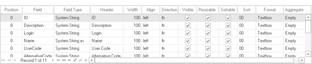
- Column Customization: In this section, users can access and customize the columns populating the table.
![]()
- Position: This field allows users to specify the order in which the column appears in the table.
- Field: This field displays the corresponding attribute for the column.
- Field Type: This field displays the data type of the attribute linked to the column.
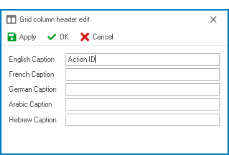
- Header: This field allows users to specify the text that appears in the header of the column.
- Users can input their preferred header directly into this field. Alternatively, they can click on the ellipses to display the Grid Column Header Edit window, in which they can input or modify the caption in all available languages.
![]()
- As English is set as the default language in the system, any caption inputted in the English caption field will be used as the display caption for the column, regardless of other language options that may be available.
- Users can input their preferred header directly into this field. Alternatively, they can click on the ellipses to display the Grid Column Header Edit window, in which they can input or modify the caption in all available languages.
- Width: This field allows users to set the width of the column in pixels.
- Align: This field allows users to specify the alignment of the text within the column. Users can choose their alignment preference from a dropdown menu.
- Alignment Options
- Left: This option aligns the text to the left side of the column.
- Right: This option aligns the text to the right side of the column.
- Center: This option centers the text within the column.
- Unset: This option aligns the text based on the language or culture setting in the web application.
- Direction: This field allows users to specify the direction of the text within the column. Users can choose their direction preference from a dropdown menu.
- Direction Options
- Left-to-Right: This option specifies that the text in the column should be read from left to right, in the standard direction for languages that use a Latin-based alphabet (such as English).
- Right-to-Left: This option specifies that the text in the column should be read from right to left, in the opposite direction to the standard direction for languages that use a Latin-based alphabet (such as Arabic or Hebrew).
- Unset: This option specifies that the text direction should be based on the language or culture setting in the web application.
- Visible: This is a checkbox which, if selected, allows for the column to be visible in the table.
- Resizable: This is a checkbox which, if selected, allows users to resize the width of the column in the table.
- Sortable: This is a checkbox which, if selected, allows users to sort the column by clicking on its header.
- Sort: This field allows users to set the initial sort order of the column. Users can choose the sort order from a dropdown menu.
- By selecting a value from this dropdown, users are essentially assigning a priority level for the column.
- Format: This field allows users to specify the display format of the column.
- To select or modify the display format, click on the ellipses (
![]() ) inside the field.
) inside the field.
- It will display the Edit Type window.
- To select or modify the display format, click on the ellipses (
- Aggregate: This field allows users to specify how the data in the column should be aggregated. Users can choose their preferred aggregation option from a dropdown menu.
- Aggregation Options
- Average: This option allows users to calculate the average of the values in the column.
- Empty: This option allows users to specify that the table should not perform any aggregation on the column.
- Sum: This option allows users to calculate the sum of the values in the column.
 button.
 button.
 button.
 ) inside the field.