
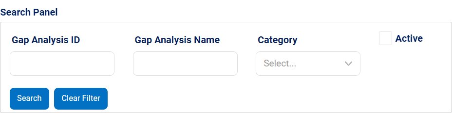
The search panel control enables users to quickly and easily filter through a list of items based on specific criteria, helping them find the information they need in an efficient manner.
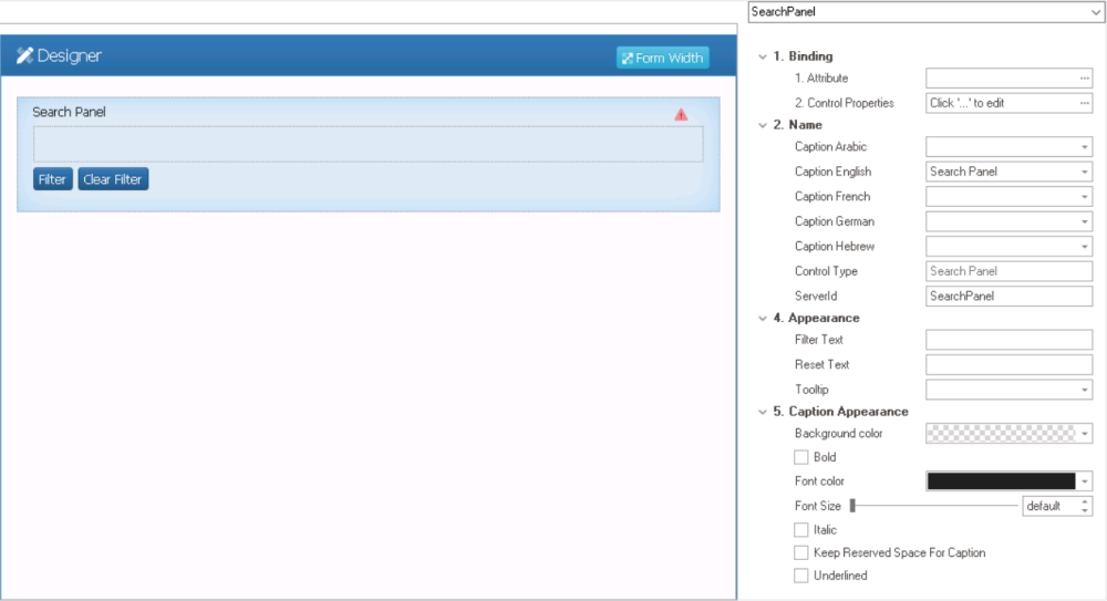
When a search panel control is selected in the design environment, its associated properties are displayed in the Control Properties panel.
- Binding: In this category, users can link a control to its corresponding attribute and define its binding properties.
- For more information on the fields in this category, click here.
- Name: In this category, users can access basic properties required for the control’s identification and proper referencing in the code.
- For more information on these properties and how to configure them, click here.
- Appearance: In this category, users can customize the visual appearance of the control.
- Filter Text: This field allows users to customize the text displayed inside the Filter button in the search panel.
- Users can change the text to better reflect the purpose of the button or to display the text in a different language.
- Filter Text Preview: Web View
-
![]()
- Reset Text: This field allows users to customize the text displayed inside the Clear Filter button in the search panel.
- Users can change the text to better reflect the purpose of the button or to display the text in a different language.
- Reset Text Preview: Web View
-
![]()
- Tooltip: This field allows users to input a tooltip for the control.
- In the web application, the tooltip is represented by the tooltip icon (
![]() ) next to the control.
) next to the control. - Search Panel Tooltip Preview: Web View
-
![]()
- In the web application, the tooltip is represented by the tooltip icon (
- Filter Text: This field allows users to customize the text displayed inside the Filter button in the search panel.
- Caption Appearance: In this category, users can customize the visual appearance of the control’s caption.
- For more information on the fields in this category, click here.
 ) next to the control.
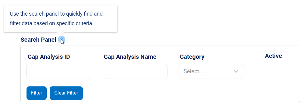
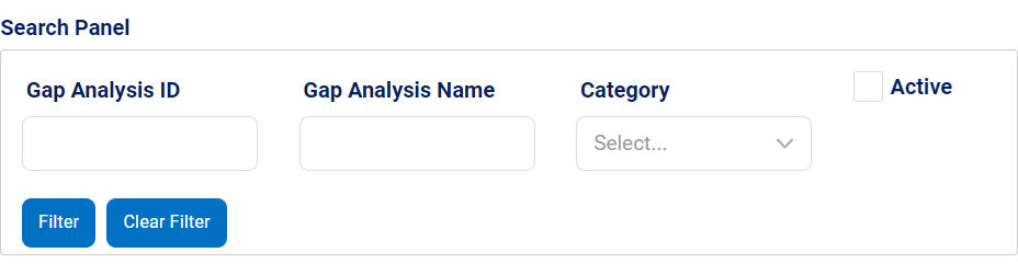
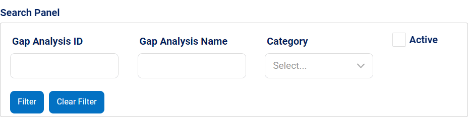
- Search Panel Control Preview: Web View
-
![]()
- To filter results according to the entered search criteria, click on the Filter button.
- To clear the filters and see the full data set again, click on the Clear Filter button.