
In the Binding category, users can link a single-select dropdown to its corresponding attribute and define its binding properties.
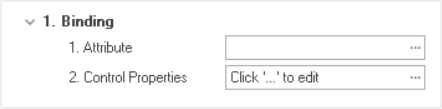
- Attribute: This field allows users to select the attribute associated to the single-select dropdown control.
- To access the list of relevant attributes, click on the ellipses (
![]() ) inside the field.
) inside the field.
![]()
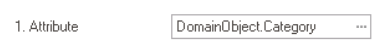
- Once an attribute has been selected, it will populate the Attribute field.
![]()
- To access the list of relevant attributes, click on the ellipses (
 ) inside the field.
- Control Properties: This field allows users to configure the control properties.
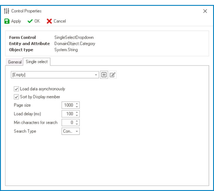
- To access the control properties, click on the ellipses (
![]() ) inside the field. In the displayed window, navigate to the Single-Select tab.
) inside the field. In the displayed window, navigate to the Single-Select tab.
![]()
- Dropdown Data Source: This field retrieves the list of dropdown data sources available in either the application or system. Depending on the data source chosen in this field, the available options for selection in the single-select dropdown control will vary.
- To define a new dropdown data source, select the
![]() button.
button.
- It will display the Query Editor window, in which users can configure static or dynamic items.
- To modify an existing dropdown data source, select the
![]() button.
button. - To remove a dropdown data source, select the
![]() button.
button.
- This button will only be visible once users have added/selected a dropdown data source.
- This button will only be visible once users have added/selected a dropdown data source.
- To define a new dropdown data source, select the
- Load Data Asynchronously: This is a checkbox which, if selected, allows the dropdown data to be retrieved in the background while the user interacts with other parts of the application.
- Selecting this checkbox will speed up the display of dropdown options, improving performance.
- Sort By Display Member: This is a checkbox which, if selected, allows users to sort the dropdown options by their display values, instead of their original order in the data source.
- Users can specify the display member by editing the query in the Query Editor window
- Page Size: This field allows users to set the number of items that are displayed in the dropdown at one time.
- By default, the size is set to 1000. To adjust this size, users can enter numbers into the field either manually or by clicking the increment/decrement arrows.
- Tip: How to Change Page Size for All Dropdowns
The information in this window is saved in the MetaInfo field of BPMS_PhysicalFormBinding as an XML document. Therefore, to change the page size for all dropdowns in the application, users can apply a query like this:
UPDATE [ray].[BPMS_PhysicalFormBinding]
SET MetaInfo = REPLACE(MetaInfo, '<MaxResults>20</MaxResults>', '<MaxResults>100</MaxResults>')
WHERE MetaInfo LIKE '%<MaxResults>20</MaxResults>%' AND ApplicationName = 'yourAppName' AND MetaInfo LIKE '%<AutoCompleteMeta%'
- By default, the size is set to 1000. To adjust this size, users can enter numbers into the field either manually or by clicking the increment/decrement arrows.
- Load Delay (ms): This field allows users to set the amount of time, in milliseconds, that the single-select dropdown control will wait before loading or displaying its options.
- By default, this value is set to 100. To adjust this value, users can enter numbers into the field either manually or by clicking the increment/decrement arrows.
- Min Characters for Search: This field allows users to specify the minimum number of characters a user must input into the search field before the search function is activated.
- By default, the minimum value is set to 0. To adjust this value, users can enter numbers into the field either manually or by clicking the increment/decrement arrows.
- By default, the minimum value is set to 0. To adjust this value, users can enter numbers into the field either manually or by clicking the increment/decrement arrows.
- Search Type: This field displays the list of search types. It allows users to choose how the search function will match their search query with the available options.
- Search Types: Contains, Starts With, or Ends With.
- Contains: This option will return results that include the search query anywhere in the text.
- Starts With: This option will return results that begin with the search query.
- End With: This option will return results that end with the search query.
- Search Types: Contains, Starts With, or Ends With.
- Apply: This button allows users to save their changes.
- OK: This button allows users to save their changes and exit the Control Properties window.
- Cancel This button allows users to cancel their changes and exit the Control Properties window.
- Dropdown Data Source: This field retrieves the list of dropdown data sources available in either the application or system. Depending on the data source chosen in this field, the available options for selection in the single-select dropdown control will vary.
- To access the control properties, click on the ellipses (
 button.
 button.
 button.