
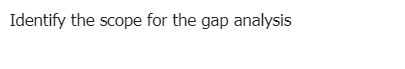
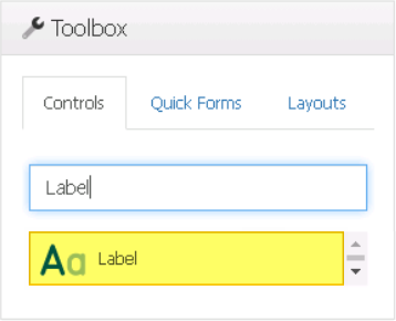
Label controls are a simple yet effective way to display descriptive text or titles for various form elements, providing users with clear guidance and context for their input.
When a label control is selected in the design environment, its associated properties are displayed in the Control Properties panel.
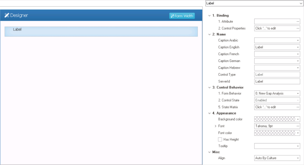
- Binding: In this category, users can link a control to its corresponding attribute and define its binding properties.
- For more information on the fields in this category, click here.
- Name: In this category, users can set the caption that will be displayed as the label in the web application. They can also access basic properties required for the control’s identification and proper referencing in the code.
- Caption: This field allows users to input the text that will be displayed as the label in the web application.
- As English is set as the default language in the system, any caption inputted in the English caption field will be used as the display caption for the control, regardless of other language options that may be available.
- As English is set as the default language in the system, any caption inputted in the English caption field will be used as the display caption for the control, regardless of other language options that may be available.
- Control Type: This field displays the control type. It cannot be modified.
- Server ID: This is a text field that allows users to input the Server ID for the control.
- Server ID refers to the name used to call the control in the code.
- Caption: This field allows users to input the text that will be displayed as the label in the web application.
- Control Behavior: In this category, users can configure the behavior of the control and define how it interacts with the form or application.
- Form Behavior: This is a single-select dropdown field that retrieves the list of form behaviors (from the Form Behavior section of the Forms module). It allows users to select the form behavior associated to the control.
- Any state or validation properties set for the control will apply only to the selected form behavior.
- Any state or validation properties set for the control will apply only to the selected form behavior.
- Control State: This field displays the current state of the control.
- Control States
- Enabled: This option allows for the control to be visible and editable in the web application.
- Disabled: This option allows for the control to be visible but not editable in the web application.
- Invisible: This option allows for the control to be hidden in the web application.
- State Matrix: This field allows users to configure the control state properties.
- To access the control state properties, click on the ellipses (
![]() ) inside the field.
) inside the field.
![]()
- Form Behavior: This field displays the form behavior.
- All form behaviors linked to associated form will be listed in this window.
- Control State: This is a single-select dropdown field that displays the list of control states. It allows users to modify the current control state of the form behavior.
- Apply: This button allows users to save their changes.
- OK: This button allows users to save their changes and close the window.
- Cancel: This button allows users to cancel their changes and close the window.
- Form Behavior: This field displays the form behavior.
- To access the control state properties, click on the ellipses (
- Form Behavior: This is a single-select dropdown field that retrieves the list of form behaviors (from the Form Behavior section of the Forms module). It allows users to select the form behavior associated to the control.
- Appearance: In this category, users can customize the visual appearance of the control’s caption.
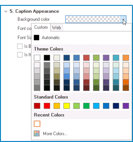
- Background Color: This is a single-select dropdown field that allows users to choose the background color of the caption text.
- It contains two tabs: Custom and Web.
![]()
- In the Custom tab, users can choose a background color by selecting a color from a color picker. The color picker offers a selection of theme colors, standard colors, and the ability to create custom colors.
- In the Web tab, users can select a background color from a scrollable list. The list displays a range of specific colors, each with its own name, allowing users to easily choose from pre-defined options.
- After choosing a background color, the control will update to reflect the new color scheme.
- It contains two tabs: Custom and Web.
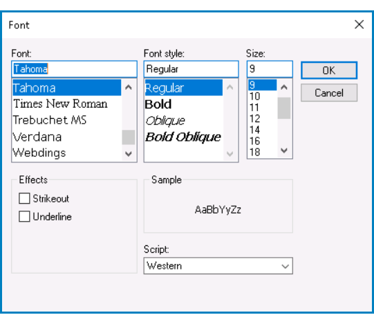
- Font: This field allows users to configure the font properties for the caption text.
- To configure all font properties at once, click on the ellipses (
![]() ) inside the field.
) inside the field.
- Configuring All Font Properties
- If the ellipses button is selected, the Font window will appear.
![]()
- Font: This field allows users to choose the font family from a scrollable list of options.
- Font Style: This field allows users to choose the font style from a scrollable list of options.
- Depending on the font family selected, the options displayed in this list may vary.
- Depending on the font family selected, the options displayed in this list may vary.
- Size: This field allows users to choose the font size from a scrollable list of options.
- Users can also simply type in a specific font size.
- Users can also simply type in a specific font size.
- Effects: In this section, users can modify the appearance of the text by applying common effects, such as strikeout and underline.
- Strikeout: This is a checkbox which, if selected, allows users to apply a strikeout effect to the text.
- Underline: This is a checkbox which, if selected, allows users to apply an underline effect to the text.
- Sample: This field displays a preview of how the text will look based on the chosen font family, style, size, and effect. It updates in real-time as the user makes changes to the font settings.
- Script: This field allows users to choose a specific script or writing system for the text from a dropdown menu.
- By selecting the appropriate script, users can ensure that their text is correctly displayed and formatted for the desired language or writing system.
- By selecting the appropriate script, users can ensure that their text is correctly displayed and formatted for the desired language or writing system.
- OK or Cancel: To save your changes and close the window, click on the OK button. To cancel your changes and close the window, click on the Cancel button.
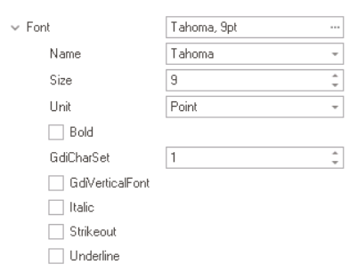
- To instead configure individual font properties, toggle the arrow (
![]() ) icon.
) icon.
- Configuring Individual Font Properties
- If the arrow icon is toggled, the following fields will appear:
![]()
- Name: This field allows users to choose the font family from a dropdown menu.
- Size: This field allows users to set the font size for the text.
- Users can enter a font size into this field either manually or by clicking the increment/decrement arrows.
- Users can enter a font size into this field either manually or by clicking the increment/decrement arrows.
- Unit: This field allows users to choose a specific unit of measurement for the font size from a dropdown menu
- Bold: This is a checkbox which, if selected, allows users to apply a bold effect to the text.
- GdiCharSet: This field allows users to specify the character set or encoding for the text.
- Users can enter a number into this field either manually or by clicking the increment/decrement arrows.
- GdiVerticalFont: This is a checkbox which, if selected, indicates that the selected font supports vertical writing.
- Vertical writing is commonly used in East Asian scripts such as Chinese, Japanese, and Korean.
- Vertical writing is commonly used in East Asian scripts such as Chinese, Japanese, and Korean.
- Italic: This is a checkbox which, if selected, allows users to apply an italic or slanted effect to the text.
- Strikeout: This is a checkbox which, if selected, allows users to apply a strikeout effect to the text.
- Underline: This is a checkbox which, if selected, allows users to apply an underline effect to the text.
- To configure all font properties at once, click on the ellipses (
- Font Color: This is a single-select dropdown field that allows users to choose the font color of the caption text.
- It also has two tabs, similar to the Background Color field, where users can select a color from a color picker or a scrollable list of pre-defined options.
- Has Height: This is a checkbox which, if selected, allows for automatic adjustment of the vertical spacing or line-height of the caption text, improving its readability or aesthetic appeal.
- If this checkbox is selected, a bottom margin of 12 px is automatically added to the label.
- Tooltip: This field allows users to input a tooltip for the control.
- In the web application, the tooltip is represented by the tooltip icon (
![]() ) next to the control.
) next to the control. - Label Tooltip Preview: Web View
-
![]()
- In the web application, the tooltip is represented by the tooltip icon (
- Background Color: This is a single-select dropdown field that allows users to choose the background color of the caption text.
- Misc: In this category, users can define additional properties for the control.
- Align: This is a single-select dropdown field that allows users to choose the alignment of the control.
- Alignment Options: Right, Center, Left, or Auto By Culture.
- Auto By Culture: This option aligns the control based on the language or culture setting in the web application.
- Right: This option aligns the control to the right side of the screen.
- Center: This option aligns the control to the center of the screen.
- Left: This option aligns the control to the left side of the screen.
- Alignment Options: Right, Center, Left, or Auto By Culture.
- Align: This is a single-select dropdown field that allows users to choose the alignment of the control.
 ) inside the field.
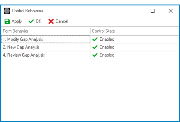
 ) icon.
 ) next to the control.
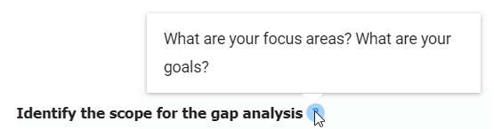
- Label Control Preview: Web View
-
![]()