
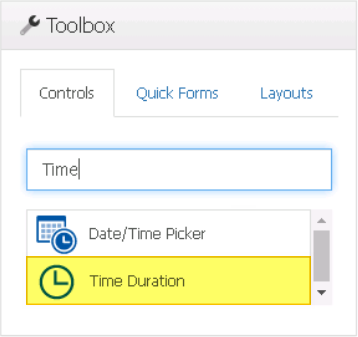
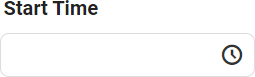
The time picker control allows users to select or input a specific time.
When a time duration control is selected in the design environment, its associated properties are displayed in the Control Properties panel.
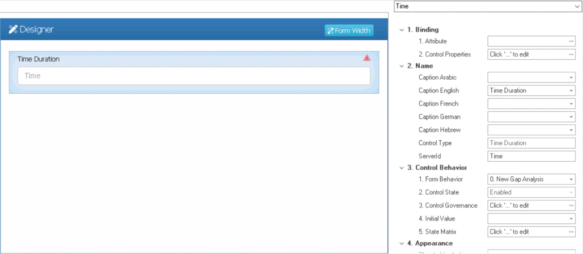
- Binding: In this category, users can link a control to its corresponding attribute and define its binding properties.
- For more information on the fields in this category, click here.
- Name: In this category, users can access basic properties required for the control’s identification and proper referencing in the code.
- For more information on these properties and how to configure them, click here.
- Control Behavior: In this category, users can configure the behavior of the control and define how it interacts with the form or application.
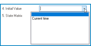
- Time Duration Initial Value
- When configuring the initial value for the time duration control, users can either set a specific time or select the Current Time option from the dropdown menu.
![]()
- For more information on these properties and how to configure them, click here.
- Appearance: In this category, users can customize the visual appearance of the control.
- For more information on these properties and how to configure them, click here.
- Caption Appearance: In this category, users can customize the visual appearance of the control’s caption.
- For more information on the fields in this category, click here.
- Time Duration Control Preview: Web View
-
![]()
- Quick Forms Application
- To apply the Quick Forms feature to time duration controls, take the following steps:
- Drag a time duration control from the toolbox and drop it onto the design environment.
- Provide a caption for the control.
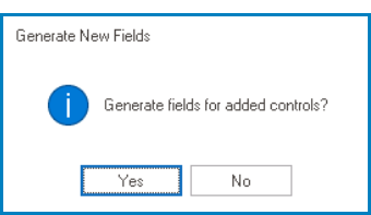
- Save the form and select Yes in response to the following prompt:
![]()