
Unlike checkbox controls, which allow users to select multiple options at once, radio button controls allow users to choose only one option from a set of mutually exclusive options.
When a radio button control is selected in the design environment, its associated properties are displayed in the Control Properties panel.
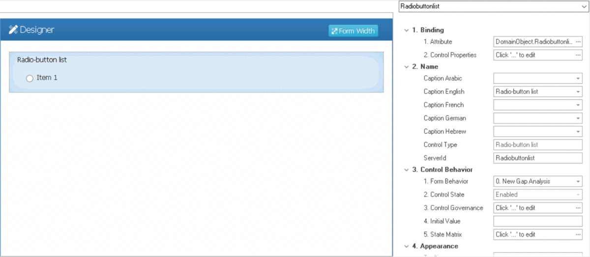
- Binding: In this category, users can link a control to its corresponding attribute and define its binding properties.
- For more information on the fields in this category, click here.
- Name: In this category, users can access basic properties required for the control’s identification and proper referencing in the code.
- For more information on these properties and how to configure them, click here.
- Control Behavior: In this category, users can configure the behavior of the control and define how it interacts with the form or application.
- Radio Button Initial Value
- Both the Initial Value field and the Selected checkbox (described below) are used to pre-select radio button options.
- If both properties are set, the Initial Value overrides the Selected checkbox.
- If the Initial Value matches a radio button option, that option will be pre-selected.
- If the Initial Value doesn’t match any option, nothing will be pre-selected.
- If the Initial Value is not set, the option with the Selected checkbox checked will be pre-selected.
- If both properties are set, the Initial Value overrides the Selected checkbox.
- For more information on these properties and how to configure them, click here.
- Appearance: In this category, users can customize the visual appearance of the control.
- Tooltip: This field allows users to input a tooltip for the control.
- In the web application, the tooltip is represented by the tooltip icon (
![]() ) next to the control.
) next to the control. - Radio Button Tooltip Preview: Web View
-
![]()
- In the web application, the tooltip is represented by the tooltip icon (
- Tooltip: This field allows users to input a tooltip for the control.
- Caption Appearance: In this category, users can customize the visual appearance of the control’s caption.
- For more information on the fields in this category, click here.
- Misc: In this category, users can define additional properties for the control.
- Items: This field allows users to create and customize items or options for the radio button.
- To access the List Items Editor, click on the ellipses (
![]() ) inside Items field.
) inside Items field.
![]()
- Add: This button allows users to add a new item.
- Once added, the new item will be displayed in the Items box and its properties will be shown in the Item section.
- Value: This is a text field that allows users to input the data value for the item.
- This value corresponds to a specific item in the radio button. When users select the item, the corresponding value is sent to the server, allowing it to be processed in the backend.
- This value corresponds to a specific item in the radio button. When users select the item, the corresponding value is sent to the server, allowing it to be processed in the backend.
- Caption: This is a text field that allows users to input the displayed name or caption of the item.
- As English is set as the default language in the system, any caption inputted in the English caption field will be used as the display caption for the item, regardless of other language options that may be available.
- As English is set as the default language in the system, any caption inputted in the English caption field will be used as the display caption for the item, regardless of other language options that may be available.
- Selected: This checkbox determines whether the radio button option is pre-selected or not.
- To pre-select an option, users must check the Selected checkbox for that option.
- To pre-select an option, users must check the Selected checkbox for that option.
- Enabled: This checkbox determines whether the radio button option is available for selection or not.
- To disable an option, users must uncheck the Enabled checkbox for that option.
- To disable an option, users must uncheck the Enabled checkbox for that option.
- Value: This is a text field that allows users to input the data value for the item.
- Once added, the new item will be displayed in the Items box and its properties will be shown in the Item section.
- Remove: This button allows users to remove a selected item.
- Up / Down: These buttons allow users to reorder the items in the list.
- To move an item up or down, select it from the list and click on the Up or Down button. This will move the selected item one position up or down in the list, respectively.
- OK: This button allows users to save their changes and exit the List Items Editor window.
- Add: This button allows users to add a new item.
- To access the List Items Editor, click on the ellipses (
- Repeat Columns: This field allows users to specify the number of columns in which the radio button options will be arranged.
- By default, the number of columns is set to 1. To adjust this value, users can enter numbers into the field either manually or by clicking the increment/decrement arrows.
- Repeat Directions: This field allows users to specify the direction in which the radio button options will be arranged.
- Directions: Vertical or Horizontal.
- Horizontal: This option arranges the radio button options in rows from left to right.
- Vertical: This option arranges the radio button options in columns from top to bottom.
- Directions: Vertical or Horizontal.
- Items: This field allows users to create and customize items or options for the radio button.
 ) next to the control.
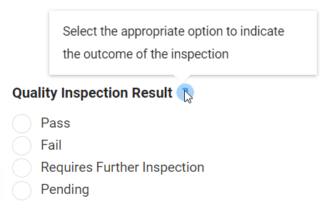
 ) inside Items field.
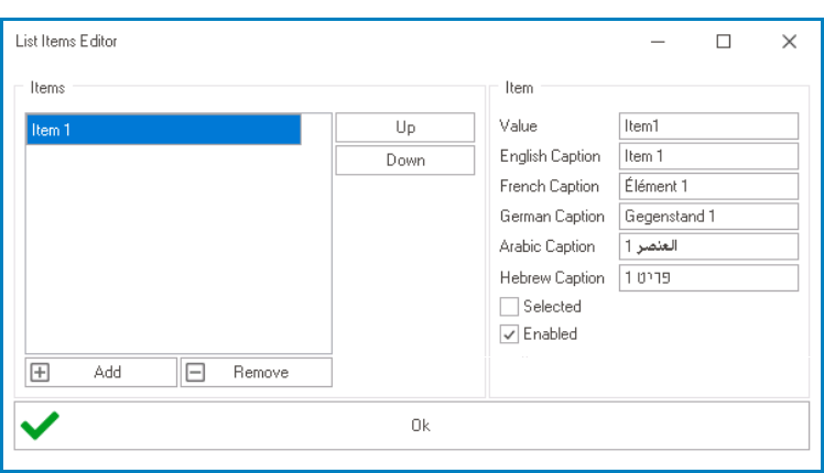
- Radio Button Control Preview: Web View
-
![]()
- Customizing Radio Button Control: Web View
- Design A – Pre-Selected Option (Active); Design B – Direction: Vertical; Design C – Direction: Horizontal; Design D – Columns: 3, Direction: Vertical
; Design B – Direction: Vertical; Design C – Direction: Horizontal; Design D – Columns: 3, Direction: Vertical")
; Design B – Direction: Vertical; Design C – Direction: Horizontal; Design D – Columns: 3, Direction: Vertical")
- Quick Forms Application
- To apply the Quick Forms feature to radio button controls, take the following steps:
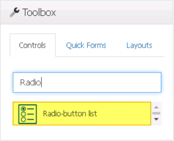
- Drag a radio button control from the toolbox and drop it onto the design environment.
- Provide a caption for the control.
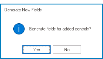
- Save the form and select Yes in response to the following prompt:
![]()