
Map controls are useful tools that enable users to navigate, explore, and interact with geographic data. With these controls, users can manipulate maps, zoom in and out, pan across different regions, and extract valuable insights from spatial information.
When a map control is selected in the design environment, its associated properties are displayed in the Control Properties panel.
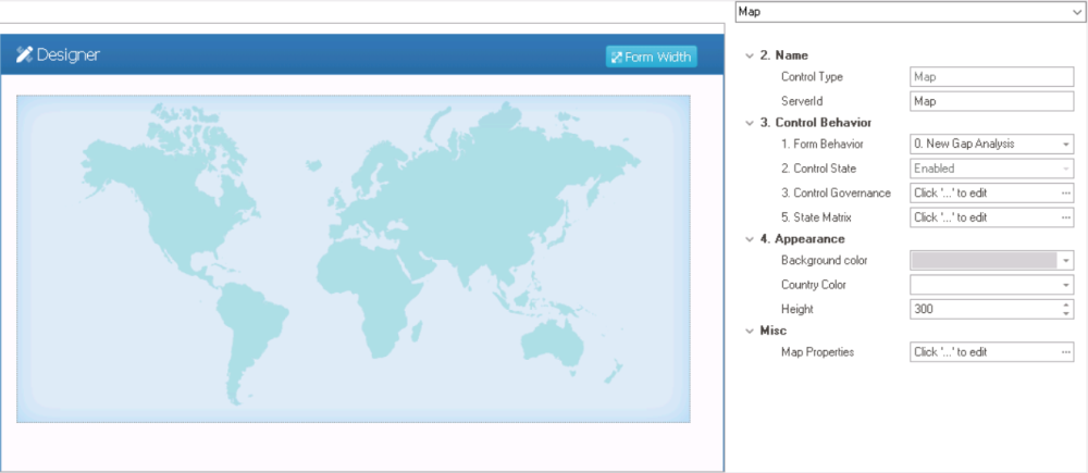
- Name: In this category, users can access basic properties required for the control’s identification and proper referencing in the code.
- Control Type: This field displays the control type. It cannot be modified.
- Server ID: This is a text field that allows users to input the Server ID for the control.
- Server ID refers to the name used to call the control in the code.
- Control Behavior: In this category, users can configure the behavior of the control and define how it interacts with the form or application.
- Form Behavior: This is a single-select dropdown field that retrieves the list of form behaviors (from the Form Behavior section of the Forms module). It allows users to select the form behavior associated to the control.
- Any state properties set for the control will apply only to the selected form behavior.
- Any state properties set for the control will apply only to the selected form behavior.
- Control State: This field displays the current state of the control.
- Control States
- Enabled: This option allows for the control to be visible and editable in the web application.
- Disabled: This option allows for the control to be visible but not editable in the web application.
- Invisible: This option allows for the control to be hidden in the web application.
- Control Governance: This field allows users to configure various properties that govern the functionality of controls.
- To access the control governance properties, click on the ellipses (
![]() ) inside the field.
) inside the field.
![]()
- Enable View: This is a checkbox which, if selected, allows users to enable view mode for the control.
- If this checkbox is selected, it will enable the View Form Behavior field.
- View Form Behavior: This is a single-select dropdown field that retrieves the list of form behaviors (from the Form Behavior section of the Forms module). It allows users to select the form behavior linked to the control’s ‘view’ functionality.
- To define a new form behavior, select the
![]() button.
button.
- It will display the Form Behavior Properties window.
- To modify an existing form behavior, select the
![]() button.
button. - To remove a form behavior, select the
![]() button.
button.
- To define a new form behavior, select the
- Apply: This button allows users to save their changes.
- OK: This button allows users to save their changes and close the window.
- Cancel: This button allows users to cancel their changes and close the window.
- Enable View: This is a checkbox which, if selected, allows users to enable view mode for the control.
- To access the control governance properties, click on the ellipses (
- State Matrix: This field allows users to configure the control state properties.
- To access the control state properties, click on the ellipses (
![]() ) inside the field.
) inside the field.
![]()
- Form Behavior: This field displays the form behavior.
- All form behaviors linked to associated form will be listed in this window.
- Control State: This is a single-select dropdown field that displays the list of control states. It allows users to modify the current control state of the form behavior.
- Control Governance: This field allows users to configure the control governance properties.
- If selected, it will display the Form / Behavior / Control window (described above).
- Apply: This button allows users to save their changes.
- OK: This button allows users to save their changes and close the window.
- Cancel: This button allows users to cancel their changes and close the window.
- Form Behavior: This field displays the form behavior.
- To access the control state properties, click on the ellipses (
- Form Behavior: This is a single-select dropdown field that retrieves the list of form behaviors (from the Form Behavior section of the Forms module). It allows users to select the form behavior associated to the control.
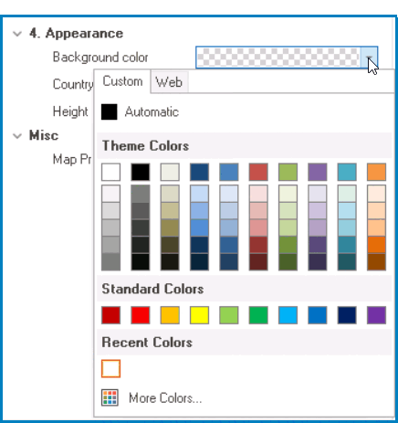
- Appearance: In this category, users can customize the visual appearance of the control.
- Background Color: This is a single-select dropdown field that allows users to choose the background color of the map control.
- It contains two tabs: Custom and Web.
![]()
- In the Custom tab, users can choose a background color by selecting a color from a color picker. The color picker offers a selection of theme colors, standard colors, and the ability to create custom colors.
- In the Web tab, users can select a background color from a scrollable list. The list displays a range of specific colors, each with its own name, allowing users to easily choose from pre-defined options.
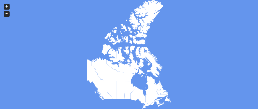
- Map Background Color Preview: Web View
-
![]()
- It contains two tabs: Custom and Web.
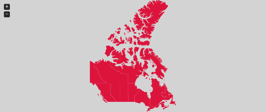
- Country Color: This is a single-select dropdown field that allows users to choose the color of the countries in the map control.
- It also has two tabs, similar to the Background Color field, where users can select a color from a color picker or a scrollable list of pre-defined options.
- Map Country Color Preview: Web View
-
![]()
- Height: This is a numeric updown field that allows users to set the height of the control.
- By default, the height is set to 300. To adjust this size, users can enter numbers into the field either manually or by clicking the increment/decrement arrows.
- Background Color: This is a single-select dropdown field that allows users to choose the background color of the map control.
- Misc: In this category, users can define additional properties for the control.
- Map Properties: This field allows users to configure the gauge properties.
- To access the map properties, click on the ellipses (
![]() ) inside the field.
) inside the field.
- It will display the Map Editor Form window.
- To access the map properties, click on the ellipses (
- Map Properties: This field allows users to configure the gauge properties.
 ) inside the field.
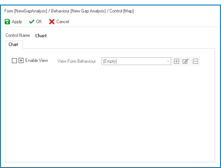
 button.
 button.
 button.
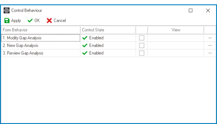
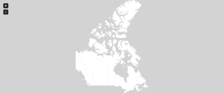
- Map Control Preview: Web View
-
![]()