
In the Form Entity tab, users can modify the form properties and create local attributes for the form.
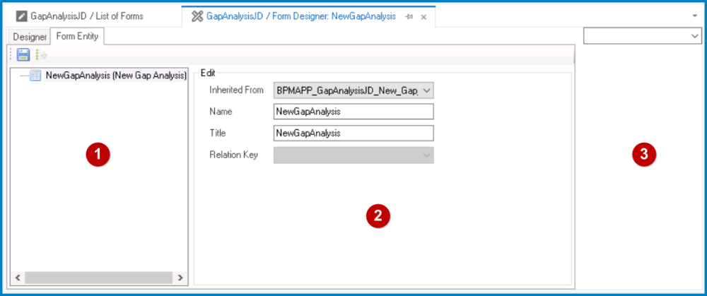
There are three primary components to the Form Entity tab:
- Attribute Tree
In the Attribute Tree, users can manage the attributes defined for the form entity, including creating and deleting form-specific local attributes.
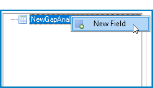
- To create a local attribute for the form, right-click on the form entity and select New Field from the context menu. It will generate a new field below the form entity, which can then be customized and defined to suit the needs of the form.
![]()
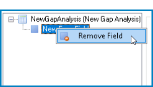
- To remove a local attribute, right-click on the attribute and select Remove Field from the context menu.
![]()
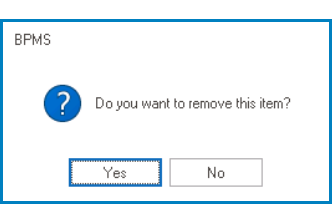
- If this option is selected, users will be alerted of the action with the following confirmation message:
![]()
- Yes or No: To confirm the removal, click on the Yes button. To cancel, click on the No button.
- If this option is selected, users will be alerted of the action with the following confirmation message:
- Edit Properties
In the Edit Properties pane, users can modify the properties of the currently selected attribute or form entity.
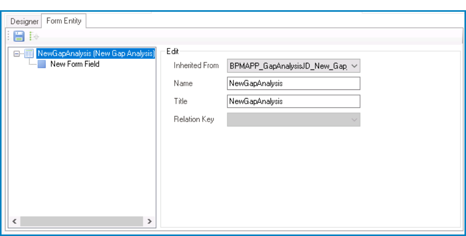
- To modify the properties of the form entity, select it from the Attribute Tree. This will display the associated properties in the Edit Properties pane.
![]()
- Inherited From: This is a single-select dropdown field that retrieves the list of entities (from the Entity Designer section of the Entities module). It allows users to select or modify the entity associated with the form.
- Name: This field displays the name of the form entity.
- Users can modify this field as needed.
- Title: This field displays the title of the form entity.
- Users can modify this field as needed.
- Relation Key: This field displays the relation key for the form.
- Users cannot modify this field.
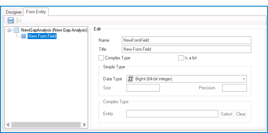
- To define or modify the properties of an attribute, select it from the Attribute Tree. This will display the associated properties in the Edit Properties pane,
![]()
- Name: This is a text field that allows users to input the name of the attribute.
- There are the following rules determining the validity of names:
- A valid name can contain letters, numbers, and the underscore symbol. It cannot, however, contain spaces or other special characters. It also cannot begin with a number.
- A form must have a unique name. It cannot have the same name as another form in the application.
- There are the following rules determining the validity of names:
- Title: This is a text field that allows users to input the title of the attribute.
- The title inputted in this field will be used to identify the attribute in the Attribute Tree.
- Unlike with names, there are no rules determining the validity of titles.
- Complex Type: This is a checkbox which, if selected, allows the control to reference data from another form or entity.
- This field is used when the control is not directly tied to the form.
- Is a List: This is a checkbox which, if selected, allows the control to hold multiple instances of the attribute’s value, effectively creating a list of data.
- This field is used when the control is expected to display and/or manage a collection of data.
- Simple Type: In this section, users can define the properties of an attribute that stores a single, simple value within the form.
- Data Type: This is a single-select dropdown field that displays the list of data types. It allows users to select the data type for the attribute.
- By choosing the appropriate data type, users can ensure that the attribute’s value is properly formatted and validated within the form.
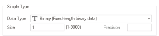
- Size: This is a numeric field that allows users to input the size of the data type associated with the attribute.
- Depending on the data type selected, this field may be enabled or disabled. For data types that require a specific size (such as Binary, Char, and Decimal), users must input a size within the given range of values.
![]()
- Depending on the data type selected, this field may be enabled or disabled. For data types that require a specific size (such as Binary, Char, and Decimal), users must input a size within the given range of values.
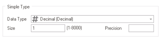
- Precision: This is a numeric field that allows users to input the precision of the decimal places for decimal or numeric data types associated with the attribute.
- This field will only be enabled if Decimal or Numeric (Decimal) are selected as data types.
![]()
- This field will only be enabled if Decimal or Numeric (Decimal) are selected as data types.
- Data Type: This is a single-select dropdown field that displays the list of data types. It allows users to select the data type for the attribute.
- Complex Type: In this section, users can select the form or entity from which the attribute will reference data.
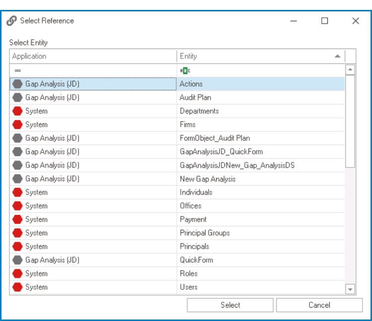
- Select: This button allows users to select the referenced form or entity.
- It will display the Select Reference window.
![]()
- Select or Cancel: To confirm the selection, click on the Select button. To cancel the selection, click on the Cancel button.
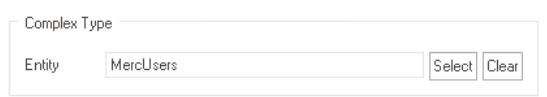
- Once selected, the form or entity will populate the Entity field.
![]()
- It will display the Select Reference window.
- Clear: This button allows users to clear the selected form or entity from the Entity field.
- Select: This button allows users to select the referenced form or entity.
![]() : This button allows users to save their changes.
: This button allows users to save their changes.![]() : This button allows users to automatically sort all attributes listed in the tree in ascending order.
: This button allows users to automatically sort all attributes listed in the tree in ascending order.
- Name: This is a text field that allows users to input the name of the attribute.
 : This button allows users to save their changes.
 : This button allows users to automatically sort all attributes listed in the tree in ascending order.
- Control Properties
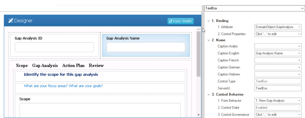
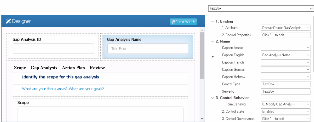
In the Control Properties panel, users can view and modify the properties of a selected layout or control. To select a layout or control, either click on it from the design environment or choose it from the dropdown menu in the panel.
To resize this panel, take the following steps:
- Hover the cursor over the edge of the panel’s left-side border (as shown below).
![]()
- Click and drag the cursor until you get the desired size.
![]()