
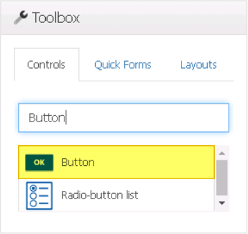
Buttons are an essential element in form development, allowing users to interact with forms in a variety of ways. With buttons, users can store and send form information, trigger actions and events, and execute custom code to perform specific tasks.
When a button control is selected in the design environment, its associated properties are displayed in the Control Properties panel.
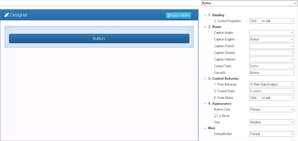
- Binding: In this category, users can define the binding properties of the control.
- Control Properties: This field allows users to configure the control properties.
- For more information on these properties and how to configure them, click here.
- Control Properties: This field allows users to configure the control properties.
- Name: In this category, users can access basic properties required for the control’s identification and proper referencing in the code.
- For more information on these properties and how to configure them, click here.
- Control Behavior: In this category, users can configure the behavior of the control and define how it interacts with the form or application.
- For more information on these properties and how to configure them, click here.
- Appearance: In this category, users can customize the visual appearance of the control.
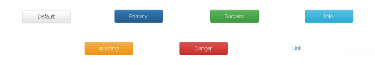
- Button Color: This is a single-select dropdown field that allows users to choose the color of the button.
- Button Colors: Default, Primary, Success, Info, Warning, Danger, or Link.
- Button Color Preview: Design View vs. Web View
-
![]()
- Button Colors: Default, Primary, Success, Info, Warning, Danger, or Link.
- Is Block: This is a checkbox which, if selected, allows the button to expand to fill the available space within the layout box.
- If this checkbox is left unselected, the button will be sized according to its content, and may not take up the full width of the box.
- Button Width Preview: Is Block Checkbox (Unselected/Selected)
-
![]()
- If this checkbox is left unselected, the button will be sized according to its content, and may not take up the full width of the box.
- Size: This is a single-select dropdown field that allows users to choose the size of the button.
- Button Sizes: Large, Medium, Small, or Tiny.
- Button Size Preview: Web View
-
![]()
- Button Sizes: Large, Medium, Small, or Tiny.
- Button Color: This is a single-select dropdown field that allows users to choose the color of the button.
- Misc: In this category, users can define additional properties for the control.
- Default Action: This is a single-select dropdown field that allows users to choose the default action of the button.
- Button Actions: Default, Submit, or Save.
- Default: This action allows the button to perform a specific action that can be configured by code.
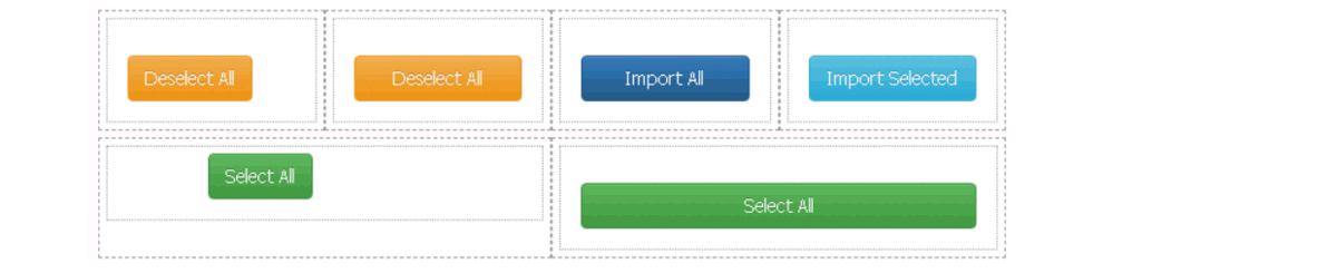
- Users, for example, can configure the button to perform tasks such as selecting all items in a given grid, importing items from one grid to another, or copying a previous form’s content.
- Submit: This action allows the button to submit the form.
- Save: This action allows the button to save the form.
- Default: This action allows the button to perform a specific action that can be configured by code.
- Button Actions: Default, Submit, or Save.
- Default Action: This is a single-select dropdown field that allows users to choose the default action of the button.