For those unfamiliar with using the interactive charts in the DBP web application, the following instructions will guide you through the process:
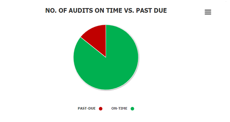
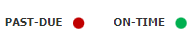
- Chart Legend: This is a graphical element that provides a key for the data series displayed in the chart.
![]()
- It includes color-coded labels or symbols that correspond to the data being displayed. Users can refer to the legend to better understand the data represented in the chart.
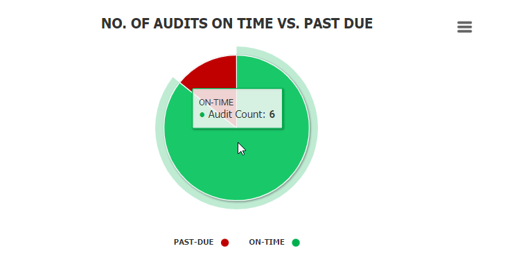
- Chart Tooltip: This is a graphical element that appears when the user hovers over a data point or marker in the chart.
![]()
- It displays additional information about the data point, such as the label, value, or other contextual details. Users can use the tooltip to gain more insight into the data represented in the chart.
- Drilldown Reports: These are data reports that users can access by double-clicking on the different data points in the chart. They allow users to navigate from the summary report visualized by the chart to the detailed report that created it.
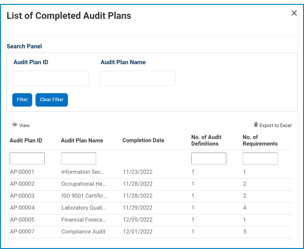
- For example, if users were to double-click on the sector of the pie chart representing audits that have been completed on time, a modal window would appear with the following form:
![]()
- For example, if users were to double-click on the sector of the pie chart representing audits that have been completed on time, a modal window would appear with the following form:
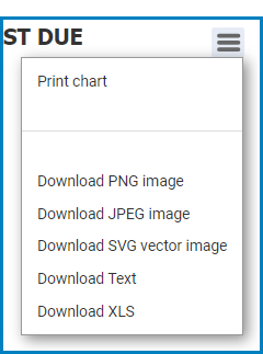
- Chart Context Menus: These are hamburger buttons which, when collapsed, display a list of options that allow users to either print or download the chart.
- Icon:
![]()
- If selected, it will display the following menu:
![]()
- Icon: