
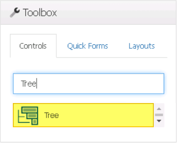
The tree control is a useful tool for displaying and navigating hierarchical data. With its intuitive structure and interactive features, this control simplifies the exploration, manipulation, and visualization of hierarchical information, making it an essential component for managing and presenting complex data relationships.
When a tree control is selected in the design environment, its associated properties are displayed in the Control Properties panel.
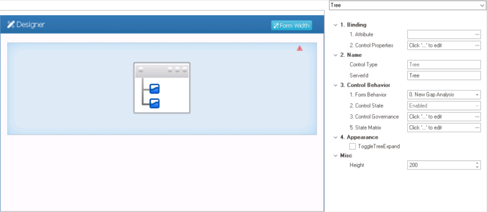
- Binding: In this category, users can link a control to its corresponding attribute and define its binding properties.
- For more information on the fields in this category, click here.
- Name: In this category, users can access basic properties required for the control’s identification and proper referencing in the code.
- Control Type: This field displays the control type. It cannot be modified.
- Server ID: This is a text field that allows users to input the Server ID for the control.
- Server ID refers to the name used to call the control in the code.
- Control Behavior: In this category, users can configure the behavior of the control and define how it interacts with the form or application.
- Control Governance
-
- In the Control Governance field, users can configure various properties that govern the functionality of controls.
- To access the control governance properties, click on the ellipses (
![]() ) inside the field. It will display the Form / Behavior / Control window.
) inside the field. It will display the Form / Behavior / Control window.
- This window consists of two tabs:
- Tree Behavior
- Validation
- This window consists of two tabs:
- To access the control governance properties, click on the ellipses (
- In the Control Governance field, users can configure various properties that govern the functionality of controls.
- For more information on these properties and how to configure them, click here.
- Appearance: In this category, users can customize the visual appearance of the control.
- Toggle Tree Expand: This is a checkbox which, if selected, enables a toggle functionality that allows users to expand or collapse the tree nodes with a single click or interaction.
- Toggle Tree Expand Preview: Web View
-
![]()
- Toggle Tree Expand: This is a checkbox which, if selected, enables a toggle functionality that allows users to expand or collapse the tree nodes with a single click or interaction.
- Misc: In this category, users can define additional properties for the control.
- Height: This is a numeric updown field that allows users to set the height of the control.
- By default, the height is set to 200. To adjust this size, users can enter numbers into the field either manually or by clicking the increment/decrement arrows.
- Height: This is a numeric updown field that allows users to set the height of the control.
 ) inside the field. It will display the Form / Behavior / Control window.
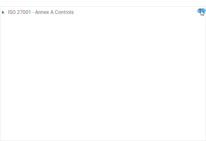
- Tree Control Preview: Web View
-
![]()
