
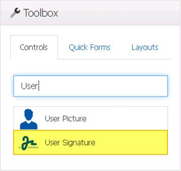
With the user signature control, user signatures can be dynamically displayed on forms.
When a user signature control is selected in the design environment, its associated properties are displayed in the Control Properties panel.

- Binding: In this category, users can link a control to its corresponding attribute.
- Attribute: This field allows users to select the attribute associated to the control.
- To access the list of relevant attributes, click on the ellipses (
![]() ) inside the field.
) inside the field.
![]()
- Once an attribute has been selected, it will populate the Attribute field.
![]()
- To access the list of relevant attributes, click on the ellipses (
- Attribute: This field allows users to select the attribute associated to the control.
 ) inside the field.
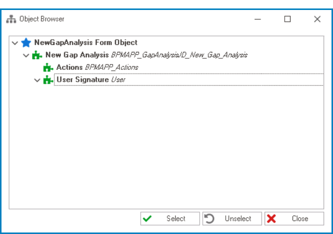

- Name: In this category, users can access basic properties required for the control’s identification and proper referencing in the code.
- Control Type: This field displays the control type. It cannot be modified.
- Server ID: This is a text field that allows users to input the Server ID for the control.
- Server ID refers to the name used to call the control in the code.
- Control Behavior: In this category, users can configure the behavior of the control and define how it interacts with the form or application.
- User Signature Initial Value
- An option for the user signature control is to set the initial value to the current user’s signature. This means that when the form is opened, the control will automatically display the signature for the user associated with the current session.
![]()
- For more information on these properties and how to configure them, click here.
- Appearance: In this category, users can customize the visual appearance of the control.
- Height: This is a numeric updown field that allows users to set the height of the control.
- By default, the height is set to 128. To adjust this size, users can enter numbers into the field either manually or by clicking the increment/decrement arrows.
- Height: This is a numeric updown field that allows users to set the height of the control.
- Misc: In this category, users can define additional properties for the control.
- Location: This is a single-select dropdown field that allows users to choose the location of the control.
- Location Options: Right, Center, or Left.
- Right: This option places the control on the right-hand side of the screen.
- Center: This option centers the control in the middle of the screen.
- Left: This option places the control on the left-hand side of the screen.
- Location Options: Right, Center, or Left.
- Location: This is a single-select dropdown field that allows users to choose the location of the control.

- User Signature Control Preview: Web View
- If the initial value is set to the current user’s signature, the user signature control will function in the following manner:
![]()
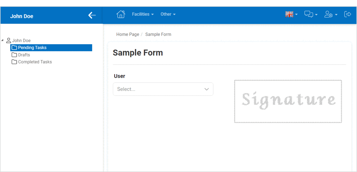
- If the user signature is instead set to be dependent on another control, such as a dropdown, its function will vary based on the user’s selection.
![]()
- If the initial value is set to the current user’s signature, the user signature control will function in the following manner: