
This article introduces you to the Builder interface. Click one of the bullet headings to go to a step by step article on the selected topic.
Left Pane
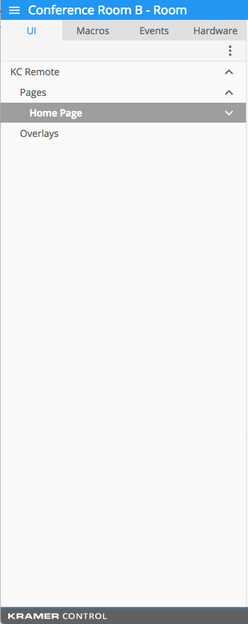
- “UI”: – the graphic layout that is viewed by your end user. You configure the user interface using the Builder.
The user interface includes, but is not limited to:- Backgrounds
- Device controls such as:
- Cursor commands
- Scene controls
- Lighting sliders
- Macros – saved sequences of commands that can be initiated with a single button press.
The following is an example of a macro that turns a system on to an Apple TV device. This macro is the first step in creating a universal remote:
- Power ON the display (TV, Projector)
- Select the source on the switcher. (A display or another device can be used as the switcher.)
- Power ON the audio device. (The sound can be directed through a display or another device.)
- Execute the Menu command on the Apple TV to wake up the unit.
- Events – scheduled actions that are executed when certain conditions are met. The three types of events are:
- State based – executed when a condition or set of conditions are met within the system.
For example: When System State = ON, execute Light ON Command in Zone 1 - Interval – executed after a defined amount of time.
For example: If you have a device that requires a wake up, you can execute the wake up command every 30 minutes. - Absolute time – executed at a pre-determined time of day.
For example: Every day at 11pm the system performs the system OFF macro. OR At sunrise the lights turn OFF and at sunset the lights turn ON.
- State based – executed when a condition or set of conditions are met within the system.
- Hardware: – methods in which your user interface communicates with the controlled hardware.
Hardware includes, but are not limited to:- Brain hardware
- Kramer Hardware
- Telnet or HTTP connections
Center Pane

The center pane is your design pane where all editing is done. The user interface, macros, events and gateways are all configured within this pane.
The design tools used in the center pane include:
The center pane also includes the Properties Section where you can edit:
- Font style
- Font color
- Background color
- Images
Right Pane
The right pane includes the following tabs:
Top Icons in blue section (from left)
- First icon
- Hides the left pane enlarging the center pane
- Second icon
- Hides the properties section of the center pane
- Third icon
- Hides the right pane enlarging the center pane
- Fourth icon
- Publishes changes to the brain
- Last icon
- Saves changes to the cloud without publishing to the brain
Devices tab – where you search and import your device drivers. Each device driver contains:
- Capabilities – executable commands. For example: Power On, Input 1, Power Off
- States – used to track information on the device. For example: Power State = On, Off, Standby, Powering down
- Device references – devices used within another space, but can still be used within the space currently being designed.
For example: a video matrix switcher that is housed in space A, and also affects spaces B – D. Instead of importing the same device four times (once for each space) you can use the reference device in each space, eliminating the need to assign four devices to a single gateway. This is one piece of hardware connected to a single gateway and referenced in multiple spaces.
All devices include Capabilities and States that can be used within the user interface to build macros and events.
Device references can only be imported when you have multiple spaces within a Project.
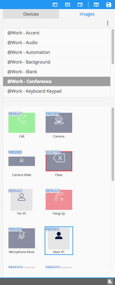
Images tab – where you find the previously imported images to used for backgrounds and buttons. Each image can contain the following multiple states:
- Default – appears on the initial display of the user interface. This image is static on the interface until affected by a button being pressed, or another event.
- Pressed – appears while the button is being clicked. Typically the pressed image has some kind of hue surrounding the image to indicate a change in state.
- Selected – appears after clicking and releasing the button. The selected state of an image indicates to the user that this was the last pressed button in the user interface.
- Disabled – appears when the button is no longer active. For example, when a toggle command cannot be executed after system power on, the disabled button image is displayed.
Réaction
Laissez votre avis sur ce sujet.