
The value graph provides finer control over temporal interpolation between keyframes.
The graph plots the value of the most recently selected property against time, with a line representing the change in value. As you add keyframes, the graph visually represents the change in value.
Take a look at this example:
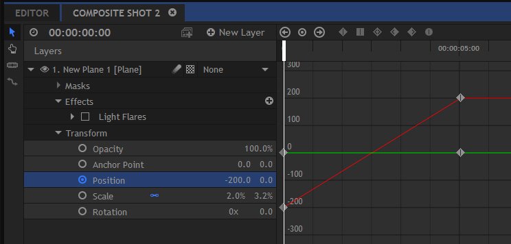
This graph is showing the Position property, which is highlighted in the layer list on the left. The position property draws two separate lines on the graph, one for the X coordinate (red) and one for the Y coordinate (green). In this particular example you can tell at a glance that the layer has been animated to move from left to right over the course of 5 seconds.
The keyframe at the left shows the X value (red) at -200, while the Y value (green) is at 0. This means the layer is positioned to the left of center by 200 pixels. The second keyframe, at 5 seconds, shows that the Y value has not changed, so the layer has not moved vertically. The X value has changed to 200, with the red line drawn between the two keyframes revealing a linear animation from left to right.
Here is that same animation, with the keyframe on the right changed to Smooth In interpolation:
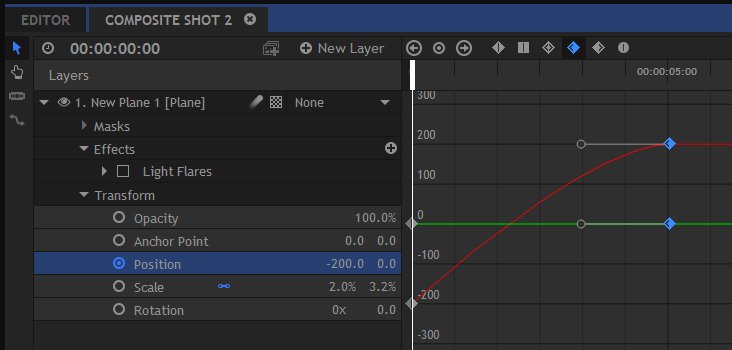
Note how the smoothed keyframe is represented on the graph by a gradual curve. In the first image a straight line was drawn between the keyframes, representing a linear move. The curve in this second example shows that the speed of the value change alters over time. At the start of the animation, close to the first keyframe, the angle of the curve is steeper, meaning that the animation here is faster. As the curve becomes less steep, the animation slows down, creating a gentle shift into the value of the second keyframe.
Keyframes on the Value Graph
Keyframes function similarly on the value graph as they do in the normal timeline view. You can use the controls at the top of the timeline to jump between keyframes and to switch temporal interpolation type. See Animating with Keyframes for full details.
Additionally, when in a keyframe mode other than linear or constant you will be presented with bezier handles. These can be used to fine tune the shape of the curve.
Scaling the Graph ![]()

The scale of the graph is different for each property. With the auto zoom feature turned on the graph will automatically scale appropriately so as to include all keyframes within the timeline’s height.
If you turn off the auto zoom, you can then scale the height of the graph manually by holding CTRL or SHIFT and scrolling the mouse wheel. This way you can zoom in on a specific area when needed.