Every mobile device has a dedicated screen size with a fixed number of pixels. With any device, you are never free to use EVERY pixel of the device for your GUI. Whether it is iOS or Android, there are always parts of the operating system that cannot be completely defeated. Therefore it is important to know the actual usable space. Knowing the size of your GUI helps when making custom graphics and sizing your page grid.
- Select the Handset
- To select the handset, click the name of the handset in the bottom left-hand corner of the builder.
![]()
- Determining Usable Pixels of Your Handset
- Select the handset and view its properties in the bottom left-hand corner. There are three areas in the handset properties that show the resolution of your device.
This example uses an iPad 2.
![]()
- Screen Width (Portrait): Number of physical pixels wide on the device in portrait orientation.
- Screen Height (Portrait): Number of physical pixels high on the device when in portrait orientation.
- Portrait Usable Area: The true usable resolution for your GUI based on the handset selected when used in portrait orientation.
- Landscape Usable Area: The true usable resolution for your GUI based on the handset selected when used in the landscape orientation.
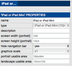
Note: The usable area for both Portrait and Landscape change depending on whether the navigation bar is hidden or not.
Copyright © 2025 Kramer
—
Powered by