
A button is an image on the foreground that can interact with the user. A button can be programmed to send a command to a device, link the GUI to another panel or page, change a variable, or a combination of everything.
To add a button:
- Choose a Panel and Page to Work On
- Select the Foreground Layer (or All Layers)
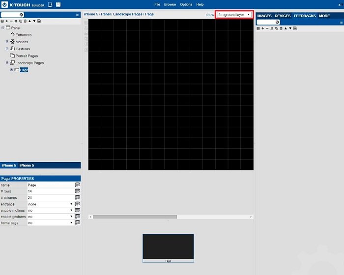
All buttons are added to the foreground layer of the selected page. Each page has three view options:
- In the background layer view you only see background elements.
- in the foreground layer view you only see foreground elements.
- In the all layers view, you see both the background and the foreground elements. When working in all layers, only the foreground elements are active.
![]()
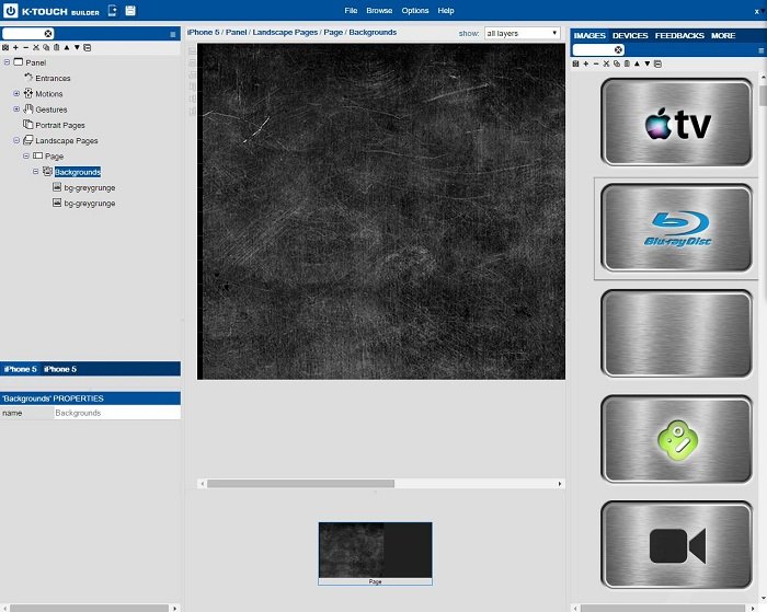
- Select a Button Image
All images are found under the Images tab on the right side of the screen. Based on the handset and theme you selected, some image libraries have been imported automatically.
- Open an image library and find a button image that works for you. In this example, we look in “Sources – Multistate”
![]()
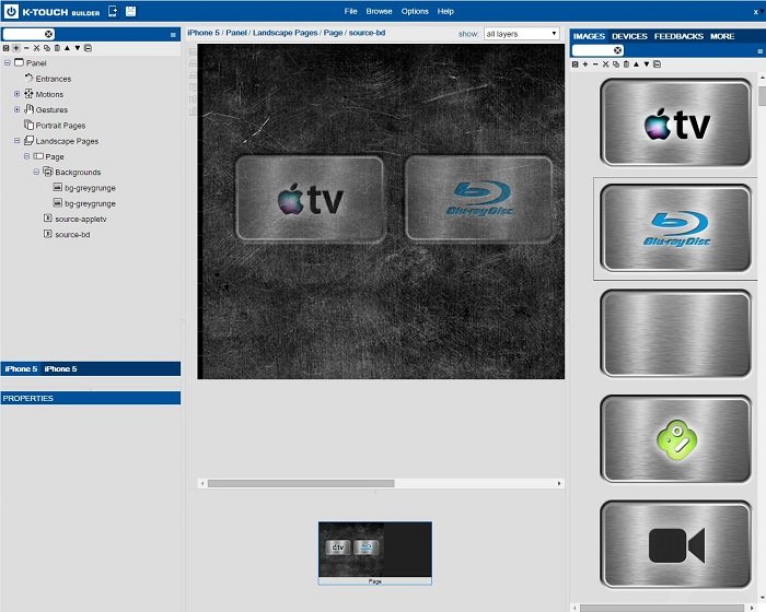
- Drag the Desired Button Images onto the Panel
- Drag any button images you would like to have onto your panel. (Initially all buttons are grayed out because no action is linked to this button yet.)
![]()
- Set a Button Size
A selected button has a green box around it. This green box represents the physical size of the button and determines the pressable area of the button in the GUI.
Dragging a button onto the panel automatically gives it a reasonable size although it can be edited in button properties if needed.
![]()
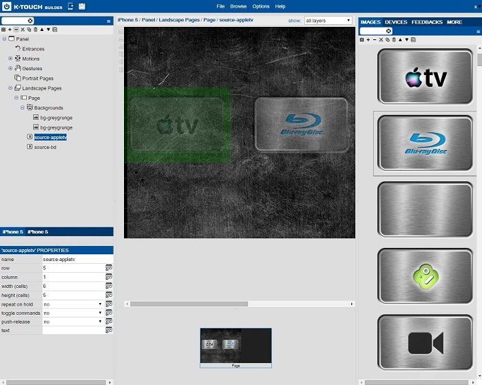
- Button Properties
When a button is selected, like every other object, its properties appear in the bottom left hand corner. Button properties are shown and described as follows:
![]()
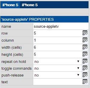
Name: Name buttons to recognize them in a list. The name of the button does not affect its performance.
Row: Vertical position of the top left corner of the button as it pertains to rows in the grid.
Column: Horizontal position of the top left corner of the button as it pertains the columns in the grid.
Width: Width of the pressable area of the button in grid spaces.
Height: Height of the pressable area of the button in grid spaces
Repeat on Hold: If the button outputs a command, select Yes to constantly send the command as the button is held down (for example, volume buttons).
Toggle Commands: If two commands are assigned to a single button, select Yes to send the first command on the first press, and the second command on the second press of the button. (for example, one button for mute on and mute off).
Push – Release: If two commands are assigned to a single button, select Yes to send the first command when the button pressed, and the second command when the button is released (for example, camera move and stop).
Text: To add text to the button, add it in this field.