
Every K-Touch page has a grid that can snap images and other objects . The grid is responsible for the position and size of every object. Each page has a default grid but to obtain a finer level of detail for custom design it is necessary to change the size of the grid.
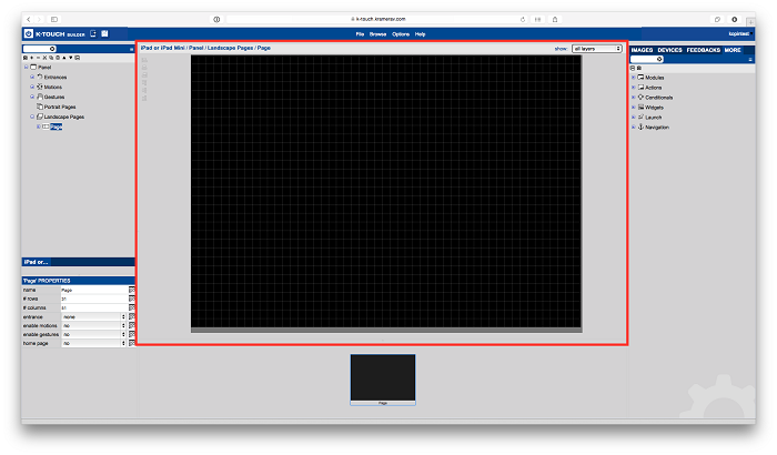
- Select the Page for which you Want to Change the Grid
It is best to change the grid size before creating the GUI. Altering the grid size after laying out the GUI could cause sizing issues for existing items.
- When selecting the page, you see the grid (if nothing is blocking it).
![]()
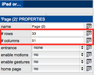
- Change the Grid Size
- With the page selected, you see the Pages properties in the bottom left corner of the K-Touch Builder.
Properties contains ‘# Rows’ and ‘# Columns’. Here you can adjust the size of the grid.
The maximum size the grid equals the total pixels of the handset you are using.
![]()
Finished
Note: Determining Usable Pixels of Your Handset
Select the Handset and Look at its properties in the bottom left hand corner. There are 3 areas in the handset’s properties that show the resolution of your device. In this example I am using an iPad 2.
With any device, you are never free to use EVERY pixel of the device for your GUI. Whether it is iOS or Android, there will always be parts of the operating system that cannot be completely defeated. Therefore it is important to know what the actual usable space
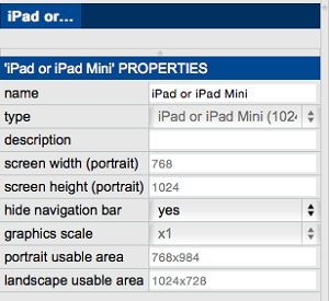
Screen Width (Portrait): Number of physical Pixels Wide on the Device when in the Portrait orientation.
Screen Height (Portrait): Number of physical Pixels High on the Device when in the Portrait orientation.
Portrait Usable Area: This will be the true usable resolution for your GUI based on the handset selected when being used in the Portrait Orientation.
Landscape Usable Area: This will be the true usable resolution for your GUI based on the handset selected when being used in the Landscape Orientation.
*The usable area for both Portrait and Landscape will change depending on whether the Navigation Bar is hidden or not.