
Overview
A new feature found within the Kramer Control Builder is the ability to change the Widget State as a property value. If you create a multi state image and upload that image group to your Project, you will be able to identify which image will appear by adding an Update Property to any action field. Follow the steps below to use this new feature in your setup.
Process
Launch Builder
Upload Image Group
Add image to UI

Scroll to middle of Properties window beneath center pane to view Image states and the new UI state option

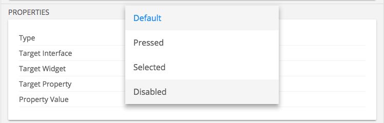
*Prior to v1.5.1 you would only see the Default and Pressed image states. Now you can see Selected and Disabled images.
Changing Image state with Update Property
Add Update Property to Action field of button, Macro and or Event

Change Target Widget of Update Property by dragging the widget from the left pane to the property window Target Widget section
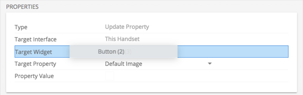
Change Target Property to UI State
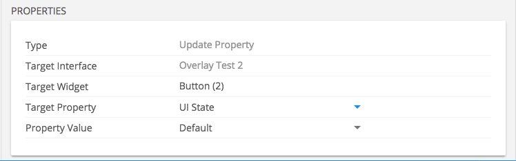
Select the new Property value that you would like to appear for State
Follow Up
The benefit to this feature is that you can alter the UI state of a button without having to change a specific image with an Update Property. If you were to upload a new graphic to the button but have Event triggering a UI state change, that Event will use the new image within the image group.
At this time this new feature will allow the user to change the UI state of a button by altering the image shown within the UI. We cannot build the UI around the UI button state using Conditional programming.
Feedback
Post your comment on this topic.