
In certain forms, users are provided access to interactive chart controls.
For those unfamiliar with using these controls, here are some key features to consider:
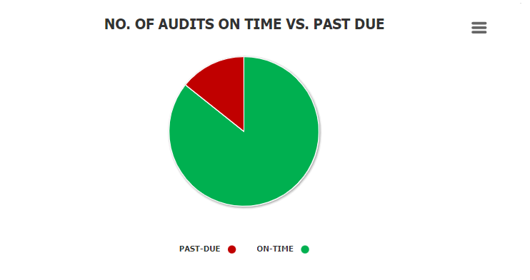
- Chart Legend: This graphical element provides a visual key or guide for interpreting the data series depicted in the chart.
![]()
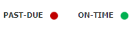
- Chart Tooltip: This graphical element appears when the user hovers over a data point or marker in the chart. It displays additional information about the element, such as the label, value, or other contextual details, enabling users to gain deeper insights into the charted data.
![]()
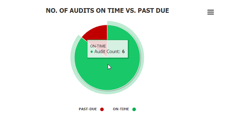
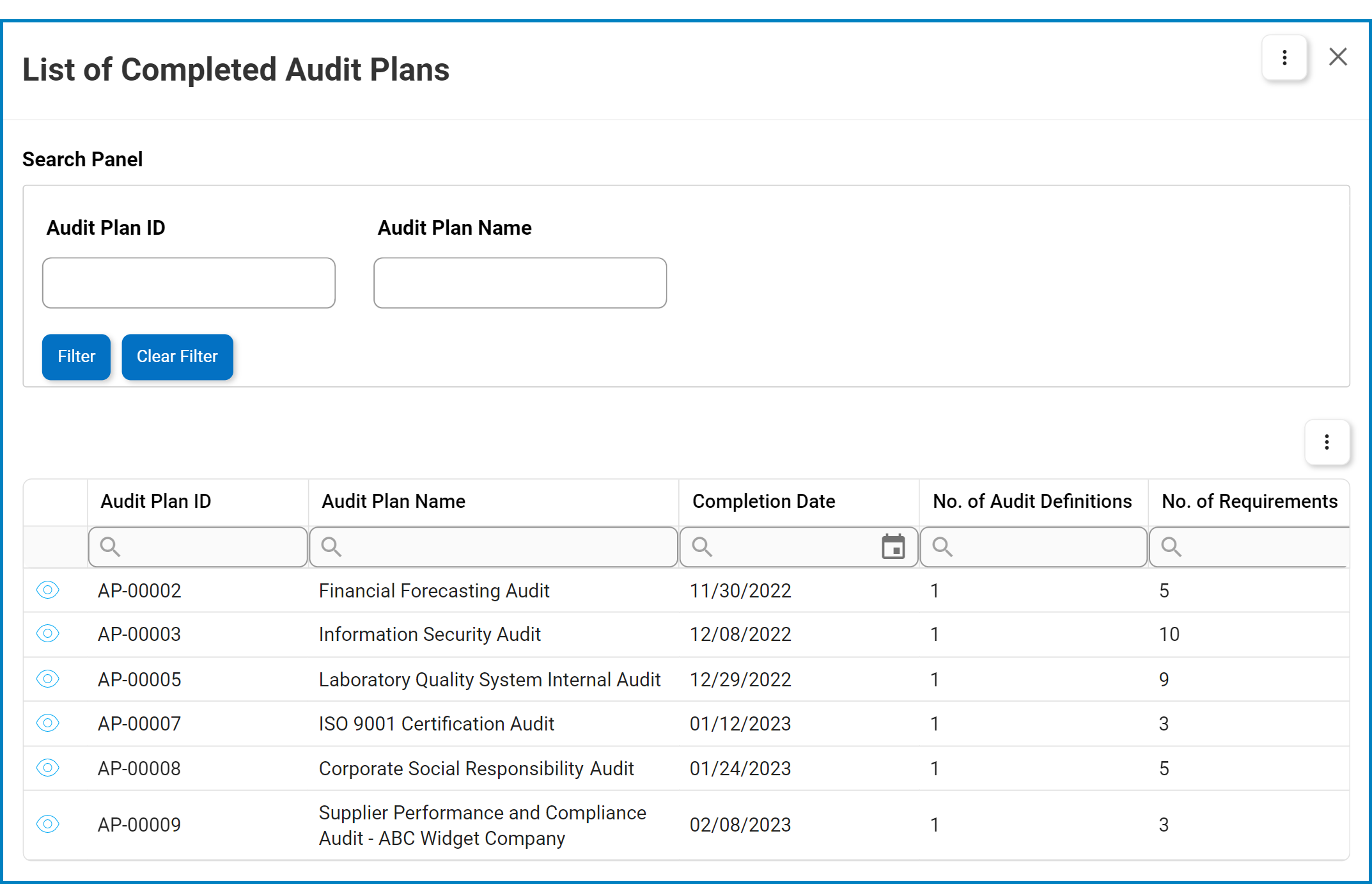
- Drilldown Reports: These reports are accessed by double-clicking on specific data points in the chart. This action allows users to “drill down” from the high-level summary visualized by the chart to a more detailed view of the data.
- For example, double-clicking the sector of the pie chart representing audits that have been completed on time reveals the following modal window:
![]()
- For example, double-clicking the sector of the pie chart representing audits that have been completed on time reveals the following modal window:
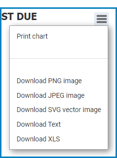
- Chart Context Menus (
![]() ): These hamburger buttons, when clicked, reveal a menu with options for printing or downloading the chart.
): These hamburger buttons, when clicked, reveal a menu with options for printing or downloading the chart.
![]()
- Users can choose to download the chart in various formats, including PNG image, JPEG image, SVG vector image, text file, or XLS file.
Post your comment on this topic.