
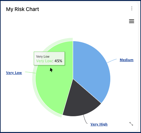
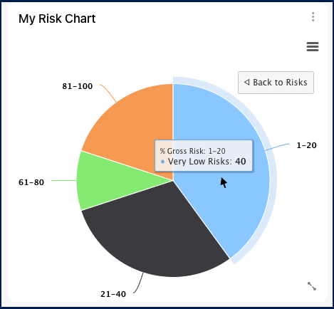
The ‘My Risk Chart’ widget is valuable for users overseeing or involved in high-risk tasks and processes. By adding this widget to their dashboard, users can access a pie chart displaying the residual priority of risks by category, with the option to click on each category to access more specific information on the percentage of gross risk. It provides users with quick, visual information, showing the percentages of each risk level on the chart.
In this topic, we’ll explore the general functionalities and how to access the customizable settings of this widget.
Functionalities of the Widget
- To see the percentage of each risk level (very low, low, medium, high, very high), simply hover your mouse over the corresponding section of the pie chart.
- Click on the desired section of the chart to access more specific information on the percentage of gross risk. Click on ‘Back to Risks’ to go back to the previous chart.
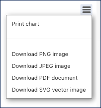
- Access the burger menu on the right for options to print or download the risk chart.
- To move the widget, click and hold it, then drag it to your preferred location in the page.
- To resize the widget, hover over the bottom right corner, click the double-pointed arrow (
![]() ), and drag to the desired size.
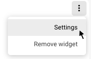
), and drag to the desired size. - To remove any widget from the home page, click on the ellipsis menu and select “Remove widget”
- To access the settings parameters of the widget, select “Settings”
Settings of the Widget
When clicking on the “Settings” option, a pop-up window will be generated.
General
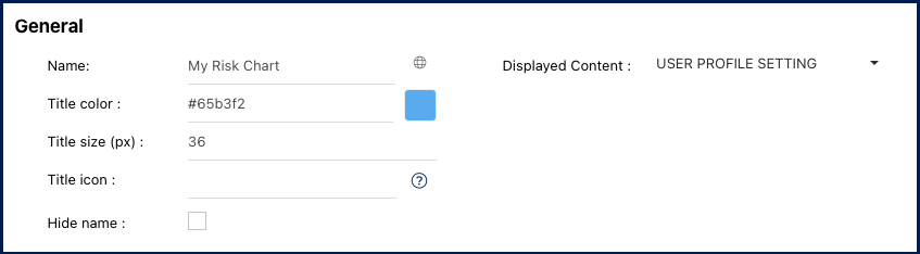
- Name: Customize the name of the widget.
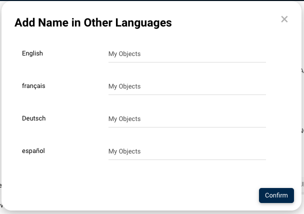
- Globe Icon (
![]() ) – Name Translation: Customize the widget name in all supported languages within EPC or your organization. Switching between interface languages will automatically update the widget name.
) – Name Translation: Customize the widget name in all supported languages within EPC or your organization. Switching between interface languages will automatically update the widget name.
- Upon clicking the globe icon, a pop-up will appear as shown below. Input the corresponding name translation for each language.
![]()
- Upon clicking the globe icon, a pop-up will appear as shown below. Input the corresponding name translation for each language.
- Title color: Select the preferred widget title color using a specific hex code or the color picker.
- Title size (px): Specify the title size in pixels.
- Title icon: Choose the desired adjacent icon from Font Awesome’s V5 version collection. Copy its HTML code and paste it into this text box. Please ensure to remove the extra HTML code at the beginning and the end, keeping only the icon’s name, as shown below.
![]()
- Displayed Content: Users can filter the widget based on object status.
- Show Latest: Displays in-progress (draft) and published content.
- Published Only: Displays only published content.
- User Profile Setting: Content display changes based on the user’s chosen mode, whether “Latest” or “Published,” selected through the toggle button. If the user is in “Latest” mode, the widget will reflect the “Show Latest” option. If the user is in “Published” mode, the widget will reflect the “Published Only” option.
- Hide Name: To hide the widget’s name when viewed in the home page, click this checkbox.
Options
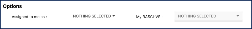
- Assigned me to as: This enables users to query the specific risks assigned to certain of their roles, allowing them to monitor their various responsibilities.
- My RASCI-VS: This filter serves as an expansion of the “Assigned to me as” filter, enabling additional categorization of objects based on the RASCI-VS Matrix. Through this filter, users can ensure a more focused search.
It’s important to note that this filter remains inaccessible until a user has correctly selected an object in the “Assigned to me as” filter.
Haben Sie noch weitere Fragen?
Visit the Support Portal