
We are pleased to introduce a series of significant enhancements to our user interface, designed to provide a more enjoyable, contemporary, and organized visual experience. These improvements offer a glimpse of the many enhancements made to deliver a more intuitive EPC experience.
For an overview of more commonly used UI element changes, including before-and-after visuals, please refer to our change log.
Key UI Improvements:
- Optimized Main Navigation Bar: We replaced the New button with the more intuitive and action-driven Create button. This change brings a heightened sense of usability, especially tending to those who are new to the EPC interface. Additionally, we’ve fine-tuned the arrangement of main navigation bar components, optimizing your navigation experience.

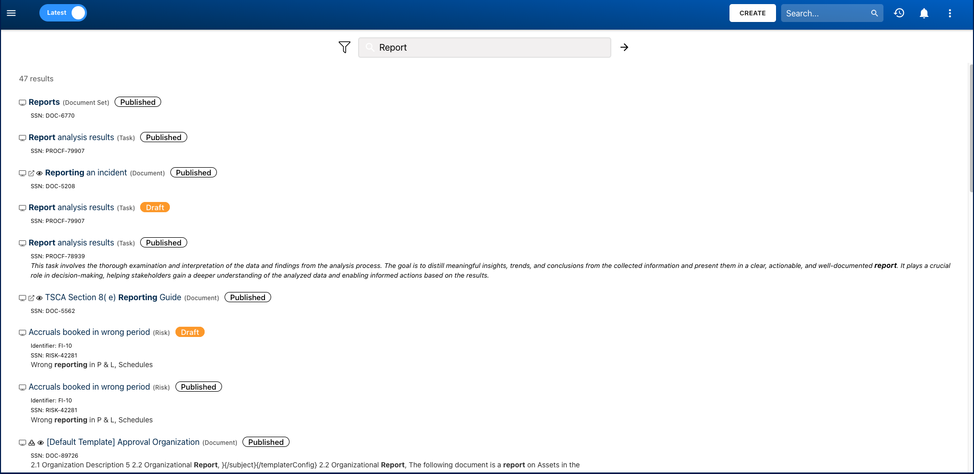
- Easy Access to Search Functionality: The search box is now consistently available in the main navigation bar, ensuring quick and convenient access. Furthermore, it remains visible on the search results page, enabling users to easily modify and refine their searches within the page.
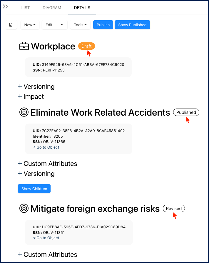
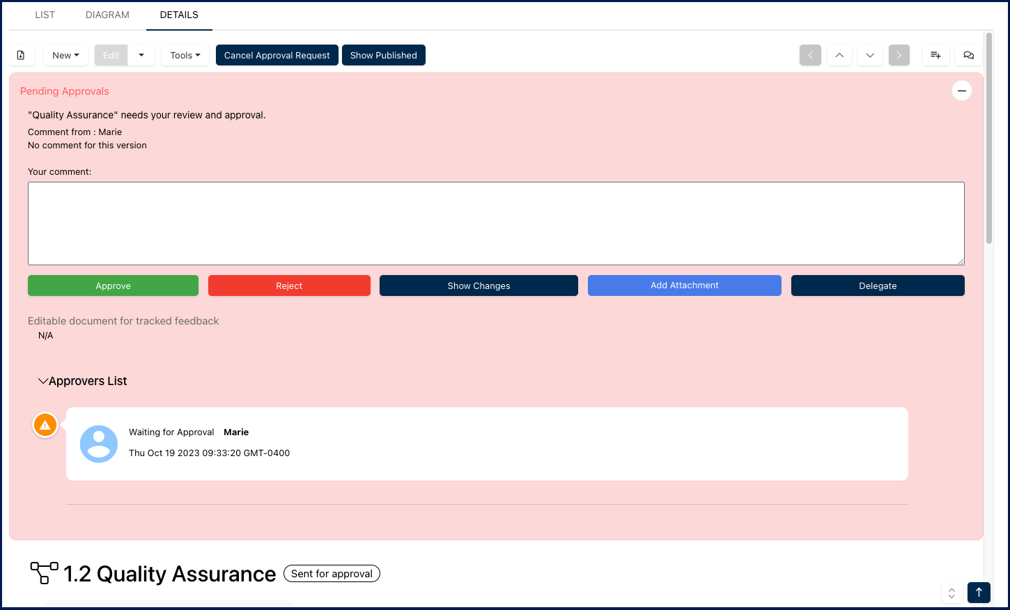
- Improved Object Status Tags: The Details view features enhanced object status tags, now color-filled and presented in an oval shape for improved visibility. Additionally, children objects are now automatically expanded in the Details view. More information available here.
- Enhanced Readability: Experience enhanced content legibility with carefully adjusted font sizes and boldness. This design ensures that text elements are optimized for readability, providing a more comfortable reading experience.
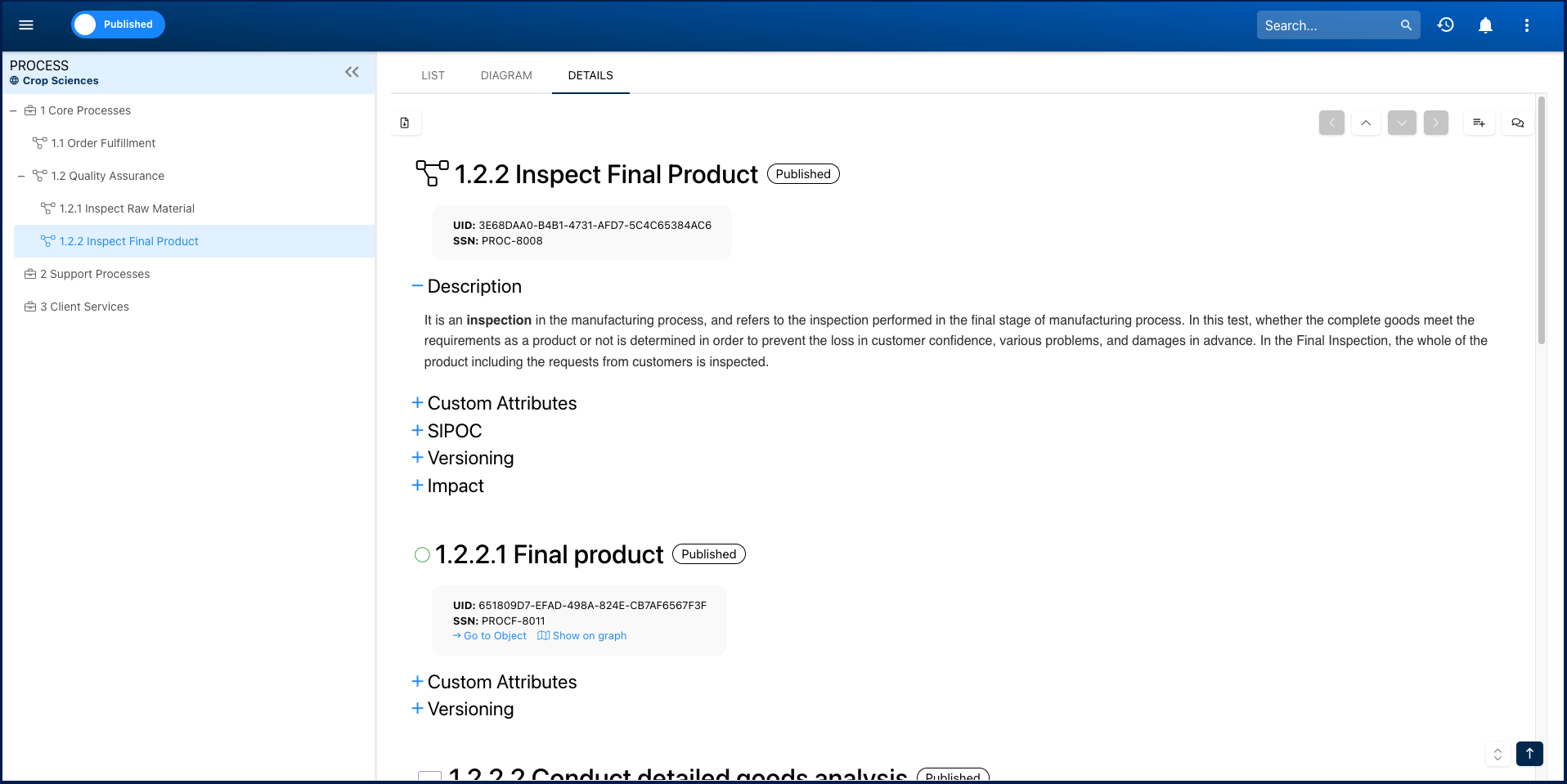
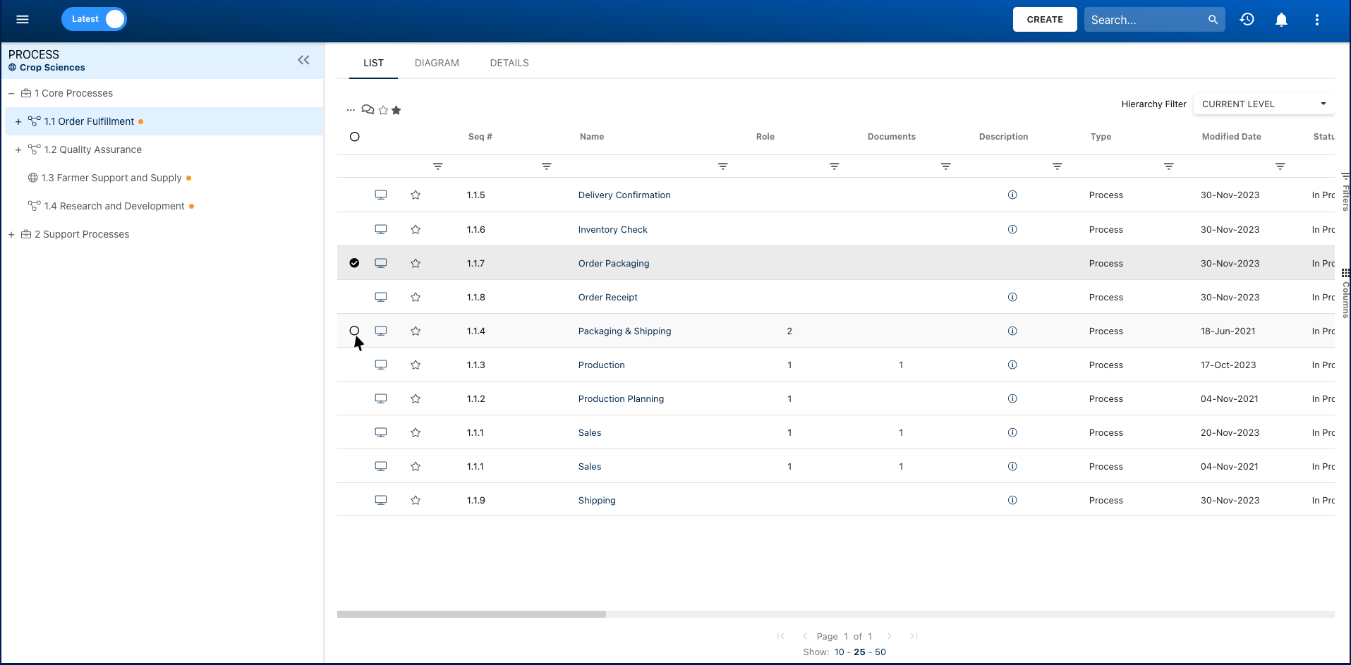
- Added Padding: Enjoy improved organization and clarity with increased padding between accordions, tabs, and rows. The enhanced spacing not only contributes to a cleaner visual layout but also makes navigation more intuitive. Additionally, in the ‘List’ view, object selection checkboxes now appear upon hovering over an object.
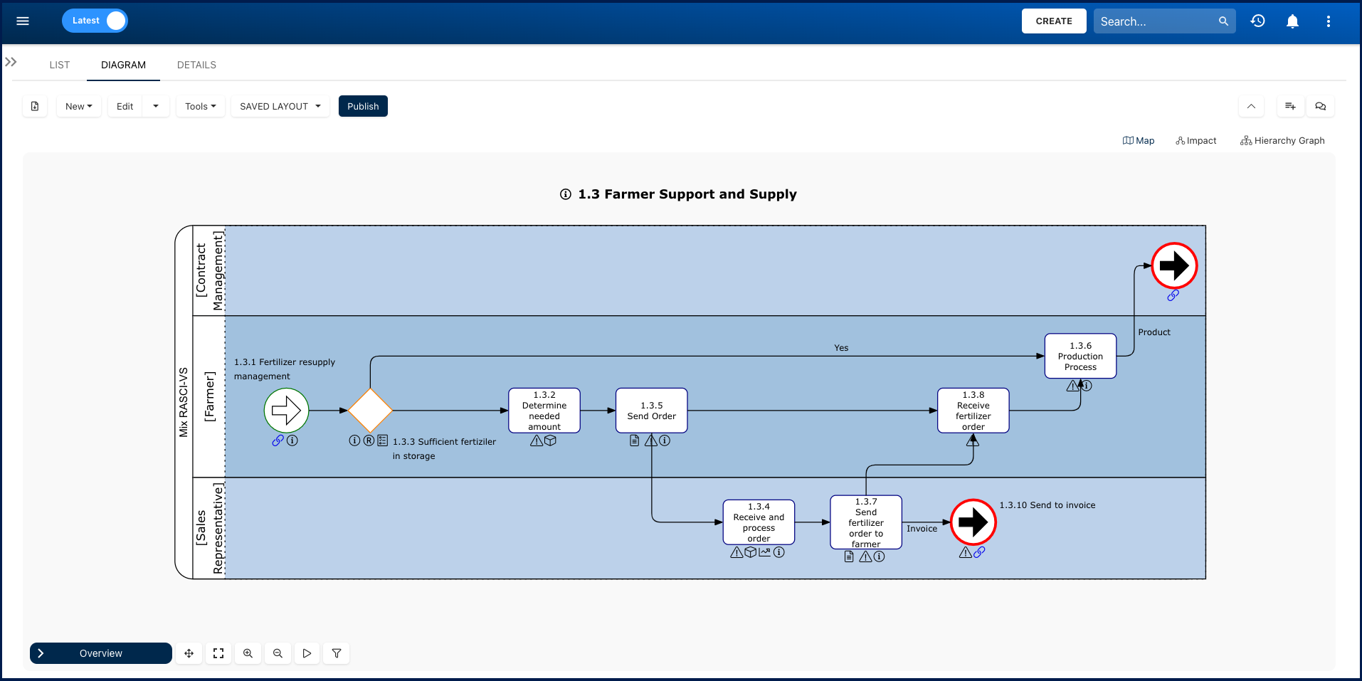
- Displayed Diagram Types & Aligned Icons: The ‘Diagram’ view, formerly known as ‘Graph,’ has been renamed and prominently showcases all available diagram types. This enhancement enables users to effortlessly switch between their preferred views. Moreover, both the menu and collaboration icons have been refreshed and aligned, contributing to a cleaner appearance and a more cohesive overall look.
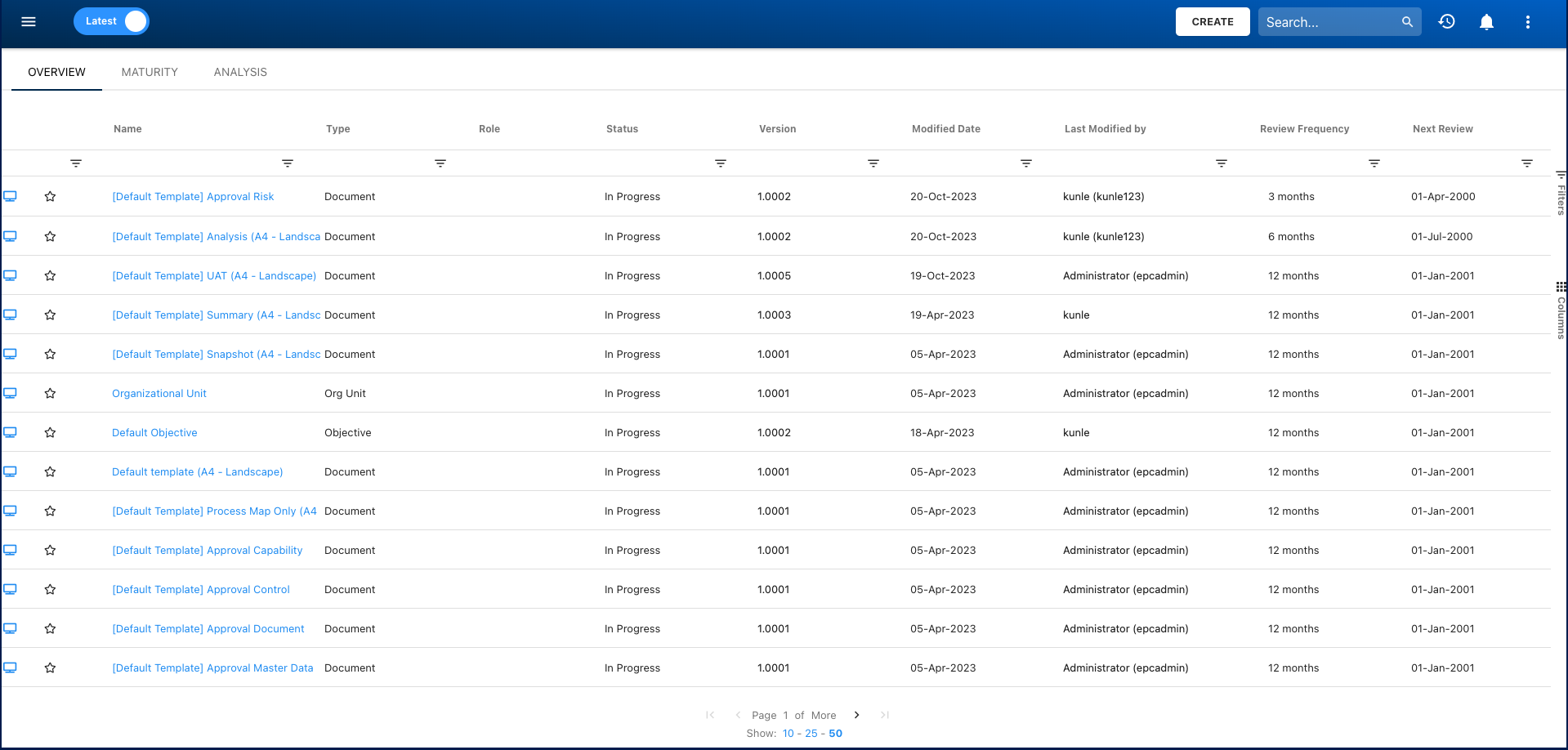
- Governance Module: Governance module’s interface has been enhanced, now featuring a design and components aligned with the ‘List’ view in other modules. This not only provides a cohesive visual experience but also allows for all filtering and sorting capabilities, ensuring a seamless and unified user experience across the platform.
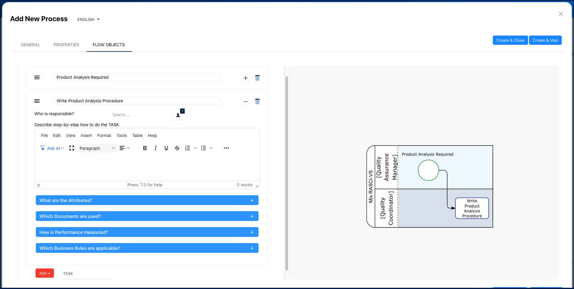
- Improved Quick Process Mapping Feature: The quick mapping interface has been redesigned to offer an easy-to-use experience, especially for users with smaller screens. As a significant bonus, we have added the ability to directly associate UDAs, documents, performance indicators, and rules during the quick mapping process, providing added convenience.
- Convenient Language Settings: Language settings are now conveniently placed next to form titles, making them easier to access and modify.

- Polished Interface: We’ve replaced all icons within EPC with thinner versions, giving it a polished and modern touch. Additionally, pop-up forms, buttons, and widgets now showcase rounded corners for an added touch of refinement.
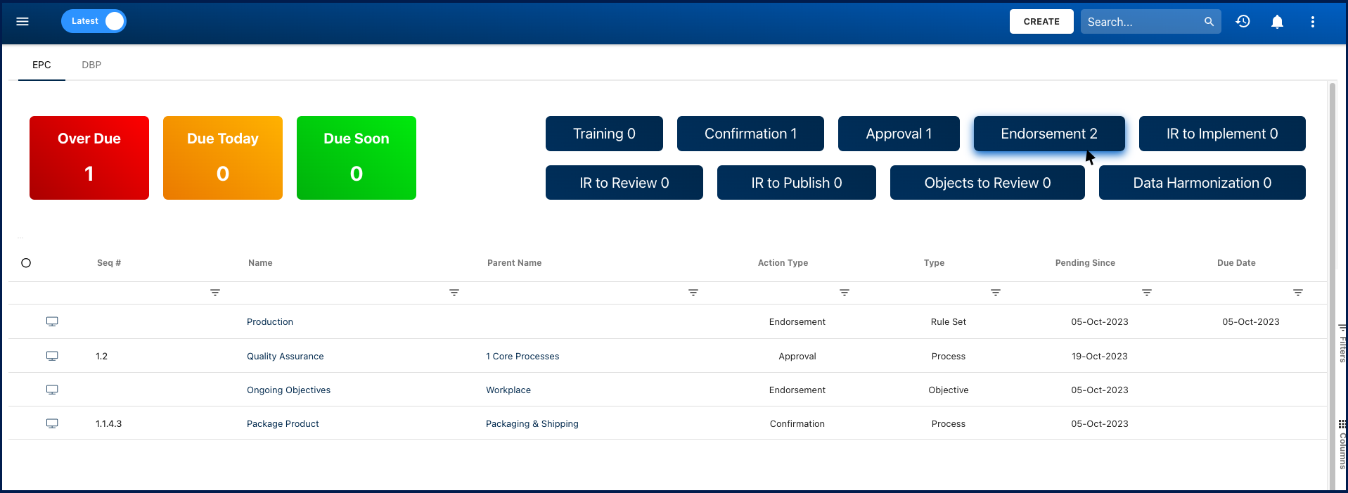
- Distinctive Color Fills: Approval, endorsement, review, and training sections now feature distinctive color fills, providing clearer differentiation and a visually appealing interface.
Haben Sie noch weitere Fragen?
Visit the Support Portal