
Introduction
This document describes how to configure the appearance and behavior of the Shop Floor interface. Examples of how to add/remove columns, change the names and widths of the columns are illustrated. Then some more specific features are described i.e. changing the size of the browser popup windows.
The configuration of Shopfloor is very similar to the customization of HTML reports, see Customize_reports. In fact the same mechanism for generating the HTML is used by Shop Floor and the HTML reports. Therefore some references to the “Customize reports” chapter will occur.
Getting started
Shop Floor is configured in JSP (Java Server Page) files. The syntax is defined by XML manual for info about user management. Thus if the configuration which is going to be performed is limited to adding or removing columns or controlling if a value in a field is allowed to be changed by the user, the user management should be used. However if more advanced configuration is to be done like changing the width or name of a column, the configuration files must be edited.
Location
The configuration files exist in two locations, in the “jsp” folder and in the “site” folder.
- The “jsp” folder: \plugins\shopfloor\jsp\webapps\Root
- The “site” folder: \plugins\shopfloor\site\webapps\Root
The “jsp” folder contains the original files which are replaced when ROB-EX is updated. The “site” folder contains copies of the files from the “jsp” folder. The files are copied the first time Shop Floor is started. Therefore the customization should be done in the “site” folder.
Overview of the configuration files
The table below gives a list of available configuration files and which page in Shop Floor they correspond to.
| File name | Description |
|---|---|
| “index.jsp” | The front page. This one shows a Gantt chart for each resource in the specified period. |
| “operation.jsp” | Operation detail. This one shows details of a specific operation, in a separate popup window. |
| “productionorder.jsp” | Order detail. This one shows details of a specific order and a Gantt chart showing the operations in the order. |
| “project.jsp” | Project detail. This one shows a Gantt chart showing the operations in the project, in the specified period. |
| “search.jsp” | Search result page. This one shows the result of a search for an order. |
| “customPage1.jsp” | Custom page. It is possible to create custom pages where additional reports can be defined. See Custom_pages. Notice that the “customPage1.jsp” doesn’t exist by default. |
Add or remove fields/columns
Normally this is configured in the user management in ROB-EX, see Shop Floor for more info. However in some customer specific situations it can be necessary to edit a configuration file in order to add or remove a column. This could be the case if a custom field has been created and must be shown in Shop Floor or if the various pages must be configured separately.
So when should the user management be used? When a certain field, i.e. “operation.name” (the name field on an operation) is to be showed (or hidden) on all the Shop Floor pages. Thus granting or restricting permissions for a specific field will be applied to all the Shop Floor pages, where the field occurs.
In order to remove a field from only the front page it is necessary to edit the “index.jsp” file. See below for an example.
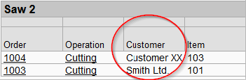
Remove the “Customer” field from the front page
The “Customer” field is located on the “productionorder” property (“productionorder.customer”), thus the “customer” field is located on an order. See The baseGroup attribute in the “Customize reports” document for information about the properties and their use.
Below is shown a part of a resource table from the front page, including the customer column.
Locate the highlighted line below in the “index.jsp” file and either remove it or change it to a comment by wrapping the line with “<%—” and “—%>” (without the quotes).
<%-- *** In urlAction the position of the browser window can also be ...** --%>
<gantt:show property="operationlist.name" showAs="default" ... />
<gantt:show property="operationlist.productionorder.Customer" showAs="default"
label="@index.jsp.operationlist.productionorder.Customer" cssClass="mediumWideColumn"
url="index.jsp?name={name|" />
<gantt:show property="operationlist.productionorder.Product.name" showAs="default" .../>
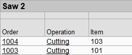
<gantt:show property="operationlist.FirstPossibleStartCalendar.customDate.dd-MM-yyyy HH:mm" .../>The result is the same table without the customer column.
However the customer field still exists on the order detail page because the “productionorder.customer” property still exists in the “productionorder.jsp” file and the user has the permissions to view the field.

Add “CustomText1” to the front page
The “customText1” and “customText2” fields on production order are not accessible by default in Shop Floor. Add the highlighted line below in order to add “customText1”.
Notice the line just above the highlighted line. This is commented out and represents the “customer” field, which was hidden just before.
<%-- *** In urlAction the position of the browser window can also be specified ... --%>
<gantt:show property="operationlist.name" showAs="default" .... />
<%-- <gantt:show property="operationlist.productionorder.Customer" showAs"default"
label"@index.jsp.operationlist.productionorder.Customer" cssClass"mediumWideColumn"
url="index.jsp?name={name|" /> --%>
<gantt:show property="operationlist.productionorder.CustomText1" showAs="default" label="Custom text1" cssClass="mediumWideColumn"/>
<gantt:show property="operationlist.productionorder.Product.name" showAs="default" ... />
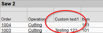
<gantt:show property="operationlist.FirstPossibleStartCalendar.customDate.dd-MM-yyyy ... />Below the result is shown with the “customText1” column added.
A total reference of all available properties (fields/columns) can be found at The complete list of properties.
Change the name of a column
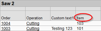
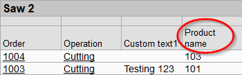
The names of the columns can be changed freely. The example below illustrates how to change the name of the “Item” column to “Product name”.
The property “operationlist.productionorder.Product.name” is by default named “Item” as illustrated below.
The “label” attribute of the tag defines the name of the column. As illustrated below the value of the label by default starts with an ‘@’ sign. This indicates that the name of the column is looked up in a language file.
<gantt:show property="operationlist.productionorder.Product.name" showAs="default"
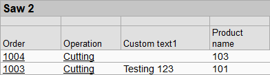
label="@index.jsp.operationlist.productionorder.Product.name" cssClass="popupTextColumn"/>In order to rename the column to “Product name” change the value of the label as illustrated below. When the ‘@’ sign is removed the name of the column is specified directly in the label.
<gantt:show property="operationlist.productionorder.Product.name" showAs="default"
label="Product name" cssClass="popupTextColumn"/>
Below the “Item” column is renamed to “Product name”.
Change the width or appearance of a column
The general appearance of a column, like the width, the font size, the color etc. is controlled by CSS (Cascading Style Sheets).
The CSS classes are located in the files “opi.css” and “smallOpi.css” which exist in the same location as the configuration files, see Location. In the following example the “Custom text1” column is made a little bit wider. All the Shop Floor pages use the classes in the “opi.css” file except the operation detail page (“operation.jsp”) which uses the classes in “smallOpi.css”.
Make the “Custom text1” column wider
As illustrated below the CSS class is defined in the attribute “cssClass”. In order to change the width the CSS class “mediumWideColumn” must be changed or another class must be specified. Notice that if an existing class is changed it will affect other columns as well. In this example another class is specified.
<gantt:show property="operationlist.productionorder.CustomText1" showAs="default"
 label="Custom text1" cssClass="mediumWideColumn"/>
Specify “veryWideColumn” as illustrated below instead of the “mediumWideColumn” class.
<gantt:show property="operationlist.productionorder.CustomText1" showAs="default"
 label="Custom text1" cssClass="veryWideColumn"/>
The “Custom text1” column has become wider.
The “veryWideColumn” class is 9em wide and the “mediumWideColumn” is 6em wide. See the table below for a list of the common CSS classes and their widths.
The CSS classes in the file “opi.css”.
| CSS class | Width |
| smallColumn | 2em |
| wideColumn | 4em |
| popupTextColumn | 6em |
| mediumWideColumn | 6em |
| veryWideColumn | 9em |
The “showAs” attribute
On the “showAs” attribute on the tag (see illustration below) there’s specified how the values in the cells in a certain column are presented. Some cells in Shop Floor take user input which could be text typed in a text box or for instance by selecting a value in a combo box.
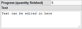
This example is from the “operation.jsp” file (the operation detail page) where the “SelectResource” field must be presented in a combobox.
<gantt:show property="SelectResource" showAs="editRestricted"
label="@operation.jsp.SelectResource"/>
On the operation detail page several fields take user inputs. In the examples below the resource can be selected in a combo box and a description can be entered in a text field.
The selected resource can be selected in a combo box (showAs=“editRestricted”).

The operation description can be entered in a text field (showAs=“editFree.3”)
The table below lists the possible values in the “showAs” attribute.
| showAs value | Description |
|---|---|
| default | Normal text or numbers. |
| limitedView | Shows text in one line. |
| largeLimitedView | Shows text in three lines. |
| text | Plain text. |
| headline | The field will be shown in the header of the table. |
| editFree | An editable text box. The number of lines can be specified by specifying a number after the period. If three lines are needed specify: “editFree.3”. |
| editiRestricted | This will show a combo box where values can be selected from a list. |
| checkbox | This will show a check box where the values only can be true/false (or yes/no). |
| script | The java script specified in the “customScript” attribute of the tag is linked with the column. See The customScript attribute. |
| select | Creates a select (also known as combo) box with options specified in an options attribute as possible choosable inputs |
The options attribute
Attribute used to give possible choosable options to the show element when using the showAs select attribute. Format of the attribute value is like: ‘key1=value1,key2=value2’, where the value can be a reference to the sflanguage.properties file. If the value isn’t found in the resource file the value will be used shown directly in the select box.
<gantt:show property="operationlist.productionorder.CustomInt1" showAs="select"
options="0=False,2=operation.jsp.startcalendar,5=11"/>
The hideEmpty attribute
This attribute can be used, if a field or row, that have no data, should be hidden. Possible values are always and never.
The <gantt:htmlsite> tag
The <gantt:htmlsite> tag is the top level tag in a configuration file. It has attributes which applies to the entire page. In the following the attributes are described.
The “Menu” attribute
The table shows the possible values.
| Value | Description |
|---|---|
| hide | This will hide the top menu. |
| show | This will show the top menu. This is the default value if not specified. |
The “styleSheet” attribute
Here the file containing the CSS classes is specified. This is either “opi.css” (default) or “smallOpi.css”.
The “onSave” attribute
Here it can be specified what should happen when the user hits enter or presses the “Save” button on for instance the operation detail page.
The table lists the possible values.
| Value | Description |
|---|---|
| doNothing | The page will remain open. |
| showMessage | A message will be shown when data is saved. The page will remain open. |
| closeReloadOpener | This will close the popup window (the page where the save is performed) and then refresh the page from where the popup window was opened. Normally the “Opener” is “index.jsp” and the popup windows are either “operation.jsp” or “productionorder.jsp”. |
| goBack | This will go back to the previous page. |
The “autoRefresh” attribute
The Shop Floor pages are automatically updated so changes made in ROB-EX are reflected in Shop Floor. In this attribute the refresh rate can be set in seconds.
So specifying autoRefresh=“300” will reload the page every 300 second.
This line must be added to relevant shopfloor .jsp pages.
The “customScript” attribute
Here a custom java script can be specified. The script will be linked to the columns where the “showAs” attribute is specified to “script”.
The value of the “customScript” attribute is the file name of the script. The script must be located in the same folder as the configuration files, see Location.
The enableTablePositioning attribute
This attribute may be used to position the tables on the site. Setting the value to “true” warps
cssPlace# for each table.
    .cssWrapper { overflow: hidden; }
    .cssPlace0 { width: 25%; float: left; }
    .cssPlace1 {width: 75%;float: right; }
The <gantt:timeperiod> tag
The start- and end time can be changed in Shop Floor as illustrated below

In the “timeperiod” tag the default start- and end time of the report period can be specified. The default dates will be prefilled in the above illustrated date fields.
The line below shows the default settings of the “timeperiod” tag.
<gantt:timePeriod startTime="this week" endTime="this week + 2 weeks - 1 second"
 format="dd-MM-yyyy HH:mm" remember="true" />
The “startTime” and “endTime” attribute
The keyword “this week” corresponds to Monday morning at 00:00 in the current week and the “now” keyword refers to “right now”. It is possible to add and subtract by specifying for instance ‘this w-3w+2d’ (or ‘this week – 3weeks + 2days’). Please notice that ‘m’ corresponds to month and NOT minute.
Supported notation: “now” or “this week” +_*/* , y/year(s), m/mon/month(s), w/week(s), d/day(s), h/hour(s), min/minute(s) and s/sec/second(s).
The default is “this week”.
The “format” attribute
In here the date format can be specified, see Formatting dates for more info.
The “remember” attribute
Specify “true” if the entered dates also should be used on other pages in Shop Floor. If “false” is specified the default dates are used on other Shop Floor pages.
The “urlAction” attribute on the tag
For instance when clicking on an operation link on the front page of Shop Floor the operation detail page opens in a popup window. The size and location of the popup window can be specified in the “urlAction” attribute as illustrated below (highlighted in yellow).
<gantt:show property="operationlist.name" showAs="default" label="@index.jsp.operationlist.name" url="operation.jsp?oid={operationlist.id}" cssClass="mediumWideColumn" urlAction="popup(450,540)" />The default value “popup(450, 540)” defines the width and height in pixels of the popup window. However it is also possible to specify the X and Y location of the popup window, this is done after the height value, see below.
urlAction=“popup(width, height, X, Y)”
If specifying “popup(450, 540, 1, 1)” in the above example the popup window will appear in the top left corner of the screen.
The X and Y coordinates must be greater than zero.
Custom pages
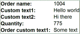
Custom pages containing custom reports can be created. In the example below a column (“Custom page”) has been added to the front page. When clicking on a link in the column the custom page will open. In this example the custom page is based on the operation detail page.
A “Custom page” column has been added to the front page
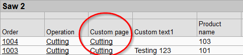
When clicking on a link in the “Custom page” column the custom page will open, showing custom information about the selected operation.
Steps to perform in order to create a custom page:
- Insert the illustrated line in “index.jsp”. The “customPage1.jsp” text in the “url” attribute refers to the file name of the custom page. The “oid” text refers to the “operation id” which is used by the custom page in order to know which operation to show.
<gantt:show property="operationlist.name" showAs="default" label="Custom page"
url="customPage1.jsp?oid={operationlist.id}" cssClass="mediumWideColumn" urlAction="popup(900,1000)" />- Create a new JSP file under the “site” folder in the same location as the other configuration files. Name the file for instance “customPage1.jsp”. Copy the contents from the “operation.jsp” file to the newly created file and perform the customization.
- Add permissions to the user to see the new custom page, in the user administration, see below. If the custom page doesn’t exist in the user management, ROB-EX must be restarted in order to update the pages. Please notice that customPage1 and customPage2 by default is enabled in usermanagement and will thus not occur in the list below. Only pages with other names must have permissions applied.

Below the code to the custom page example is shown.
<%@ page language="java"
errorPage="errorpage.jsp" contentType="text/html; charset=UTF-8" %>
<%@ taglib uri="/WEB-INF/ShopFloor.tld" prefix="gantt" %>
<gantt:htmlsite margin="keep" menu="hide" styleSheet="smallOpi.css" onSave="doNothing" showFilename="false">
<gantt:reporttable baseGroup="operation" label="@operation.jsp.Reporttable" view="detailedTable" cssClass="customTable" url="operation.jsp">
<gantt:filter property="id" source="user" value="oid" compare="==" />
<gantt:show property="id" showAs="hidden" label="@operation.jsp.id" />
<gantt:show property="productionOrder.name" showAs="default" label="Order name: " cssClass="custom"/>
<gantt:show property="CustomText1" showAs="default" label="Custom text1: " cssClass="custom"/>
<gantt:show property="CustomText2" showAs="default" label="Custom text2: " cssClass="custom"/>
<gantt:show property="productionOrder.Quantity.0" showAs="default" label="Quantity: " cssClass="custom"/>
<gantt:show property="productionOrder.customText1" showAs="default" label="Order custom text1: " cssClass="custom"/> </gantt:reporttable>
</gantt:htmlsite> />
Post your comment on this topic.