
The material graphs visualize the projected stock levels, i.e. the result of all the different stock transactions:
One or more material graphs can be added and each graph can be configured individually. You may choose to set up the graphs based on a single material or a group of materials.
If there is a need to view many graphs at the same time, it is possible to increase the size of the graph area itself. Or alternatively decrease the size of the individual materials graphs.
The size of the graph area can be configured in the menu Functions->Settings->General->Graphs.
The size of the materials graphs can be configured in the menu Functions->Settings->General->Materials.
The entire graph area may be un-docked and shown in a separate window on a second monitor. Read more about this option below.
Add a new graph
- First create a new Material view by right clicking on the “Material view” tab at the bottom of the main Gantt window. Then select the New material view menu option. Name the material view and click Ok. Typically select a short but descriptive name like “Raw materials”, “Packaging materials” or the like. The new material view becomes visible as a new tab.
- Now right click on the newly created tab and select New material graph. A window will open up. Select one or more materials to add and click
- Add individual: If you selected two materials, then two graphs are added. One for each material selected.
- Add grouped: If you selected two materials, then a single graphs is added showing accumulated values for all the selected materials. You will be prompted to name the group. By default ROB-EX will choose a concatenation of the materialnames. A graph based on a grouping of materials will show the individual materials by different colors in the graph. By holding/moving the mouse over the bar, details for the material will be displayed. By right-clicking on a grouped graph you will be able to edit the material group.
Configure the material graph
Right click on the graph area and a graph setup menu is shown. In this menu you can furhter configure what is shown in the graph.
Material
Select the material to be shown in the graph from the list of available materials.
Warehouse
Select what warehouse to look at. Note the setting Show warehouse sum, decides if the graph is configured to show the inventory of the combination material+warehouse or just material or just warehouse. Read more about the different options below.
Show
When the material is selected, select between the 3 graph types:
- Consumption and production
- Shows consumption as a positive value and production as a negative value.
- Purchase and shipment
- Shows changes in the stock due to purchase or shipment. Purchase are shown as positive columns and shipment are shown as negative columns.
- Consumption
- Shows the consumption of material due to BOM lines assigned to production order operations. The consumption is shown as “positive” columns, even though the consumption reduces the stock.
- Shipments
- Shows amount of the material which is shipped.
- Purchases
- Shows amount of the material which is purchased.
Select categories
If categories have been configured for the material of the graph, then choose what categories to sum for. You can select either a single category value or select the “All” option, which will sum no matter what the value is
Show graphics
If this option is disabled, then the graph only displays values, but no bar graphs. Use this in case you are only interested in figure itself. The hight of the graph is thus smaller and you can show many graphs in less space.
Show warehouse sum
This setting affects only inventory calcuations. With the option enabled, you can only show stock inventory for either a selected material or a selected warehouse. Not both combinations. I.e. if a material is selected, then show inventory of that material across all warehouses. If a warehouse is selected, then show inventory of that warehouse across all materials.
If you disable this setting, you may choose first a material and then a warehouse. I.e. show the inventory of a selected material on a selected warehouse.
Filter operations by this material
When you click this option, then the Material filter of the Gantt chart is enabled. The result is that only operations either consuming or producing this material on the BOM lines, will be highlighted in the Gantt chart. All other materials are filtered out and shown with a ghosted color. Use this option to figure out what production orders will affect stock calculations regarding this material. To disable the filtering, simply click the  toolbar button.
Std. unit
Change the standard unit of measure shown. I.e. if the material class is Volume, then you can choose between m³, liter etc.
Alt. std. unit
If an alternate unit has been configured at master material level, then you may choose the unit of measure of the alternate unit here. Please refer to usage of this functionality in the master material section.
Full period graphs
The default is to show bar graphs of the individual days – even though you in the Gantt chart zoom out to weekly level. When this option is enabled, then a single bar graph is displayed per week/month. Use this option if all the many individual bar graphs becomes dirsturbing to the eye.
Undock
When this option is selected, the entire graph area is undocked. I.e. the graph area will now be shown in its own window. This option is useful in situations where you have multiple monitors and would like the graphs to constantly be visible on a separate monitor. To dock the window either close the undocked window by clicking the read window cross. Alternatively right click on any of the graphs and select Dock
What you see on the graph
The values shown in the graph is always the expected value at the end of the period represented by the column.
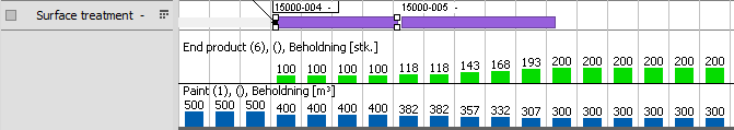
The graphs are updated automatically when the plan is changed. The user gets a quick overview of which consequences the plan has for the stock and the consumption of material. The next example shows how two material graphs gives an overview of consumption and stock of paint in a production plan.
The graphs shows:
- The blue graph (paint) starts out with an inventory on 500 m³ (which comes from a purchase).
- The operation on “Surface treatment” in order “15000-04” consumes 100 m³ so the graph drops to 400 m³. The operation consumes all 100 m³ when it begins.
- The next operation consumes another 100 m³ so the inventory ends on 300 m³. This operation consumes linear. There is a one hour break just after where the graph says 382 m³ where it can be seen that nothing is consumed.
- The green graph (End product) shows the inventory of the finished product which the two operations produce. The second operation produces linear.
Post your comment on this topic.