
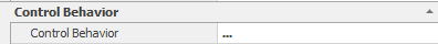
The third step in setting up the “Date” control is to specify the associated behaviour to the control

1.Control Behavior:
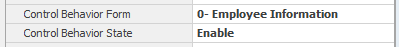
Current form behaviors (See 7.2) are displayed in the “form” section.
Enable: If this option is selected, the control will be enabled on the web.
Disable: If this option is selected, the control on the web is disabled and cannot be changed by the user.
Invisible: If this option is selected, the controls will be invisible to the users on the web.
2.Other:
Setting a required value as well as the value range is possible by clicking on this section and selecting the button  . The “Behavior of Edit Form” will then be displayed, which includes the “Validation” tab.

By selecting the “Has Required Field Validator” option, the message box will be enabled to allow the user to insert and type the error message that will be displayed.

Users can also set a range validation by the checking the “Has Range Validator” checkbox The message box will enabled for users to enter an error message, as well as specifying minimum and maximum values
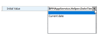
3.Initial Value: The initial value can also be set to the current date
4.Date Range:
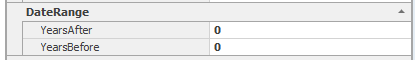
By viewing the calendar control on the web, the calendars for the next and previous years are visible, and the number of years is adjustable.
5.Relationship with the Entity:
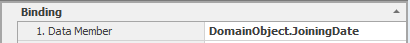
Clicking on this section and choosing the button will display the object browser to select an attribute. More about the object browser (See 7.1.2.7.2)
6.Display Details:

Clicking on this section and selecting the button allows users to set display data of the linked attribute (See 7.1.2.1).

7.Title:

Controls are automatically given a default caption name, but can be changed bu clicking in the box
8.Control Name:

The name of the control can be edited by clicking on the box.
9.Arrange:

The TabIndex control on the web is determined using this box.
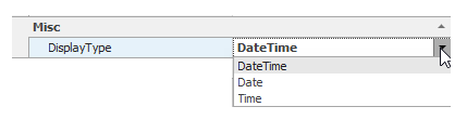
10.Type:
In the Type section the type of the date can be chosen.