
In this section, users can access visual representations of audit statistics.

Audit Dashboard
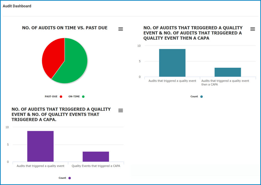
In the upper left corner of the Audit Dashboard form, there is a pie chart representing the number of audits that have been completed on time versus the ones that are overdue. Below the pie chart, in the lower left corner, there is a bar graph representing both the number of audits that triggered a quality event and the number of quality events that triggered a CAPA. In the upper right corner of the page, there is a bar graph representing both the number of audits that triggered a quality event and the number of audits that triggered a quality event and then a CAPA.
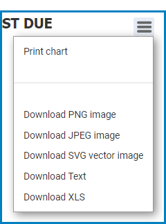
- Chart Context Menus: These are hamburger buttons which, when collapsed, display a list of options that allow users to either print or download the chart.
- Icon:
![]()
- If selected, it will display the following menu:
![]()
- Icon:
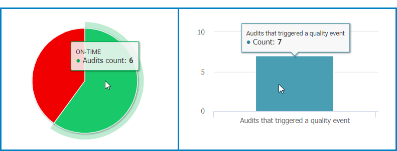
- Audits Count: This is quantitative data that users can access by hovering their cursor over the different symbols in the charts. (Symbols, in this case, refers to the slices of the pie charts and the bars of the bar chart).
![]()
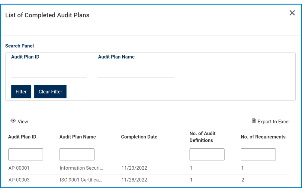
- Drilldown Reports: These are data reports that users can access by double-clicking on the different symbols in the pie and bar charts. (Symbols, in this case, refers to the slices/sectors of the pie charts and the bars of the bar chart).
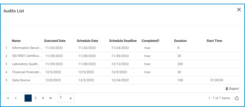
- For example, if users were to double-click on the sector representing audits that have been completed on time, a pop-up window would appear with the following form:
![]()
- Likewise, if users were to double-click on the bar representing audits that have triggered a quality event, a pop-up window would appear with the following form:
![]()
- For example, if users were to double-click on the sector representing audits that have been completed on time, a pop-up window would appear with the following form:
Post your comment on this topic.