Visual Settings Overview
The Visual Settings feature in Smart UI allows you to fully customize the appearance of your forms, aligning them with your brand or personal style — all with just a few clicks.
This intuitive tool offers flexibility and control over visual elements, enabling you to enhance the form layout and make it visually appealing without writing any code. Here’s what can be customized:
- Color palette: Choose custom colors for backgrounds, text, and highlights.
- Fonts and sizes: Define font styles and sizes for labels and data fields.
- Object appearance styles: Apply predefined visual styles to labels, text boxes, list boxes, and the form itself:
- Flat – clean and borderless look
- Raised – elevated appearance
- Sunken – inset style
- Engraved – outlined borders
- Relief – double-raised effect
Whether you’re customizing forms for personal use or creating polished layouts for others, Visual Settings helps you achieve a professional and consistent appearance that reflects your visual identity.
How to Customize the Visual Settings
To begin customizing the visual appearance of your interface, click the Visual Settings button located in the Smart UI ribbon.

The configuration window is divided into five tabs, each responsible for styling a specific part of your form.

(1) Screen
This tab controls the background color and visual style of the form itself.
- Use the Option Buttons to select a style:
- Flat, Raised, Sunken, Engraved, or Relief.
- Click Screen Color to choose a background color. This opens the Color Choice interface, which includes:
- Palette: a selection of 80 preset colors
- System Color: standard system colors
- RGB: define custom colors using Red, Green, and Blue values

- After selecting a color, click Apply to confirm or Close to cancel.
(2) Buttons
This tab customizes the appearance of buttons in the form.
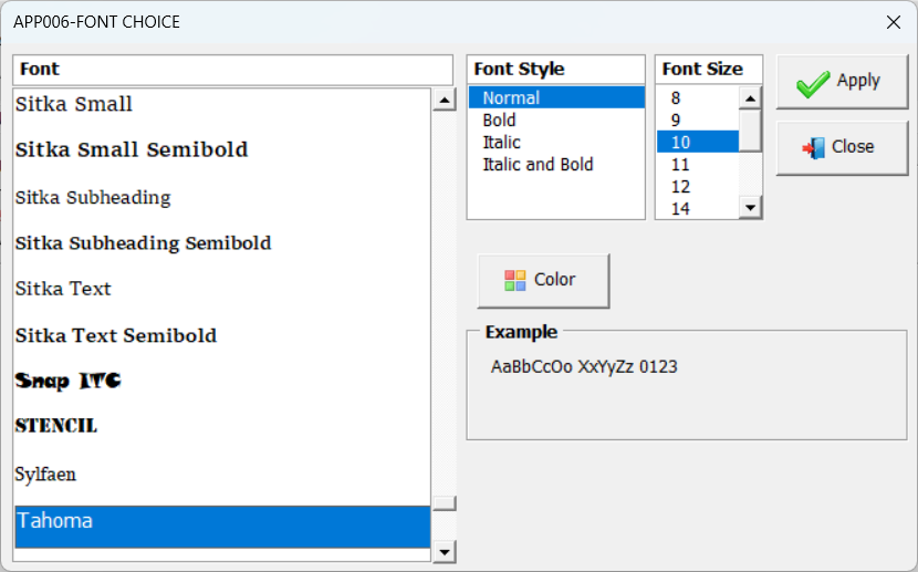
- Click Button Font to open the Font Choice window. You can choose:
- Font type, size, and style (Normal, Bold, Italic, Bold Italic)
- Font color via the Color button (opens the same Color Choice interface)

- Click Button Color to set the background color of the buttons.
(3) Pages
This tab applies the same customization options used in the Buttons tab, but specifically for page tabs created in version 1.4 of Smart UI.
- Configure font, color, and style just as you did for the buttons.
(4) Labels and Fields
This section allows you to configure Labels and Textboxes individually.
- For each, you can set:
- Color
- Font
- Style
- These settings work similarly to previous sections and allow for individual customization.
(5) Listbox
This tab allows styling of Listbox objects and their Header sections.
- Configure them separately with options for:
- Color
- Font
- Style
Finalizing Your Settings
- To apply your changes, click Apply and Close (top-left corner).
- If you click Cancel and Close, no changes will be saved.
- To revert everything to the original settings, use Restore Defaults — but remember, these defaults only take effect after clicking Apply and Close.
Live Preview
As you make adjustments in each tab, the visual elements in the configuration window update in real time. This gives you a live preview of your settings — but the changes are only saved once you confirm with Apply and Close.
This feature ensures that your interface looks exactly the way you want, without needing to guess or go back and forth.
Watch the Visual Settings in Action
The video below shows how to use the Visual Settings feature to customize the appearance of your Excel forms.
You’ll see how to apply different fonts, colors, and object styles to create a cleaner and more professional interface — all without writing any code.
This visual example reinforces the steps presented in the guide and helps you better understand how to enhance your forms using Smart UI.


Post your comment on this topic.