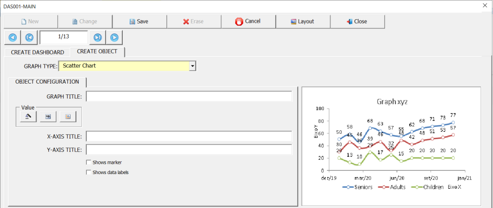
The Scatter chart (aka line plot, line graph) uses points connected by left-to-right line segments to help you identify trends. The horizontal axis represents a continuous progression, usually that of time, while the vertical axis reports values for a metric of interest in that progression. This chart is great to use when you want to show data over time.
The Scatter chart has only one data source, in addition, only data coming from tables is allowed.

To illustrate the configuration of this indicator, we are going to use an interface for recording production data. In this example, we will display through the Scatter chart the quantity of products produced and the quantity of line rejects over time.
The field (Production Date) contains information regarding the production date. The fields (Production) and (Line Rejects) contain information on the quantity produced and quantity of rejects, respectively.
Using the Date() function in the field (Production Date) will group all data within the same month, so that the result of the Sum() function in the fields (Production *and *Line Rejects) returns the sum of the production data of the whole month.

The previous example shows, through the Scatter chart, the sum of production data and line rejects for all products. Let’s now show the production data for just the called product (Product XYZ).

Restricting the maximum number of records
In some cases, the large amount of data can make the graph confusing, polluted. The option (Maximum Number of Records) can be used to restrict the total amount of data displayed in the graph, thus facilitating the reading and interpretation of the information.
In the two previous examples, the use of the Date(Jan-Dec/yy) function groups the information monthly, that is, the sum of production and line reject data is displayed each month. However, information from the entire production period will be displayed on the graph, which can make the graph polluted, making analysis difficult. Let’s then reduce the number of data displayed on the chart through the option (Maximum Number of Records). The objective is to show data from the last 12 months. However, to display the most recent data, it is necessary to sort the field (Production Date) in descending order (ZA).


Post your comment on this topic.