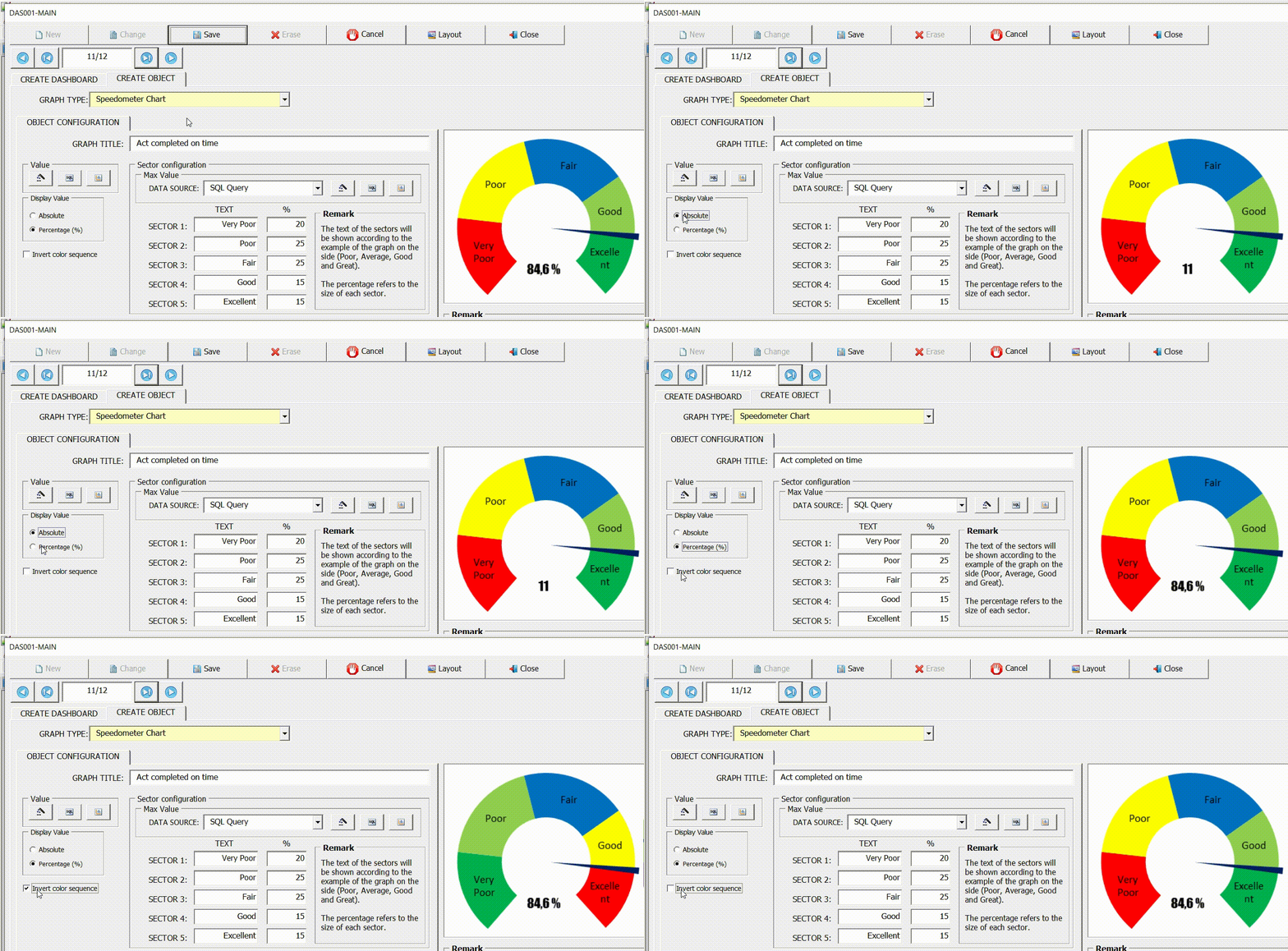
An indicator (Speedometer) is a type of data visualization often used to display a single data value with quantitative context. With a format reminiscent of a speedometer, this chart aims to track the progress of a KPI against a defined goal.
The advantage of this graph is that it is easy to interpret. It uses multiple colors to divide a scale into segments that represent different values of the same metric and uses a needle to point a certain value over the pivot point.
As with indicators (Battery and Progress circle), the speedometer needs two values to show the progress of a goal, they are:
- Max Value: Maximum target value, equivalent to 100%.
- Value: Value reached so far.
From these two values it is possible to display the actual performance compared to the maximum (target) value.

This screen also has the fields (Sector x). These fields are used to create the colored scales where the field (Text) defines the name of the range that will be displayed on the graph and the field (%) specifies the width of the range.
The example below shows the speedometer configuration with 4 ranges of values. Note that the sum of the ranges equals 100%.

Let’s repeat the example of the indicator (Progress circle) showing the same information through the Speedometer indicator.
Remembering that the objective of the example is to display the percentage of activities approved (Follow-up = Approve) within the deadline (Due Date <= Closing Date).

Invert color sequence
Use this option to change the color sequence of the speedometer segments.


Post your comment on this topic.