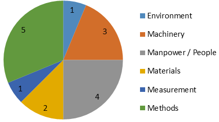
A pie chart is a graphing technique that displays data in a circular chart. The parts of the graph are proportional to the fraction of the whole in each category. In other words, each slice of the pizza is relative to the size of that category in the group as a whole. The whole pizza represents 100% of a whole, while the “slices” of the pizza represent portions of the whole.
The pie chart has only one data source, in addition, only data coming from tables is allowed.
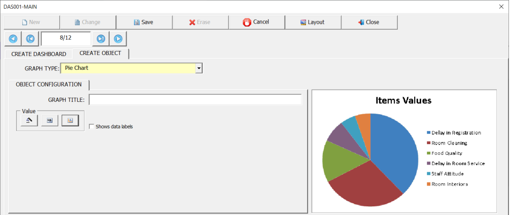
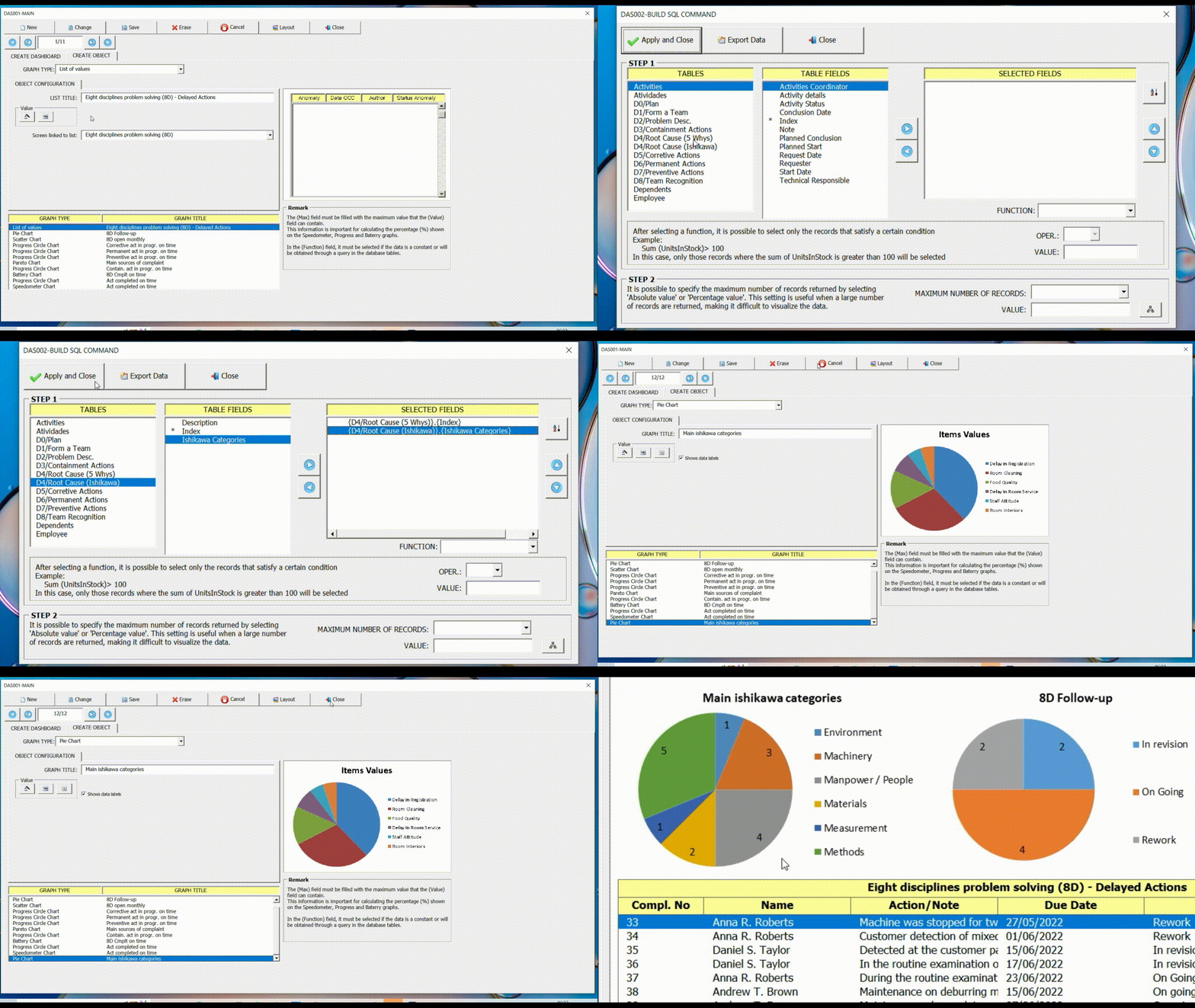
To illustrate the configuration of this indicator, we will again use the interface (8D) – Eight disciplines problem solving. In this example, we are going to display through the pie chart the main sources of problems, identified by users in the Ishikawa diagram of the 8D interface.
Axis configuration
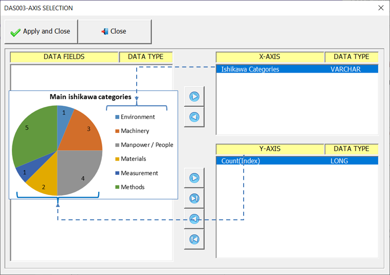
The field (Ishikawa Categories) referring to the legend (name of each slice of the pizza) must be on the X axis. The function (Count(Index)) which contains the values must be on the Y axis, as shown in the figure below.
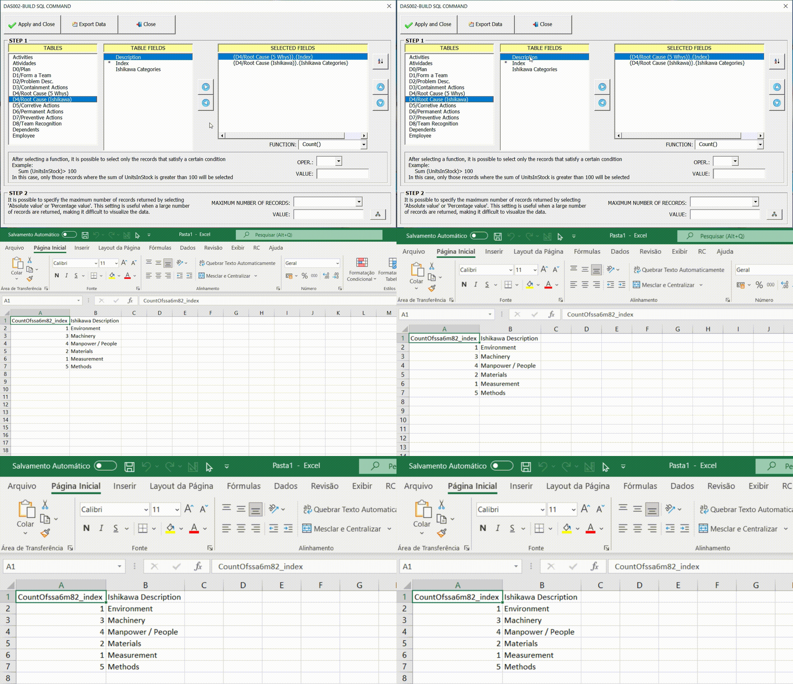
Export Data
Once the query fields have been configured, it is possible to export the data to a new Excel spreadsheet through the option (Export Data). This is particularly useful for verifying that the data generated by the query is as expected.
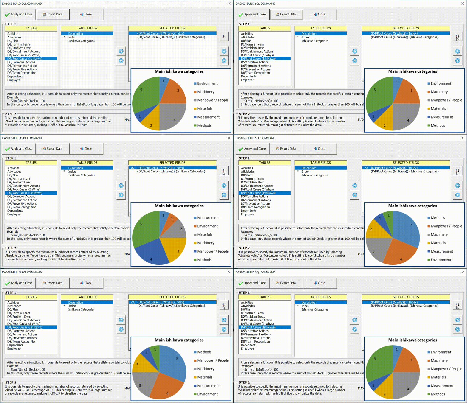
Sorting the Data
In many cases it is important to sort the data for a better display of information through graphics. In the example below we can see the difference in the result according to the order chosen.
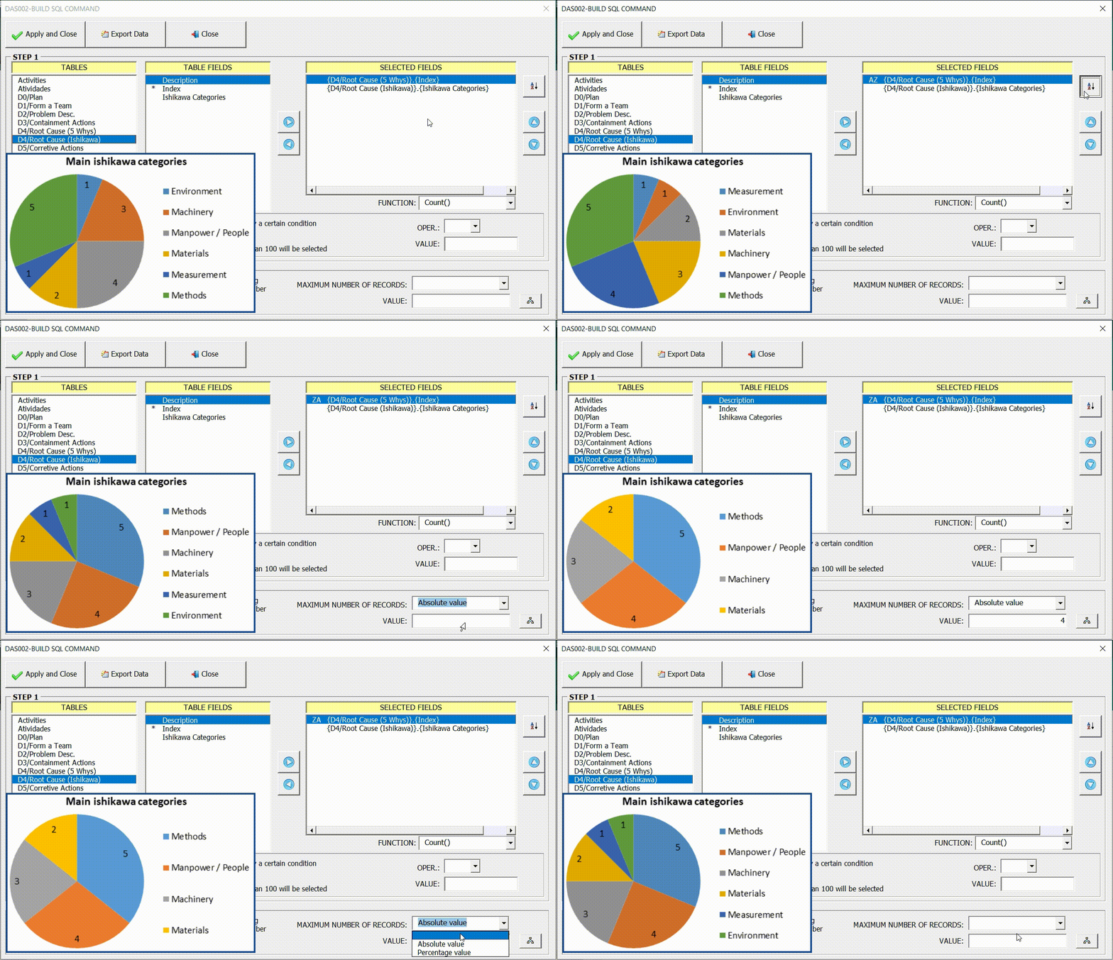
Restricting the maximum number of records
In some cases, the large amount of data can make the graph confusing, polluted. The option (Maximum Number of Records) can be used to restrict the total amount of data displayed in the graph, thus facilitating the reading and interpretation of the information.
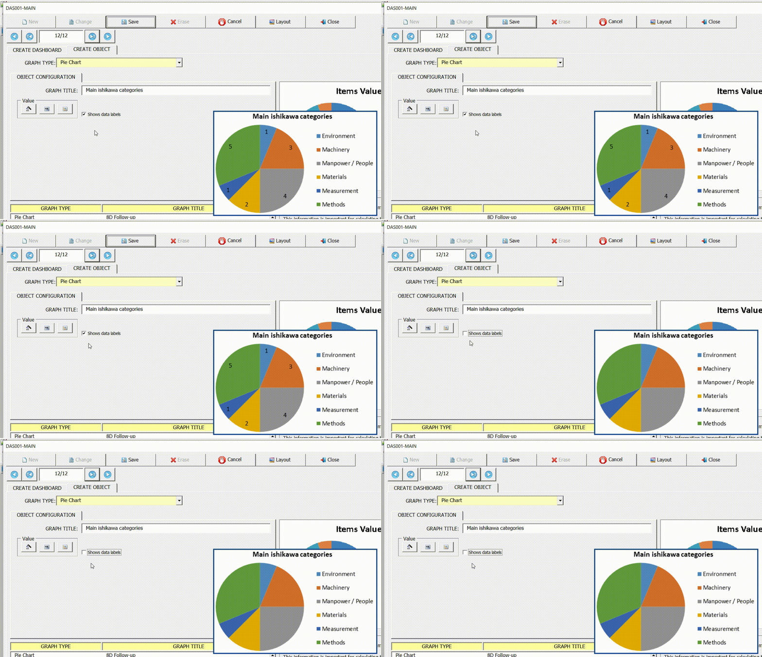
Show data labels
Use this option to show/hide data labels.


Post your comment on this topic.