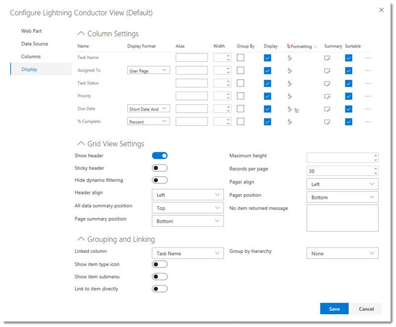
The Grid View will display your aggregated list items within a table (grid view). You can use the Display tab to modify the display (view) using settings listed below.

Column Settings
- Display Format – The Display Format will change the way in which the data for that column is displayed. For example, you can change the Display of a Date to Short Date or Long Data, and a Numerical column to Currency, Percentage etc.
- Alias – You may want to change the column header label for the column. This is useful if you would like a more meaningful column header. Such as changing ‘Title’ to ‘Task Name’.
- Width – The width setting is automatic. However, if you prefer to set a fixed width, you can do so by setting the number of pixels.
- Group By – Check the Group By check box if you would like to group by a column. Such as Priority. You can group by as many columns as you like. You may also set the primary, secondary grouping by changing the number in the group by check box if more than one column is selected.
- Display – You may select that you do not wish to display a column. This may appear strange, since you selected the column in the place from the columns tab. However, if you are grouping by a column, you may not wish to also display the column in the view.
- Formatting – The formatting option allows you to specify formatting with or without a condition. If you want formatting to be applied without a condition, you can remove the condition by clicking the trash can icon.
- Configure Summary Functions – The summary functions allow you to specify an aggregate function against a column. Such as Sum, Min, Max or Count. The summary value can be displayed at the bottom of the group, page or all of the data.
Other settings upon clicking the (…) ellipses icon include:
- Sortable – Allows the column to be sorted from within the view.
- Filterable – Allows the column to be filtered from within the view.
- Multiline – Allows the field value to word-wrap.
- Collapsible – Allows the column to be collapsed.
- Resizable – Allows the column to be resized using a dragging action.
- Allow Html – For columns such as Rich Text columns that contain elements of code. You can select whether the code is rendered or the markup is displayed.
- Header Align – Choose the justification for the column.
Grid View Settings
- Show Header – Show or hide the header (columns headings)
- Sticky Header – Keep the header displayed whilst scrolling through the list items.
- Hide Dynamic Filtering – Turn off the Dynamic Filter controls so that end users cannot filter the results.
- Header Align – Align the column labels: Left, Centre, or Right.
- All Data Summary Position – When displaying summary aggregate functions, select where they will be displayed for the entire results.
- Page Summary Position – When displaying summary aggregate functions, select where they will be displayed for per page results.
- Maximum Height – Set the maximum height for the rows in pixels. Empty is dynamic height to fit the content.
- Records per page – How many results per page do you want to display.
- Pager Align – Where do you want the pagination controls to be displayed horizontally.
- Page position – Where do you want the pagination controls to be displayed vertically.
- No item returned message – If zero results are displayed, perhaps due to filters. A meaningful message can be displayed such as: “There are no tasks assigned to you”.
Grouping and Linking
- Linked Column – The column within the results which will be the hyperlink to open the item.
- Show item type icon – This is a useful setting for a Document Library rollup. The document icon will display to the left of each document.
- Show item sub menu – The Show item sub menu option will display the drop down menu providing the options: View Item or Edit Item.
- Group by Hierarchy – This can be applied to lists and libraries that use folders allowing the folder structure to be honoured within the results, and therefore providing navigation through the folders. The By Task Hierarchy option can be set with related tasks, allowing navigation through parent tasks to child tasks.


Post your comment on this topic.