Formatting can be set on each column which includes color formatting, data bars, and icons which can also be based upon a condition.
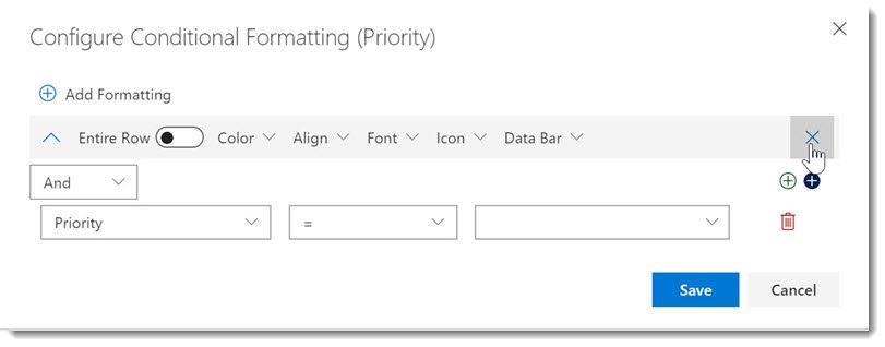
- To apply formatting to a cell or a row without a condition, remove the condition by clicking the Trash Can Icon to the right of the condition.
- To apply formatting conditionally, configure your condition using the column, operator, and value where the condition will be applied. An example would be formatting the back color to Red if the Priority = (1) High.
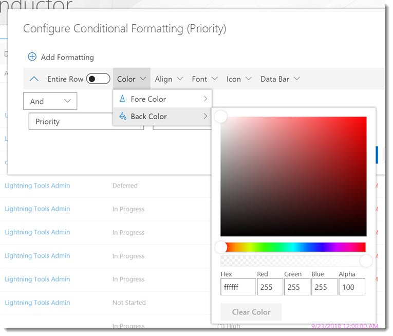
The conditional formatting can be applied to the entire row, or just a cell, by using the slider ‘Entire Row’. Colors can be selected and applied to Foreground (Font) or Background, by selecting Fore Color or Back Color, and then defining the color.
Column Alignment can also be set conditionally or unconditionally, such as setting numeric values that are negative to Align Left with Fore Color Red. Font properties such as Bold, Italic and Underline can be set conditionally such as setting Bold property for Tasks assigned to ‘you’.
Applying Icons using Conditional Formatting
Conditional Formatting allows you to highlight data to a business user that visually makes specific data stand out. Take for example, when you used to read stock figures in a black and white newspaper. You couldn’t at a glance, see which stocks had gone up or down. With color, and icons, you can apply formatting to a view of data to attract attention to specific lines of data that are important. This data visualization can be applied to any type of list column, but useful in Task list rollups to highlight important tasks, or in document rollups to highlight important documents based on their metadata.
There are around 3600 icons to choose from, which can be searched. Please use simple terms such as ‘Car’ or ‘Arrow’ to find the icon that you need. The color of the icon, along with the size can be configured after selecting an icon. You can also specify whether you would like to just see the icon displayed, or the icon alongside the column value. The position of the icon in the column cell can also be specified.
An example of a column that would be useful to have icons displayed is the Priority column in a Task list rollup.
Working with Data bars
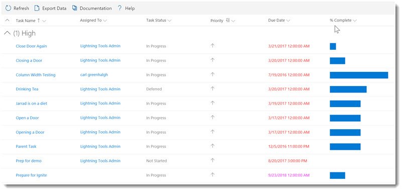
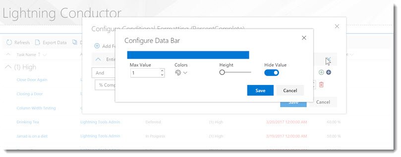
Data bars are also very useful for providing visualization within a SharePoint list rollup. In the below image, you can see databars are configured on the ‘% Complete’ column within a Task list rollup. The data bar shows at 100% if the Task is 100% complete. SharePoint percentage columns use decimals, so when you are configuring the Databars, you can set the maximum value to be 1. 0.5 will equate to 50% and 0.75 will be 75%. You may also use Databars on other types of columns such as Monthly Sales. You can compare easily each row of data for each months sales revenue within a list.

To configure a Data Bar. Set the Maximum Value that the data could reach within that column. E.g. If your sales target is $1M, and you want to show that the target has been reached. You would set the Max Value to be 100,000,000. If you are measuring a percentage column, set the max value to be 1. You can select the colors of the data bar, as well as the height. You can also choose to show or hide the column value.

Now that we have an understanding of how to configure a Quick Configuration of the Lightning Conductor, we will look at the Advanced Mode.


Post your comment on this topic.